now that’s more like it !!
as far as I can make out, the cutting edge art scene today – is all about: STEALTH.
as in, STEALTHY: wily, cat-like. STREET-SMART, STYLE-SMART, CONTENT STEALTHY, PAINTERLY STEALTHY !!
VERY FORMAL, THE VISUAL DYNAMICS are a big part of the picture, but on a very down-low type of game, as in – NOT ROTHKO !!
more ED SHERRAN !!
you know, cutting close to the beat. holding back, and then giving up. sweetly. very musical.
it’s certainly not: not in-your-face geezer ‘sexy’ overload and repeat after me, Paul McCarthy.

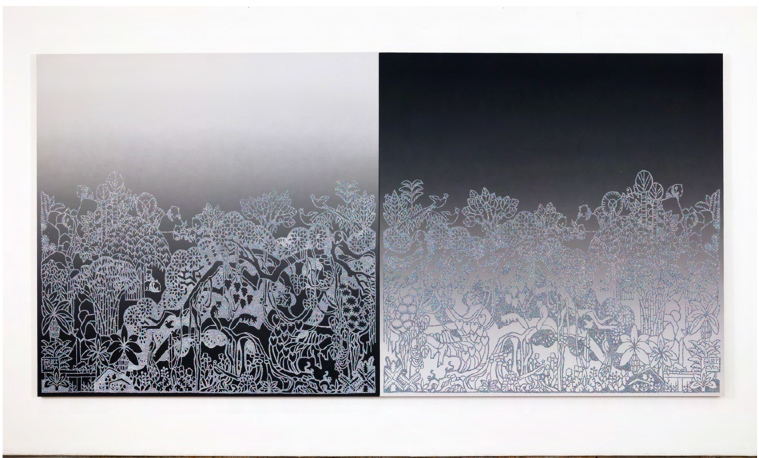
ROB PRUITT, ‘Daybreak/Twilight’, 2014
dyptique, acrylique peinture, email et pailles sur toile.
182,9 x 182,9 cm. chaque. 182,9 x 365,8 cm total.
unique – image via AIR DE PARIS – LIST FOR FIAC 2014
coming off of Rob’s recent and, gorgeous tres ombre ‘Suicide’ paintings, these are a knock-out. I was blown away the minute I saw them.
yeah, that’s what I mean by stealthy content, and ‘bio’ content – and even more stealthy . . the formal ‘painting’: smart formal elements, very fashion forward. almost a word play, game on visually, for sure.
STEALTH in this case employing digitally inspired – finely gradated & sophisticated spray paint work.

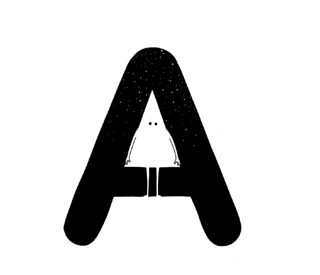
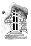
MRZYKE & MORICEAU, ‘Sans Titre’, 2014.
encre sur papier. 29,7 x 21 cm / cadre (frame) 31 x 22 cm.unique.
image via AIR DE PARIS LIST OF WORKS FOR FIAC 2014
wow, vive les native born frenchies !! these 2 artists are just so smart. in the head, in the style, in the draftsmanship, in the wit, in the down-low. in the global, in the fashion, etc. etc. etc.
so happy to be able to prove, I’m just not all about NYC, and I am for locavore cutting edge !! which this is, for sure !!
and, in double-time.
check out: MRZYKE & MORICEUA – 100 black line drawings, and counting !!
LISTEN UP, FIAC:
I’m not one to knock something and then not come up with a better alternative.
I hate negativism, it gives me nightmares after I post . . for days.
so . .
if FIAC had truly wanted to put up a giant, knock-out INFLATABLE . . that was truly ahead of the curve, and way ahead of the ‘market’ game (you damn straight, know what I mean !! McCarthy gallerists !!), that was also striking, cutting edge, super fun, super smart, very FRENCH !! and tres relevant to today, and not just A REPEAT of an old gross joke from 7 years ago, they should have / could have blown up & put up any one of the drawings on that MRZYKE & MORICEAU portfolio page link, above. in giant scale. PERIOD.
am I right ?
of course !!
in fact, here’s my top 2 picks:

MRZYK & MORICEAU – for ‘SEXY’, if that was what you were going for . . ho ho !!

MRZYK & MORICEAU – for ‘Chocolate Santa’ – if that’s what you really wanted. I mean it’s just a great image for an art fair, esp in Europe – let alone in tres sophisticate Paris !!
such a great ‘off-beat’ unexpected scenario, or what !!
plus, so super smart – design-wise.
so anti-terror, anti-war, anti-bio hazard, anti-earth, anti-market, anti-status-quo, anti bio infra-structure collapse. so sweet, and yet so powerful, edgy – but also an image everybody who came around – could embrace.
and hopefully . . transform with, evolve with – and at worse, just simply: escape and . . . dream – with.
too bad, FIAC dropped the (inflatable) ball, here’s to next time.
ok, now I can sleep better, voila !!
~ROB PRUITT, MRZYK & MORICEAU, AIR DE PARIS, FIAC |
Posted in The Bomb | By Nancy Smith | October 21st, 2014, 12:46pm
file under: old geezers gather in Paris . .
to celebrate contemporary art, gimme a break.
just bye way of comparison, to how dynamo, and relevant !! the underground art scene is in NYC, right now. not to mention that is also totally AHEAD OF THE CURVE . . .
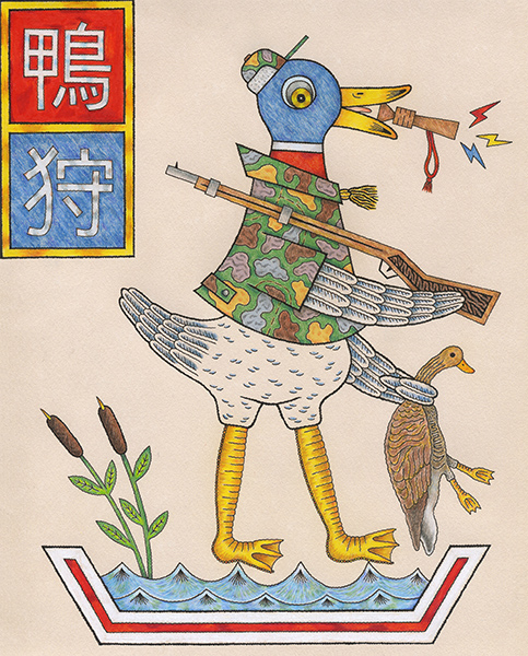
case in point: the latest “duck, sucker” image from MATT LEINES, which just surfaced from Greenpoint Terminal . . and, from a bigger venue . . the SATAN CERAMICS show !!
it’s pathetic, but check out just how old hat and desperate for attention – the Paris ‘mainstream’ art scene is. dudes, re contemporary art, rule #1 – you are supposed to be cutting edge, not behind the curve by like, about . . 7 years !!
plus, it’s a real shame considering how much great street art generates out of Europe, and Paris in particular.
but who’s surprised, the biggest adjective in the old rich guys’ art vocabulary is: sexy.
I kid you . . NOT.
as in: that THOMAS RUFF, that CINDY SHERMAN, that JEFF KOONS, that Gerhard Richter, that Anselm Kiefer concentration camp . . is so SEXY !!
am I wrong ? no.

PAUL McCARTHY – inflatable. PHOTO: AP via NEW YORK POST
is it a tree, is it a plane ? no, it’s a giant anal sex toy. a butt plug – to be specific.
thank god somebody had the brains to take it down. FIE on FIAC, what losers.
they get all this press hyping how great the contemporary art scene is in Paris, and they . . put up a giant butt plug ?!!
it’s so . . not today.
one old geezer plays a whole bunch of old geezers for saps, or is it just another case of the emperor who wore no clothes ? beats me, but it sure ain’t . . cutting edge !!
PAUL McCARTHY presented his chocolate Santa workshop at MACCARONE in NYC in the winter of . . 2007 !!
that’s 7 years – ago.
and actually – the best part of that exhibit was the chocolate shop installation itself, including the multi-colored cellophone paper they used to brightly wrap the finished chocolate gift boxes. it was pretty cool, and I guess people in Paris deserve a chance to experience it’s magic, first hand . . but don’t call it cutting edge, call it a re-enactment.
the most embarrassing part of the gig – was the anal plug in the chocolate Santa’s hand, which only your typical horny old geezer collector found . . funny. ugh, grossness in the midst of great festivity, what could be worse. and chocolate yet, let’s . . go there. I mean it was a twist, ok.
I mean maybe, just maybe . . that was the point, so we gave it a pass, but not TWICE !!
and I mean the only other rock-the-boat show in NYC at the time was DAMIEN HIRST, and his embalmed carcasses, so . . !! pick your poison. hazmat suits vs. not a gift for children, even from your pervvy uncle ?
the only CUTTING EDGE aspect to the whole thing – was how fast it got taken down !!
and apparently with NOT too much fuss, either – from the authorities.
and you wonder why the fundamentalist hordes, think we should be wiped from the face of the earth. I mean maybe as a symbol of western cultural excess, it should be re-inflated, oh give me a break – it was awful.
read: ‘Giant sculpture resembling a sex toy dismantled in Paris’ – NEW YORK POST.
p.s. as for LONDON . .
the last great thing to come out of LONDON – was the ALEXANDER McQUEEN exhibit at the MET, several years ago.
UP-DATE: OCT 20 / OCT 22, 2014
oops, MY BAD !! I had forgot about BANKSY !!
turns out his arrest was a hoax – that’s what I was thinking, London is too small, if they had wanted to arrest him they would have years ago, which is an interesting question on it’s own. funny about the hoax timing, just to be reminded of Banksy, like that ?!!
too bad the PAUL McCARTY butt plug – wasn’t. a hoax.
I wonder if they had to get a permit to put that inflatable ‘sex toy’ up in the first place ?
I wonder if FIAC submitted a pre-installation sketch ? or did they just tell the Parisian powers that be – they were putting up a ‘modern’ art – Xmas tree !! I mean, I don’t don’t think they would have come clean and said . . we are installing a giant sex toy ?!!
the amazing thing was that it came down, and so fast.
LONDON vs PARIS, so exciting !! who knew.
~I see London, I see France, I see Paul McCarthy’s underpants !! update: BANKSY HOAX |
Posted in The Bomb | By Nancy Smith | October 20th, 2014, 10:08am
as in, sitting ducks ?!!!!
‘DUCKS’ – OPENS FRI OCT 24, 2014 / 7-10 PM
the show runs thru NOV 29, 2014
a big group show of cutting edge art – curated by RYAN TRAVIS CHRISTIAN
GREENPOINT TERMINAL GALLERY – 67 WEST ST. # 320 – BROOKLYN, N.Y.
“I hate how you’re just born out of nowhere, forced to go to school and get an education so you can get a job. What if I wanted to be a duck?”
it’s a big big group show, see: artist list
there are a lot of names I am not familiar with, and I bet there are some great discoveries to be made . . but just off the top of my head, anything by any one of these 4 artists, snap up !!
BEN JONES, MATT LEINES, TAYLOR McKIMENS, CASEY JEX SMITH.

MATT LEINES, ‘Duck Hunt, A Humorous Rifle Industry Publication Aimed at Japanese Children’, 2014.
8 x 10 in. ink, colored pencil & graphite on paper
~DUCKS . . GREENPOINT TERMINAL |
Posted in The Bomb | By Nancy Smith | October 19th, 2014, 9:28am
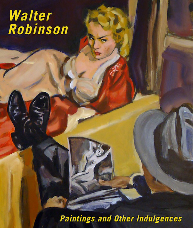
‘WALTER ROBINSON: Paintings and Other Indulgences’
OCT 17 – DEC 22, 2014
UNIVERSITY GALLERIES of ILLINOIS STATE UNIVERSITY
organized by the BARRY BLINDERMAN, this is the FIRST museum survey of NY-based WALTER ROBINSON’S work, as well as the INAUGURAL exhibit at the UNIVERSITY GALLERIES of ILLINOIS STATE – new storefront spaces at Uptown Station in Normal, Illinois.
the survey includes 80 paintings, covering the years 1979-2014.
read more: WALTER ROBINSON SURVEY
read: about BARRY BLINDERMAN, director of University Galleries of ISU since 1987

WALTER ROBINSON, ‘PICTURE PERFECT KILL’, acrylic on canvas, 2012. 48 x 48 in.
collection: MIMA & CESAR REYES, PUERTO RICO – image: University Galleries, Illinois State University
speaking of which: SIMON CERIGO.
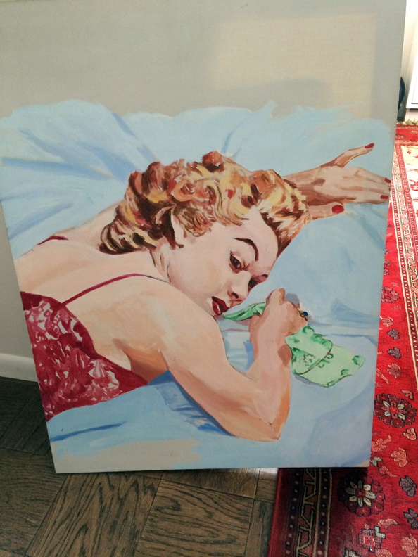
SIMON & I were both early fans, 1981 onwards – of Walter’s work. at one point we owned almost 10 canvases, including some ‘pulp novel’ covers, a drug cabinet, a straw flower still-life arrangement, and the big ‘ape’ reporter. Simon sold them all off during the years when he needed dough, with most of them ending up in his sister Helene’s collection, one of which was lent to this show, ‘Revenge’. Simon bought it from METRO PICTURES in 1982, 1983 at the latest.
Simon had his own relationship with Walter over the years, and I of course knew Walter pretty well, from 2002-2004 when he was my editor at artnet, where I was an event photographer – with my own column. when Walter hired me, it was the very first time anybody ever took me seriously, I had been taking photos for over 20 years at that point (!!) and artnet was the very first time – a photo of mine was published, so . . wow.
but he also fired me – 3 times !!
the third time stuck. I founded artloversnewyork as an independent site, posts began APRIL 2005.
what happened ?
I was bringing in too much indie stuff, and god forbid . . musicians, name one: Devendra Banheart !! but more crucially, I had managed to hustle up a nicepaid advert platform – which made everybody else over there very jealous, long story – short: I was the only the artnet contributor to hustle up income for my content, we were all unpaid !! (except for Walter of course !!) and yes, people got very very – jealous, so when Walter told me I had to drop the paid bit
– I quit, duh. it was the classic NYC . . “you are fired for being too successful” scenario, but I was always thankful to Walter for giving me a break, and a big one.
and, anyways I really did prosper better without an editor over me, and people soon came to realize I wasn’t just a papparazi ‘go-get-Schnabel’ dog, but actually had a mind behind the camera lens.
I always thought Walter was a great painter, but I did, and still do . . blame him for sticking that nerdy ‘artlovers’ tag . . on me !! I always liked what Charlie Finch called me better: CRACKULA, Crack for short !!
Charlie actually was the one to prompt Walter into looking at my PHOTOS, and he always berated me with: “does all the world revolve around Nancy ?”, to which I always replied: “damn straight” !!
who knew, a budding spin doctor was in the making, case in point !!
sandwiched between Walter and Charlie, those were the . . days !!
very exciting.

WALTER ROBINSON, ‘REVENGE’, 1982. acrylic on canvas, 40 x 30 in.
interestingly – the piece still has the original METRO PICTURES label on the back.
collection: HELENE CERIGO LUPATKIN
PHOTO: HELENE CERIGO LUPATKIN
~WALTER ROBINSON . . BIG RETROSPECTIVE |
Posted in The Bomb | By Nancy Smith | October 18th, 2014, 11:36am
here’s the line-up . . going forward:
1. WALTER ROBINSON – BIG, BARRY BLINDERMAN-ORGANIZED RETROSPECTIVE.
2. ‘DUCKS’ opens OCT 24, 2014 – GREENPOINT TERMINAL GALLERY – MATT LEINES DID THE INVITE ILLUSTRATION.
3. JIM MANGAN & PETER SUTHERLAND, ‘FLASH FLOOD’ – at MUDDGUTS. PIX FROM THE EXHIBIT
4. THEN, we are stopping the presses to get back to, the MOTHER OF THEM ALL, indies . . SEAN VEGEZZI & 170 SUFFOLK.
~LINE UP . . |
Posted in The Bomb | By Nancy Smith | October 17th, 2014, 4:22pm
SIMON CERIGO – A GHOST LIVES ON, IN GREENPOINT . . .
why am I not surprised !!
to find Simon’s work, alive and kicking – where the cool kids are !!!
the supreme hipster flaneur, Simon was always to be found at the heart of every hot scene.
anything but lazy, the very definition of the ‘boss’ on the streets, Simon was better known for the 100s of gallery openings he attended each and every month, and his subsequent ‘ratings’, aided by his consummate eye and deep art knowledge, more than for his own art – but that is surely gonna change, and one day – for sure, he will get his day – !!
because ?
because . . it’s my firm belief – that indie talent always wins out, even if it’s in the long run.
Simon could definitely call talent, he gave ANDREW GUENTHER a big thumbs-up at SILVERSTEIN GALLERY, in fact he hired him on the spot – Andrew’s very first job after leaving grad school and landing in the big apple, where he (un-typically) let Andrew curate shows, and even exhibit his work. Simon remained a great fan of Andrew’s work through-out his lifetime.
SIMON was a big contributor to artlovers, bringing in the real dirt esp from uptown – way before anybody else even knew it had happened !! everybody knew him as the art world maven, if you wanted the low-down scoop on anybody – he had it. trust me, a lot of the flair and buzz of the contemporary scene has gone out – has evaporated without his colorful on-the-scene – takes, and never-ending gossip.
he loved covering the big action, mostly the blue chip auction scene, he could call the prices and the ‘futures’ pretty good, but he also came head-to-head with the cutting edge scene, esp in the 80s .. but also even in the early 2000’s. it was he who unearthed the young CANADA GALLERY – via their DEVENDRA BANHEART drawing show. did we say, he also knew music ? he wrote the artlovers indie music reviews, which truth to be told had a bigger following at times, than the art reviews – and, which although seldom more than several lines long, always ending with: PLAY IT LOUD (!!), he was a classic slacker scribbler – relayed the essence of his extensive and deep-rooted oral history of the indie music scene, at its peak, seriously . . going back through the 70s.
yep, big art scene maven that he was, not to forget consummate party crasher, and bad boy – people don’t know that he really made (and destroyed) quite a number of careers, along the way. like I said, but can never say enough, a lot of the ‘air’ has gone out at several large galleries that he used to favor, and they don’t even know why – and, no I’m not mentioning names. just look around at crashing . . Chelsea. of course the best was when he brought in the first take on a brand new space, VENUS OVER MANHATTAN does come to mind, and of course the priceless low-down gossip, such why JASON RHOADES really hit the floor, despite the white-wash gallery cover-up. and always . . way way before it hit the mainstream headlines, put it this way, JEFFREY DEITCH was a big thorn in his side, and he called that MOCA director fiasco out west from day one. which Roberta got way wrong bye the way, and for which she had turn tracks in print, later on – at least a year or so later.
that was just the he way rolled.
Simon had a take on everyone, he had a memory like a walking rolodex. not only could he tell you who was who in a room, but who bought what, and for what price, who slept with whom, (and their sex habits !!) and most fun of all – who was trying to sabotage who’s career on the slippery path to fame & fortune – and trust me, he was not above doing a little bit of that himself, bye the way. JEAN MICHEL does come to mind, jealousy and hubris, oh yeah. colorful is not the word.
he could even tell you what someone was .. worth $$ wise. he was always: right. right down to the bank account.
not always nice, but always – right.
the one thing he didn’t know how do, probably because the mainstream art world sucks, everyone knows the art world is so damn cutthroat and unethical – was how to make real money off the ‘career’ consulting. people just got him partied up, took the info, and ran with it. “how did I know to buy this work ? heard it at a party”. was the common refrain.
it’s not a joke, he seriously had a largely unrecognized impact on the fortunes of many an artist, and gallery in this town – as he advised several big collectors on the down-low. and usually just for a good time, he absolutely didn’t know how to keep his mouth shout – til he got paid. well maybe you can’t be a tight-ass businessman, and call the scene . . you can’t have it all.
but, he had the goods, that’s for sure.
SO:
if you don’t know Simon, it’s past tense – because he departed suddenly – after a brief illness last January, 2013.
OBSERVER OBIT
ARTINFO OBIT

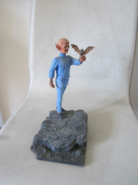
SIMON CERIGO, toy model base – with custom paint job.
and, I think that can pretty much stand for Simon’s ‘inner-most’ artist self, his artist side kinda got crushed in the sorry NYC mix, we all love . . and hate.

his daughter, KATE, now a graphic designer – who likes to be right where the action is, just like her dad !! lives in Greenpoint, and has Simon’s art work displayed everywhere.
so funny thing, a brand new generation of artists is getting to know him, but through his work, this time, as opposed to his . . ‘footwork’.
for sure, talent .. outs.
though it’s a damn hard road, for . . some of us.
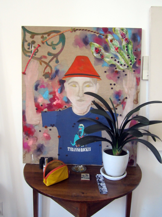
this is a portrait of Simon’s son, Theo. it’s a piece from the early 1990’s.
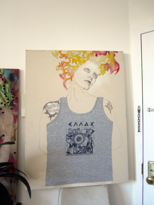
like many an artist Simon was profoundly affected by the arrival of his 2 children, but unlike many others he was among the first to actually use t-shirts, and to stick-on or other-wise attach other found objects directly onto the painting’s surface.
he had a big t-shirt collection, inspired by the underground music scene he loved so much, which had just started to produce them, you know classic underground ‘band’ & ‘tour’ shirts.

this is also an early piece by Simon, from the same time period. early 1990s.
Simon definitely had a love-hate relationship with JEFFREY DEITCH. the shirt definitely does say:
‘DEITCH PRO JERK’ . . like a tattoo on her shoulder, a riff on DEITCH PROJECTS, of course. I will let you ponder who the wild-haired woman was, for yourself.
the deal was, DEITCH at that time was putting on a lot of smokin’ hot shows, so there was JEALOUSY, esp because the locals on the scene, who were most definitely making it go round !! like Simon felt slighted, because they weren’t part of that agenda, and in particular Jeffrey didn’t give Simon the time of day. even though Simon was doing a lot of footwork for him, creating buzz etc. maybe Jeffrey didn’t realize that, or maybe he just didn’t care. bigger fish to fry.
but it went deeper than that.
Simon was actually the VERY FIRST PERSON, as in ‘COLLECTOR’ – to buy VANESSA BEESCROFT paintings from Jeffrey, and I do mean: very f-i-r-s-t. Three of her ‘Amish’ looking ladies, do you know them, ? so beautiful.
it was like $10 grand for the 3 of them. so Simon figured just for that – Jeffrey should have shown some respect.
a little later on, when Simon needed some cash and tried to put one of them up at auction, he felt Jeffrey had stepped in, and nixed the deal. so Simon got very bitter over that. game on, DIETCH was fair bait to bad mouth after that, and he sharply elbowed Jeffrey’s rep at every turn, turns out he wasn’t so far off-base, about Jeff’s social skills.
JEFFREY DEITCH – PRO JERK, haha – Simon liked to get in the first, and . . the last word.

flash from the past.
collector, artist, and hard-core party crasher – SIMON CERIGO in the winter of 2001, in fact – I think that’s the ROB PRUITT ‘Pandas and Bamboo’ opening behind him.
PHOTOS: NANCY SMITH
~SIMON CERIGO . . GREENPOINT OPEN STUDIOS |
Posted in The Bomb | By Nancy Smith | October 17th, 2014, 12:04pm

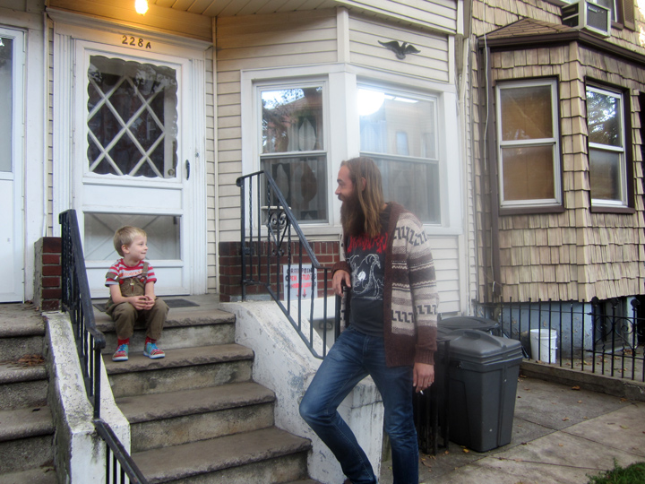
and then it was time to visit ANDREW GUENTHER, a cutting edge indie artist – if I ever did see one.
here he is looking like one big Greenpoint garden gnome . . and I mean that in a good way – with his young daughter EASTER. her full name is EASTER LILY, and I always blow it and call her TIGER, after Tiger Lily.
the Indian princess from PETER PAN.
it’s hard to tell what she’s thinking, she’s very silent – but, totally focused on observing.

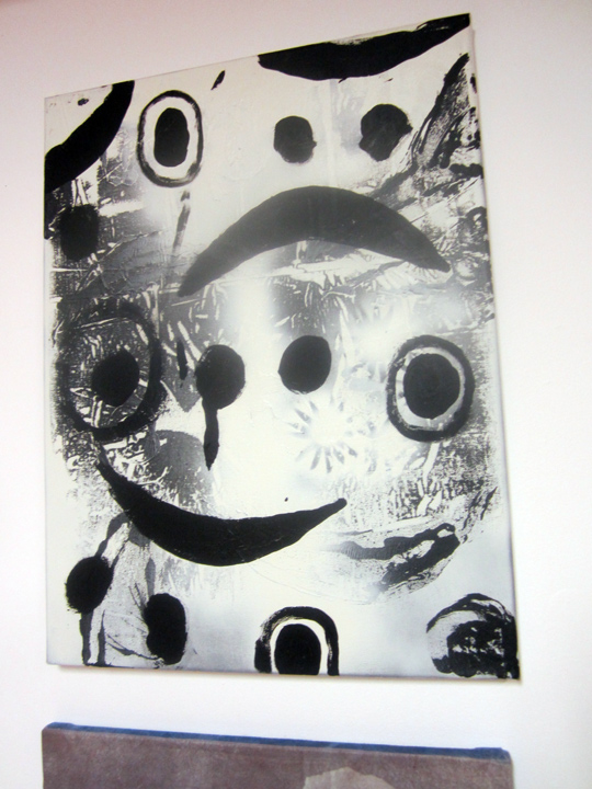
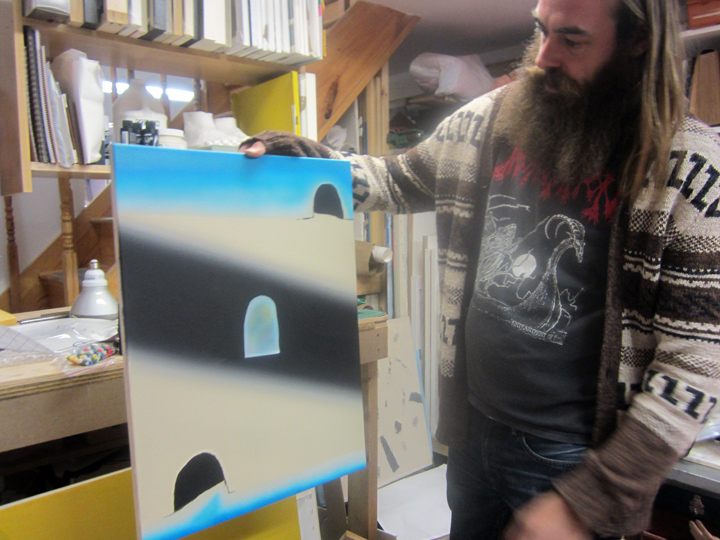
right off the bat, I see a black and white painting . . that I have never seen before: it’s a riot.
Andrew works out of this basement studio in his home, and keeps a near-by storage space for the larger works, and as a more formal viewing platform.

Andrew shows me another one of his newest paintings, a collaboration with his friend, painter RICHARD COWAN.
he also had a collaboration with Richard in that recent Gowanus Canal show.
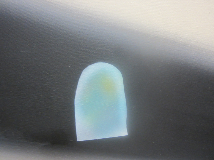
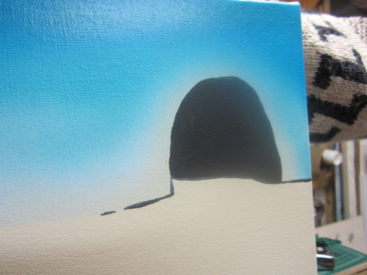
this one is even more radical. it’s the head-on collision of the formal qualities; color, composition, graphics, etc – with the non-verbal content – that knocks the work off the wall, for me.

this area was painted by RICHARD COWAN.

while this is Andrew’s painterly handiwork.

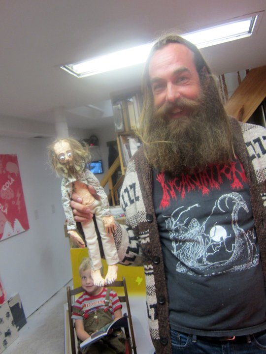
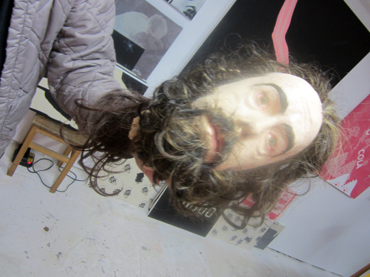
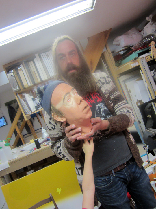
fooling around in the studio secrets – Andrew shows us a puppet he made of himself !!
talk about big, pink and fuzzy . . except as a puppet, long, wild, and bearded . . fuzzy.
but note . . the 24/7 surveillance camera monitor in the background, just to the right of that puppet.
living in NYC, or anywhere . . apparently, is no fun and games.
but it’s fun to see a serious artist . . let down his hair !!

kind of shocking, is that a ‘beheaded’ self-portrait ?
I don’t think that is what he actually had in mind, but there ya go.
actually I’m not so surprised, Andrew has a ‘craft’ side. one of my earliest photos of him – is him in the Silverstein gallery, so must have been about 2001 or so, and he has a rabbit (self-portrait ?) hand-puppet that he made – on his hand, saying hello . . to the camera.
I think of any artist I have photographed I have the most photos of Andrew, 14 years worth – if anybody wants to put on a show – you know, just ask !!
god . . are the galleries in this town mostly lame right now, or what.
and trust me, ‘Independent’ . . does not spell: INDIE !!

a ‘young’ Andrew . . puppet. kinda looking like . . Where’s Waldo !!
that’s why I have so many photos of him, one: the work is superlative, always edgy, always evolving, always original. always INDIE !! and two: he is always changing, too.
I don’t know what he thinks of the twisty path his career has taken, as opposed to the more commercial path of some of his early pals, like – name one: MATTHEW DAY JACKSON. but in my books he’s much better off for the being indie, & I have no worries that his career will catch up with him, big time.
even now, I get the feeling he is making sales, and keeping it on the low-down. storage spaces cost . . $$$.
it’s not the artists that are holding things back in this town, it’s the dealers.
no imagination whatsoever.

I brought NICHOLAS STEINDORF along to meet Andrew. and obviously, he’s having a blast.
I think Andrew is a great role model for young artists – just . . STICK TO YOUR GUNS.

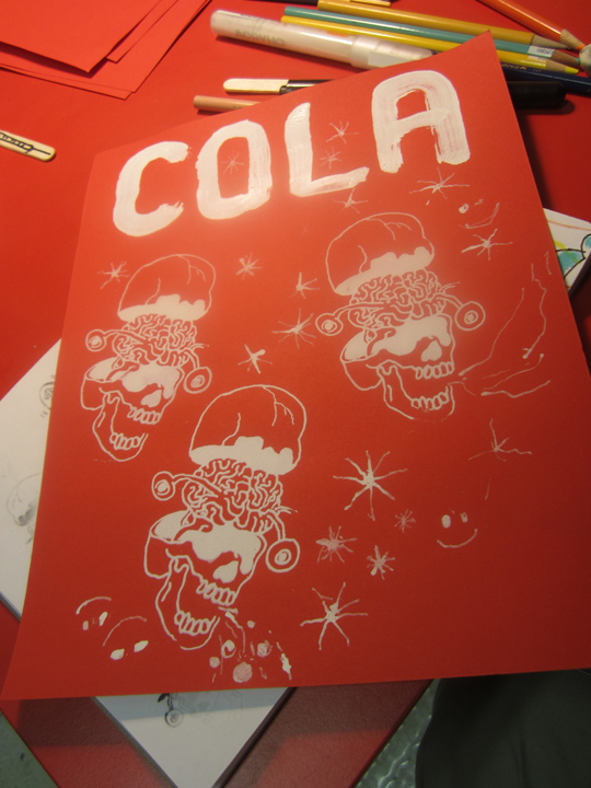
haha SANTA & COLA . . a classic advert mix, thrown up, and coming back down . . radical, super smart, & funny !!
this was just a sketchbook page.
I was thinking, so where’s the silver glitter, and fake white cotton-ball snow ?!!

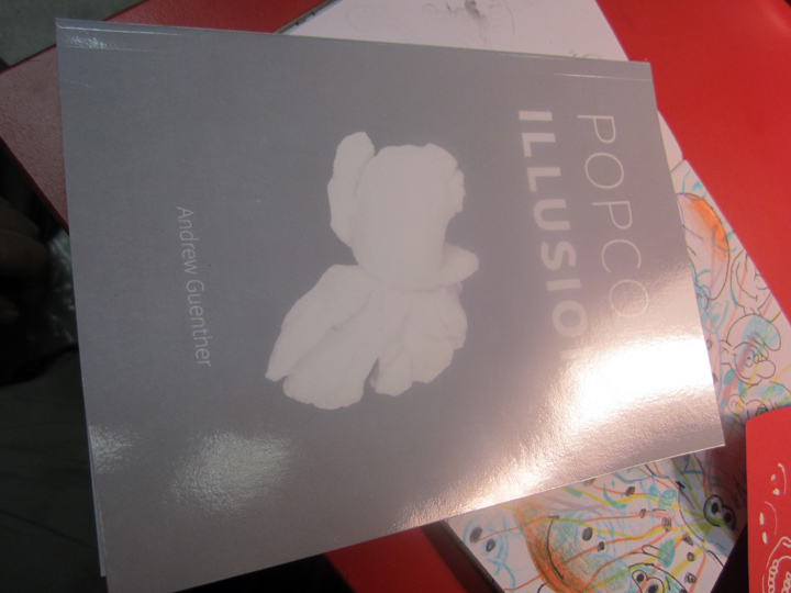
switching gears, I spy Andrew’s paperback book: ‘POPCORN ILLUSIONS’, 2014.

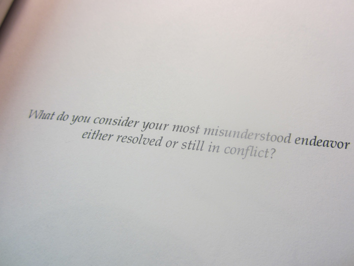
a random page said: “What do you consider your most understood endeavor either resolved or still in conflict ?”

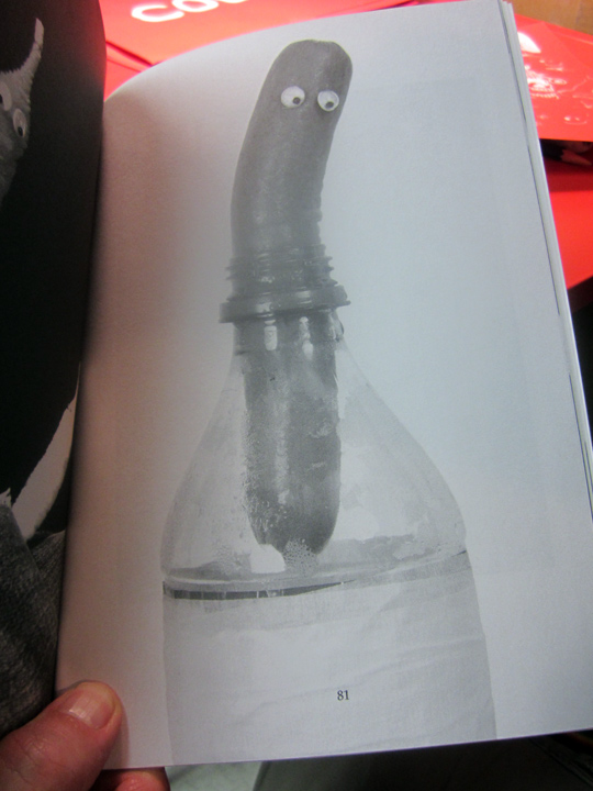
a random page was this hot dog / man puppet in a jar, and I do mean . . m-a-n.
that’s what I was talking about, his ‘crafty’ side.

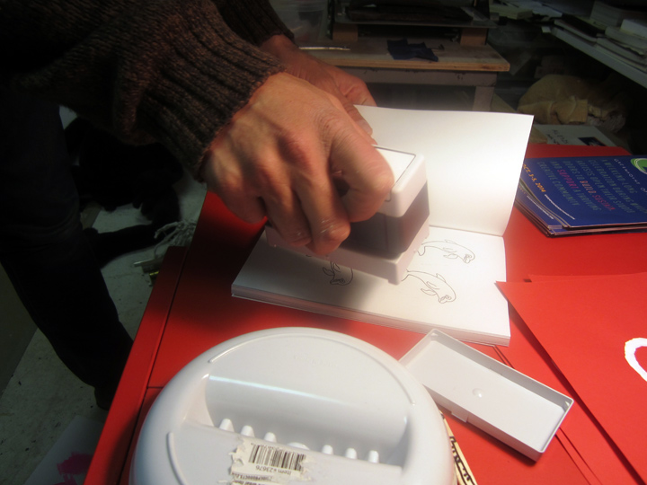
Andrew is stamping the inside cover.
wow, looks like I am scoring a copy – that I can really call – my OWN.

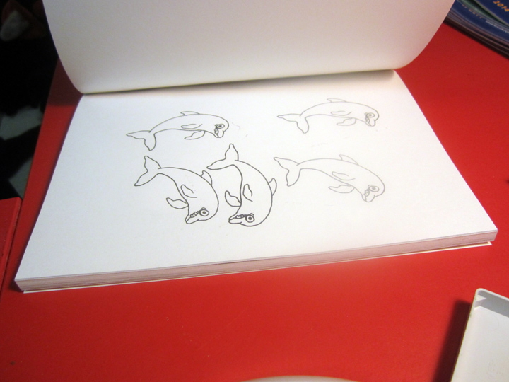
crazy wild, dolphin stamp.

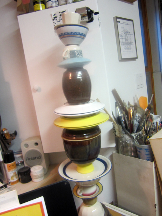
talk about ceramics.

ANDREW GUENTHER, with 2 seminal paintings from his Gowanus Canal show – anybody . . out there ?
listening.
with, half a brain ?

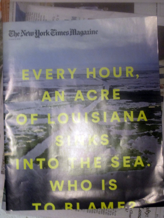
just as we are about to leave I catch this NEW TIMES MAGAZINE . . on the floor.
“EVERY HOUR, AN ACRE OF LOUISIANA SINKS INTO THE SEA. WHO IS TO BLAME.”

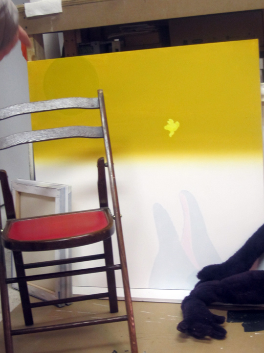
ok, one more painting for the . . road !!

DOLPHINS: S.O.S.
HUMANS: S.O.S.
trust me the days of MARY POPPINS, are o-v-e-r.
in fact, more like PETER PAN, on steroids. laced with some very bad . . acid.
PHOTOS: NANCY SMITH. OCT 5, 2014.
~ANDREW GUENTHER . . GREENPOINT OPEN STUDIOS |
Posted in The Bomb | By Nancy Smith | October 15th, 2014, 9:14am

LEVI HASKE in his studio, with his work behind him – Greenpoint Open Studio Weekend, BROOKLYN, NYC.
OCT 4-5, 2014.

LEVI HASKE’S works, acrylic paint on plywood, were (relatively) small in scale, but a had large generous feeling.
although non-objective, and without repeated patterns either – some of them did have a atmospheric landscape narrative, one could get lost in, if one wanted to visually ‘travel’, ‘trip’ or . . ‘dream’.

just so you can get a sense of the scale of the works . . Levi’s studio was longer and more on the narrow side.
that’s a slice of NICHOLAS STEINDORF, at the right – in this slice of a studio, slice of a photo.
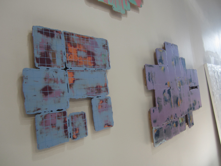
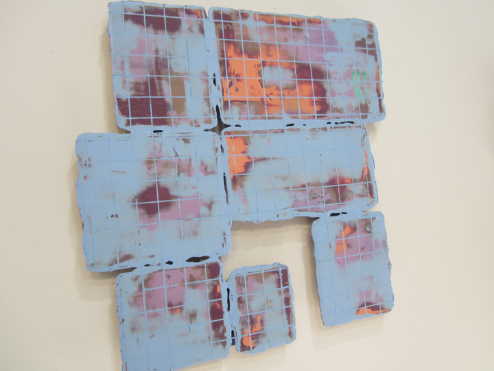
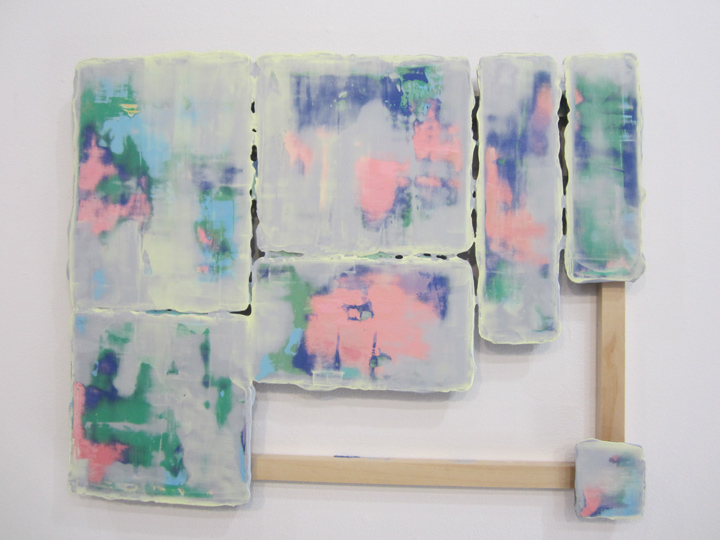
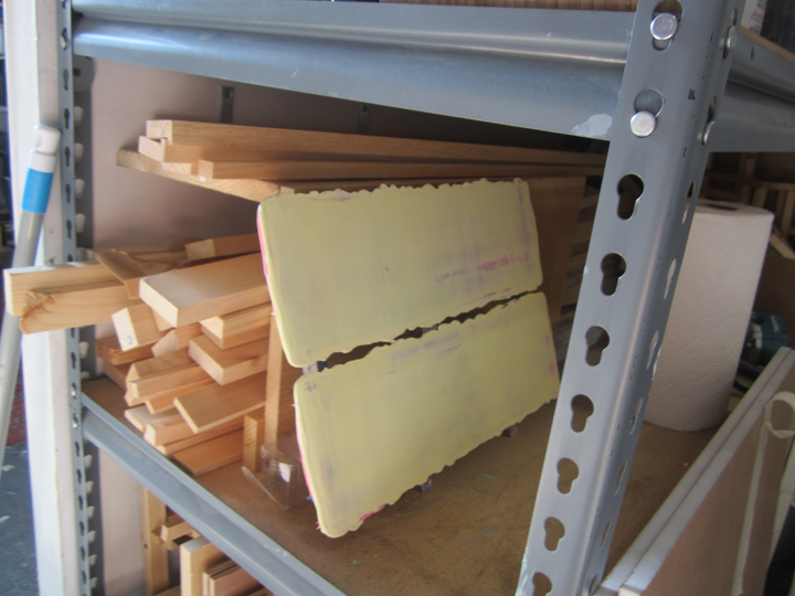
NICHOLAS STEINDORF was artlovers’ tour conductor / curator for the weekend, where an overwhelming number of artists had generously thrown open their studios to the public, and they did indeed attract quite a good crowd on both days. I found it really interesting that Nicholas brought forward just 2 studios for us focus on, well, time was also a factor – those of JAENA KWON and LEVI HASKE. and now at Levi’s studio, I realized he had also set up a small sub-text: non-objective works on wood, where the painted surface was the main focal point, muted tones ruled – and the ‘shape’ of the wood was just as important – as the manipulated, almost waxy, painted surfaces – in both cases. though the 2 artists’ works – couldn’t be further apart . . on all other (over-all) factors.
if pressed, I would say, in a nutshell: Jaena’s work was more sculptural, often large scale and that a sense of craftsmanship and patina – was a big part of the ‘experience’. Levi’s work on the other hand was more atmospheric and compact – it brought the viewer a dreamy narrative that was both inward and outward, a pictorial fluctuation, rather than a tactile sculptural state, even though his work did also depend on (sculptural) cut-out wood, which made the perceived contrast even more interesting.

Levi’s ‘wall works’ were flat cut-outs, almost like puzzle pieces. some of which contained inner “negative” or open spaces, as part of the composition.

muted color was key. but true tonal contrasts were in play – though they were soft and organic. reminded me of late stage Turner sky scapes. Jaena’s work also had color as a key element – but Levi’s were ‘colorful’ in contrast to her minimalist surface-of-a-polished-rock sensibility. having just come from Jaena’s studio made it much more easier to appreciate what was going down in both artist’s works.
thanks, Nicholas !!

a larger and more ‘colorful’ work by LEVI, with more complex sculptural wooden elements worked into the dynamic . . very Turner-esque pushed to the 21st Century, or what ?
or maybe that’s a riff on the American landscape painters, you know, a Hudson Valley School of painters type sunset ? anyways, I was thinking, that pink and blue is a classic early American quilt / needle arts color combo – esp of the folk art of the North East, the earliest colonists. if you have ever stopped to watch a sunset over NYC, even today – you know why !!
pink and blue – just like this.

looking around his studio, a work in progress !!

also looking around the Levi Haske studio, photographer PIPPA DRUMMOND.
Levi’s studio got great natural light flooding in from that one key window.

but wait a minute.
I knew it !! – American folk art was indeed a part of the larger picture in Levi’s work !!
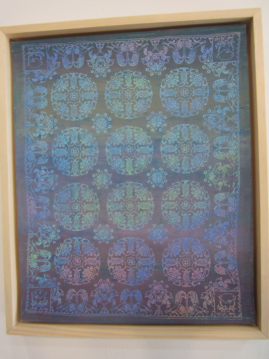
this was indeed, as Levi told me, a pastel transfer he had made, and re-colored !! of an early 19th century American hand-embroidered coverlet.
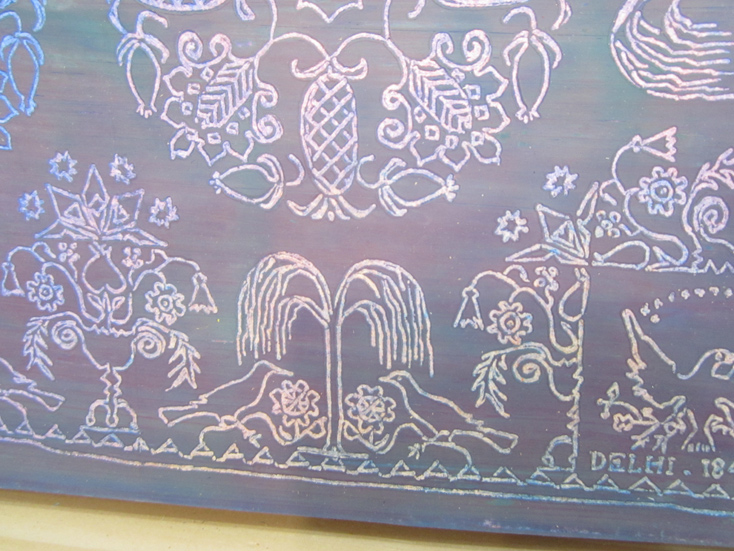
the most striking detail / clue which immediately gave away its origins, was that the corner blocks at the very top and bottom edge of the borders – were inverted. the right side block reads correctly, look at the eagle – while the left side images were like . . reversed stencils.
and that’s – that’s just what they were.
early American folk artists, esp quilters, or in this case a coverlet embroidery mistress – were very aware of ‘hubris’. one can take pride in one’s handiwork, but not too much.
PRIDE COMES BEFORE THE FALL.
even the very skilled . . must bow humble in the presence of the larger maker of the Universe, God. the father of all. the Puritans, the Colonists, onto the Amish, etc – retained this respect and reverence by deliberately making a ‘mistake’ in their patterns – it was their way of stating and reminding all who viewed their work – that man was not perfect, or alone. that there was a higher power. religious expression / experience was the center of their life experience as they lived it, in all ways and being.
you’ll also note, the maker’s initials, ‘E.E.’ – are stitched into the bottom left border ‘hubris’ inverted pattern block. ‘E.E.’ whoever she was, though proud enough of her work to ‘sign it’ was well aware that . . tis better to be humble in the face of God, and the greater universe / creation. she was happy to have made this piece, and to put her name, her initials on it – but she brought her ‘respectful’ world view to the process.
the stencil block ‘inversion’ or ‘mistake’ – that is, a deliberate skip in the pattern, has roots in all handiwork, but esp weaving, going all way back – in all cultures through-out the world, where a small slip in concentration, that one could not go back and fix – did not ruin the piece – but was said to be placed there – by the very hand of God. a mistake was a sign of God. and that we are only human. so a work with a mistake came to be seen as very special, blessed, as opposed to driving the weavers to endless frustration. as there is always a slip of the hand.
HUBRIS . . is a very interesting concept, esp for governments as a whole, to ponder.
as concerns military superiority supposedly based on advanced technology.
as in advanced / sophisticated American & European medical superiority vs ‘backwards’ Africa and a tiny little virus running rampant in the age of globalization.
yep, all ‘quilters’ and hand-stitchers, (just like bloggers in some big sense too), contemplate their world, as they stitch away those endless hours.

although the work says ‘DELHI’ (1847) in the right-hand bottom block, that might NOT be the local/place of origin, though it well could be .. but it also likely refers to the coverlet’s ‘format pattern’ which was derived from: Jacquard all-over pattern – repeating . . weaving.
apparently back in the day, the early 1800s – a skilled Scottish JACQUARD weaver settled in DELHI, NY.
this pattern is based on Jacquard over-all effects.
see: DELHI
though, changing the colors of the coverlet as LEVI HASKE has done, makes a . . very big big difference. in the content, re a contemporary art piece vs. the original. and in fact, even in real time / technical / digital formats. if you try to google-image the work – you see that google-image is solely based on color !! and you can get no further historically, than to pull up other images with the same ombre shades of blue !!
google-image is not subject matter – oriented. damn. and hard to believe.
the exact historical nature of this quilt is therefore not ‘fingertip’ easy to find, and – as well by changing the original colors, which would have been key to its meaning, Levi has transformed it.
for example, red and green would signify a Christmas quilt, etc. etc. pink is for (marital) engagement, yellow for happy and sunny . . red is sometimes a signifier for: danger.
just looking at the coverlet, and being influenced by the way it’s color scheme is ‘leaning’ now, which might be deceiving, but still . . I would take a leap of faith and imagine this quilt might be a ‘death’ or ‘bereavement’ coverlet. witness the somber tree of life, witness the somberness of the pattern as a whole. perhaps those birds, unlike the eagles in the end blocks – are crows or ravens, early folk art symbols of earthly ties to the dead.
see: CROW POEM

but at the end, there is renewal.
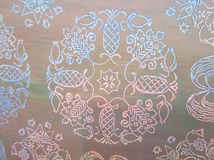
the pineapple stands for hospitality, and thus . . rooted in home, and family – the circle of life, goes on.
just like the seasons. let the circle be unbroken.
hubris, death and the eternal circle . . the tree of life. I’m on it.
folk art.
count me – in.
it struck me as as very ironic – how a visit to see cutting edge new work in Greenpoint – esp of a very abstract nature – had brought me back to my – quilt-maker ways.
something about a pineapple (open studios – !!) and . . the circle of life.
and I do mean circle of life,
quilting, and all.
PHOTOS: NANCY SMITH. OCT 5, 2014
~LEVI HASKE . . GREENPOINT OPEN STUDIOS |
Posted in The Bomb | By Nancy Smith | October 10th, 2014, 9:44am

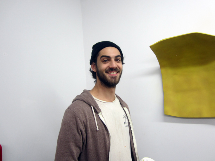
JAENA KWON opens her studio, Greenpoint Open Studio Weekend, OCT 4-5, 2014.

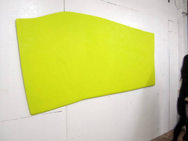
this is the piece behind her. her works are both paintings, and shallow wall sculptures.
the questions she asks, are purely theoretic – the manipulated boundaries, and plasticity games that manipulated mediums i.e. paint and wood – can play, and ultimately warp, and otherwise engage . . spatial dynamics.

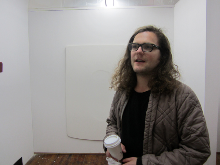
fellow artist and friend, JAMES MILLER drops by – and helps the camera ‘orient’ the manipulation of space, on a more deeply curved wall ‘structure’ by JAENA KWON.

NICHOLAS STEINDORF in front of an all-white, more shallow . . ‘staging’ by JANA KWON.
Nicholas brought me over to meet Jaena, and in that sense he curated this little weekend excursion. a visit with his friend – Levi Haske – is up next.

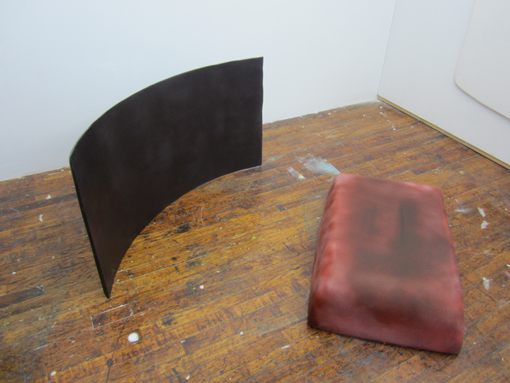
JAENA also had pieces that were more formally ‘sculptures’ in that they stood on the floor and claimed 3-D space.
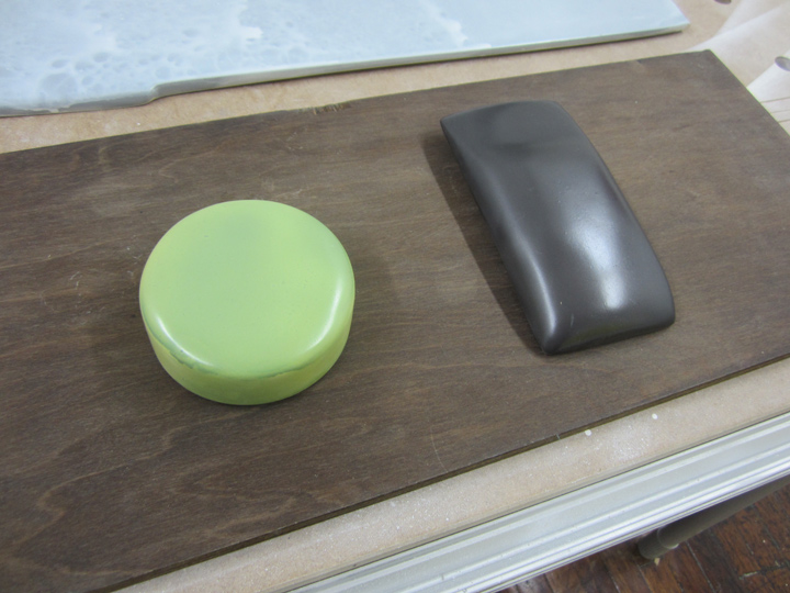
Jaena’s works are based on wooden forms that she first makes, then she paints them in mute tones with acrylic paint, and then she waxes the surface, I think ? and then finally she sands and polish rubs them into a waxy, epoxy-like, almost buttery muted leather surface.
the finished pieces look very worked, and yet not quite what they should be, re: your typical painted surface.
they definitely ‘transform’.

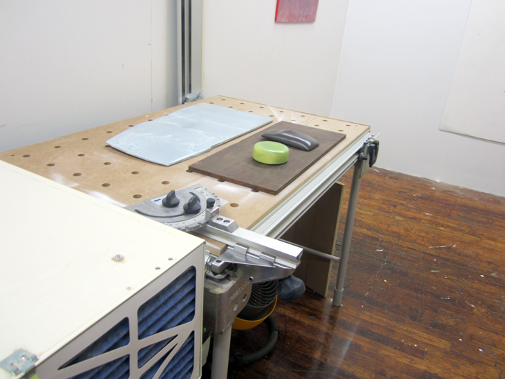
Jaena’s work station.
I (personally) experienced Jaena’s work, and her studio space – as very much as that of an artisan, as well as an artist – at work, in that the resultant work felt so ‘hands-on’ . . and was made so ‘hands-on’. despite the advanced minimalist theory that hung in the room, and I mean that in a good way. it’s my thinking, and most likely, not just mine – – that it’s always good when the sensuality of the materials, and the way they are worked . . overtakes the thoughts & concepts – I mean, isn’t that the point ?
whether it’s the intellectual passion in Nicholas’ work, or the workmanship passion – in Jaena’s.

JAENA KWON, hardly looking like paint and wood – by any means. I almost got the feeling, the metaphor that came to mind, was of a highly accomplished ‘shoe maker’ presenting the most fabulous pair of butter soft custom-made leather boots, that would fit like a glove. I guess the parallel is, these are objects to marvel at, to behold and wonder about . . meditate on.

and despite all the hallowed ‘formalism’ – me being me – I did spot a little bit of other-worldly ‘magic’ – !!
anybody else see those two faces, the ghostly profiles . . on the left.
not sure if that’s deliberate, or just a stage of a work in progress – guess that’s the excitement of being inside a working studio – process, thought, future – all about to take shape.
up close and personal.
PHOTOS: NANCY SMITH. OCT 5, 2014
~JAENA KWON . . GREENPOINT OPEN STUDIOS |
Posted in The Bomb | By Nancy Smith | October 9th, 2014, 12:20pm
UP-DATE: just after I posted this, there was a New York Post newsflash: 2 young boys had just died in Queens, they had fallen victim to a house fire / caused by ‘unattended’ lit candles.
this severely spooked me.
and not only because it’s supposed to be ‘Fire Safety’ week here in NYC, seriously !!
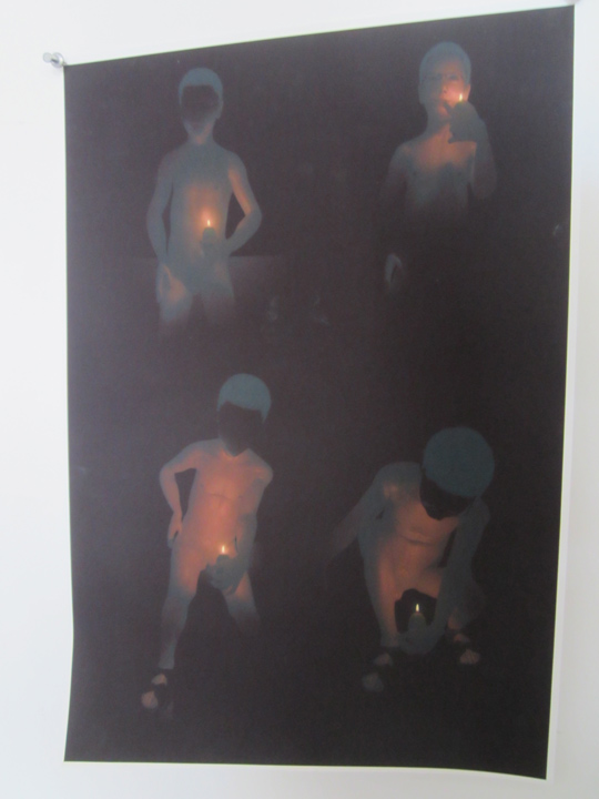
but I had just posted a studio visit with Nicholas . . that featured his digital image of a boy playing with a lit candle !!
with the accompanying words:
“yeah, Nicholas . . go set that house on Fire !! break down the status quo walls.”
!! !! !! !!
GREENPOINT OPEN STUDIOS vs SOTHEBY’S ?!!
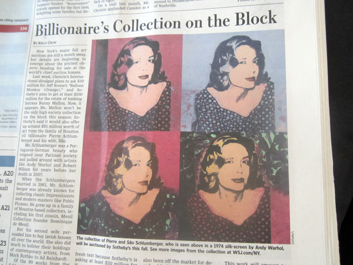
I thought it was a pretty fun coincidence to open the Wall St. Journal the very Monday after I went to Greenpoint, to see this ‘4 square’ screen print by ANDY WARHOL pop up, coming hot on the heels of just catching NICHOLAS STEINDORF’S 4 square digital image of a ‘boy with man head playing with fire’, a lit candle. a lit pipe, in his studio.
and, also in almost the very same color range – bye the way.

NICHOLAS STEINDORF, 4 square composition, digital imagery, approx 13 x 19 in. FALL 2014.
PHOTO: NANCY SMITH

ANDY WARHOL, 1974 – 4 square composition, silk-screen of SAO SCHLUMBRGER . . to be auctioned off by SOTHEBY’S this fall. it has a pre-sale estimate of $2-3 million.
first off:
who the hell paints . . SOCIALITES any more ?
I mean, not even JEFF KOONS does.
don’t mention current affairs either, the biggest fear Andy and his pals had . . was passing out at Studio 54. don’t even bring up . . Ebola & the top-notch Dallas confidence-inspiring hospital ER response, NOT. making news headlines – this week.
hmm, ANDY died from medical incompetence too, during what should have been routine gall bladder surgery.
but Andy loved reading the NEW YORK POST.
it was his favorite read. no doubt, he would have loved this recent headline: SHARPTON LAWYER “HUNG LIKE A CASHEW” – !!
damn, that Warhol was such a modern guy, up on the tabloids – and killed off by medical incompetence.
p.s. it’s interesting to remember Andy’s stats: born in Pittsburgh, Pennsylvania – in 1928, and died in New York City, in 1987. Andy actually died, 59 years old !! – probably just before, or maybe in fact . . just when Nicholas was born !! in Wisconsin.
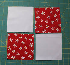
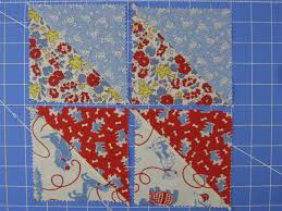
p.s.s. of course, the ‘4-square’ – is a basic quilt pattern, called the ‘4 patch’ – it is essentially, the mother of all quilt invention !!

a basic 4 patch.

and, it just keeps on – evolving !!
~NICHOLAS STEINDORF vs ANDY WARHOL . . / up-date |
Posted in The Bomb | By Nancy Smith | October 8th, 2014, 3:52pm
