~CARAMEL BOBBY aka CALI THORNHILL DEWITT . . ‘ GLOBAL WARNING’ / MUDDGUTS
BIGGEST REGRET of the YEAR ?
that I didn’t make this opening.
def, def def !! gonna try to go by & see the work.
CARAMEL BOBBY / CALI THORNHILL DEWITT – ‘GLOBAL WARNING’ at MUDDGUTS
UP THRU . . FEB 2019.

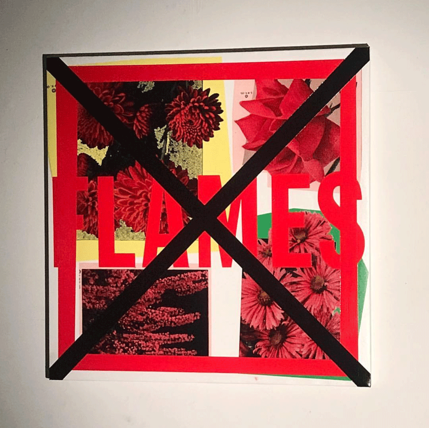
CALI THORNHILL DEWITT, ‘FLAMES’, 2018
3 ft. x 3 ft. / mixed media, paint on canvas. unique.
image via Instagram @caramelbobby
what’s . . .
growing on me about the work, through the posted images – is how it’s so insanely bold, and in-your-face, and yet very subtle as an art form – to process. it’s like the ‘graphics’ button has been pushed – to high alert, and so you get the message, the images are very clear, and assume it’s simple & sort of ‘spiritually’ . . walk away. nice job.
of course, that’s a big, big mistake.
there’s quite a lot of resonance here, both in context & message, & visual punch.
but more, as an artist myself . . it slowly dawned on me, that the surface of this work really doesn’t lie in the clear narrative, ‘collaged’ photographic images, nor even – in the big red “X” . . !!
the surface here . . is in the moment of walking through the wall of fire / an artist, at their height, deep into their work, and so it comes across very blindingly bright for the rest of us, but once that ‘brightness’ of perfection/achievement / serial creative stepping forward, slows down a little, with a little more viewing, the dynamics of the gesture, the organization, the ‘running’ of a finely honed thought / craft & vision . . becomes something that’s hard to put into words, a 4th dimenson – an aura, takes over.
and that’s even more interesting to me, as it rises from such graphic straightforward imagery. & organization.
and yes, I most def, want to jump into . . that – in PERSON !!!!

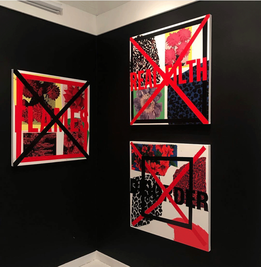
install shot.
image via Instagram @caramelbobby
1. definite quilt overtones.
on many levels, grid organization, story-telling.
communal & community context.
some carry warnings. some carry ‘protection’.
amulets.
my fav is . . ‘FILTH’ / ‘REAL FILTH’.
2. I feel there might be a great conversation here with . . VIRGIL ABLOH !!!!!
3. those black walls, beckon !!
4. def, like the ‘tag’ effect of the ‘cut-out’ images & how they just got ‘placed’ / seemingly by chance / random. they are so askance / yet, the big red “X” is so – centered, and measured.
you def get the feeling, this artist . . .
no matter what the ‘legend’, the ‘history’ / he paid his dues. he’s so superbly on point, and immersed.
and, we all get invited – to the DANCE.
5. the color hues – are . . . off the chart.
