~YO!! ALISON GINGERAS
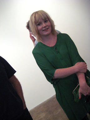
ALISON GINGERAS – at the opening of: ‘Pretty Ugly’ – a big survey show – mostly of last ( . . as in … way last !! ) generation ‘blue-chip’ artists – which she curated. GAVIN BROWN’S enterprise/MACCARONE, JULY 10, 2008.
PHOTO: NANCY SMITH
. . . why does the name JANIS JOPLIN come to mind. maybe because that’s just how tough and happening the art world in New York City really is right now – in terms of the work being made & the work being exhibited. but, as this big, yet basically timid, not to say insipid – group show – shows – if, you ain’t walkin’ the streets – you ain’t catching the beat ??
in other words – the exhibit – is way behind the curve – to be polite – to really be a knock-out presentation – no matter the theme – for New York City. For a show with such a pop-worthy title – there’s actually very little ‘pop’ for the money.
. . . you can sense it right off the bat – in the invite/poster – the image is catchy enuf – or should be !!– but – just falls flat. (first of all – why is it matte. if ever an image needed to be ‘glossy’ – this was it)
Same with the show. Gavin’s half at least proves skankworthy – but the MACCARONE portion is flat and full of too many small paintings, hung horribly – or, at least – to little effect – and, which are actually pretty ugly only because they are mediocre examples of some back-in-the day, old hat – and ultimately boring – wannabes – in terms of the art ‘throw downs’ you can see in New York City, including Brooklyn – on a casual stroll – any old day.
It doesn’t help that the twenty-something crew over at BOBO, out of PHILLY – put on a death match show over at FOXY PRODUCTION – and, seemingly, as easily as if – they were flicking on a light switch.
and, right next door to FOXY, on 27th St – at ATM – you can catch a finely expressed group show of diverse small paintings – more or less the ‘PRETTY UGLY’ format – that shimmers and glows in its !! ugliness – as to bring the words – intensity – and – originality – into play as well. and that’s just the atm summer knock-off show !! no big deal.
Yo. what’s PRETTY UGLY – as in: s-c-a-r-y !! is that such a big name curator comes up so empty-handed. and in New York City no less.
That Ms. Gingeras is the ‘personal’ curator for one of the world’s biggest art collectors – FRANCOIS PINAULT – who owns CHRISTIE’S auction house and therefore overseas a collection of over 3,000 art works – with its own exhibition venue – in Venice – only makes her lack of dynamic forward heat seeking – insight – that more more poignant for the denizens of a truly turbulent churning NYC scene – who wish the hell someone out there – could – wake up !! and be a real, on point – trend setter.
to read about one of Ms. Gingeras’ more successful outings, possibly because:
1. it was – OFF-SHORE – that is presented in a vacuum town where there is absolutely no contemporary art alive, kicking, dancing or biting – in the streets – at all – and that would be VENICE – as opposed to our glorious New York F*cking City – where we don’t import art by the bucketload – dude – we send it out !!
This is New York City – we TIME STAMP our art here. and,
2. URS FISCHER reigned supreme. the one big (NYC) beat – she got right.
see: ‘Pinault & Co’ by BEN DAVIS/artnet/o5/11/07
. . . on the other hand – when you wash up against these artlovers shores – it really is – coming up against – that final barrier reef – its live or, die – and maybe, sometimes we get a little too tough. if you stop, and look around at the rest of the art world offerings, this summer – and esp. the pathetic mainstream media coverage – you have to give her credit – for at least !! – putting on a show – where, in the words of one gallery-goer, overheard at the opening, said: “I have to go back – there’s a lot to see.” – if you don’t take it too seriously, need a wishy washy history lesson, and aren’t looking for cutting edge statements.
so, hey if you just wanna have fun – after all this is the summer – this is kinda like the CYNDI LAUPER vs JANIS JOPLIN show. you know – girls just wanna have fun – well, then its an almost good enough summer beach read – esp. if you aren’t – working – too hard, on cruising through the art scene – yourself . .
well, maybe the best that can be said is: maybe this guest curator sojourn in New York – will expose you to some new stuff. lets hope so. this show definitely veers towards out-of-touch & under-inspired. no rocking the boat here – it’s a pretty lame – PRETTY UGLY – underwhelming production.
that being said. it was worth the whole show’s price of admission – JUST !! – to get to see a f-a-b-u-l-o-u-s – ROB PRUITT – SEQUIN-LIKE WALL PIECE – ‘Prince William Sound’ – an early piece from 1989. the one spark of fast lane fabulosity in the entire show !!
that piece – a – PEACOCK FEATHER WALL PIECE by CAROL BOVE – and a SCOTT REEDER PAINTING – !! – and, ok. the BRUCE LaBRUCE photo of JEFF KOONS giving head – these 4 being – the only truly cutting edge – pieces – in the entire 2 gallery spread. pretty ugly …. or, what. and, o.k maybe that IMMENDORFF, too. just cause its green.
PIX OF THESE WORKS, and A FEW OTHERS & PHOTOS FROM THE OPENING – WHICH WAS PRETTY HOT – I GUESS CAUSE OF HER CONNECTIONS – POST: TUES JULY 28 – 10 am.
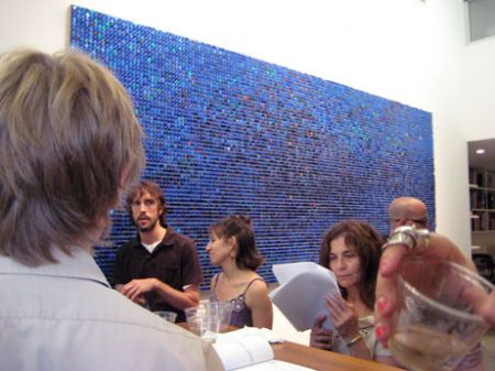
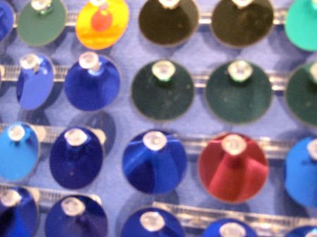
ROB PRUITT, ‘ Prince William Sound, 1989’, 2008.
plastic reflecto lights and enamel on board. 64 x 160 ins.
found in the Gavin Brown enterprise part of the show.
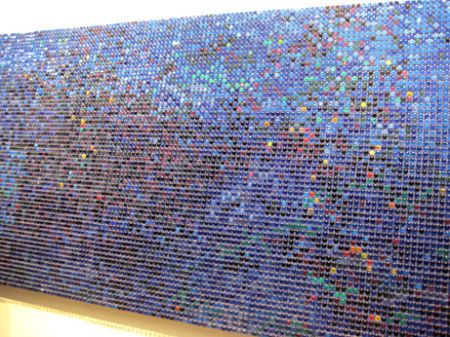

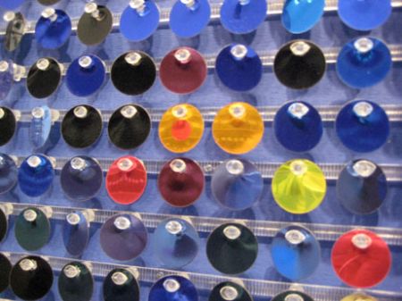
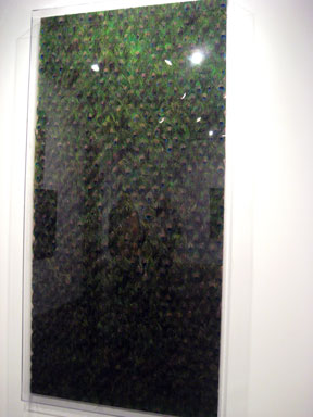
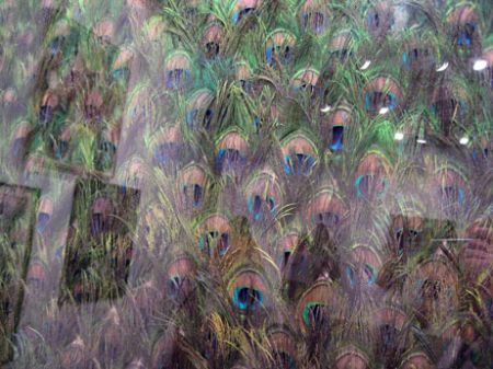
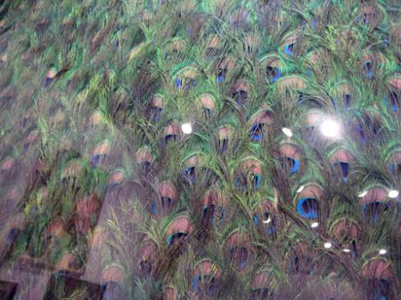
CAROL BOVE. wall piece with peacock feathers. enclosed in what seems to be a plexiglas shallow depth ‘frame’ box. in the MACCARONE GALLERY – section of the show.
PHOTOS: NANCY SMITH
further, re: ROB PRUITT and CAROL BOVE – within just this most narrow of subtexts, the show at hand – ‘PRETTY UGLY’ – curated by ALISON GINGERAS – it was interesting to note the differences between these 2 pieces – so similar in essential format – (i.e. over-all use of repeating real, non-art world materials – absolutely abstract, large scale, wall mounted, etc etc). The most telling difference – being the use of a plexiglas box ‘frame’ to enclose the Carol Bove. Not only did it prevent one from getting clean clear photos – but it prevented a true in-depth experience of the piece itself. The CAROL BOVE plexiglas box – cut off a kind of autistic, tactile appreciation of the peacock feathers, completely. what’s the point using them, then?
say, what !! – what I mean is: Although both pieces were made of many repeating rows of small units, one of feathers; one of ‘reflecto lights’ – (they looked more like classic sequins, but anyways) – while you could stand and watch transfixed for hours, the shimmery dance of the many colored sequins of the Rob Pruitt piece – wavering and shifting, and glittering out different light patterns – through their exposure to the gallery’s gentle air currents – esp. at the packed opening !! the plexiglas box around the Bove piece prevented any similar tactile motion – from the rows of almost equally shimmery and luminescent – peacock feathers. which presumably, if set free to the open air – would equally shimmer and dance – endlessly, offering up a (now) missing dimension of magic, wonder, and delight .. to me that qualified Carol’s piece as – truly PRETTY UGLY-IER, than Rob’s – because it was imprisoned. it’s a real time example of what artists, who work with fragile materials, have to do – to make their work – collector friendly, and low maintenance – pop ’em into a shallow plastic box frame. come on !! – at least for the opening – or – the short life span of a summer – exhibit – set those peacock feathers – free !!
‘PRETTY UGLY’ – CURATED BY ALISON GINGERAS
JULY 10 – AUGUST 29, 2008
GAVIN BROWN’S enterprise and MACCARONE
GREENWICH ST at LEROY in the WEST VILLAGE – NYC
see: the OPENING PIX !! – ‘PRETTY UGLY’ – now posted/2008-07-28
