~STEFAN SAGMEISTER/WE WORK IN PUBLIC
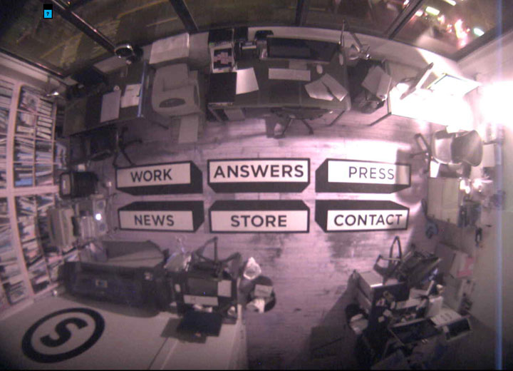
the homepage for influential designer STEFAN SAGMEISTER’S New York City office – is a real time webcam scan from above. the decal stickers on the floor, CONTACT, PRESS, STORE etc – are working links to further info. this format took effect sometime around December 14, 2010.
I guess I should go back and screen grab it – during the day with the employees at work – !! but there is something wicked and stealthy about checking in – at night !!
before the webcam set-up – it was a really cool, but very different, abstract – full screen multicolored vertical stripe pattern.
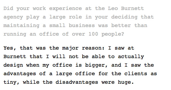
UNDER: ‘ANSWERS’ . . . .
. . . a very succinct and typically Sagmeisterian-crafted, brief but totally illuminating paragraph addressing the new: small is big issue.
though in the art world we’ve always said, at least since the 70s: less is more.
but now, the question seems to be more relevant than ever. because of the largeness of the web.

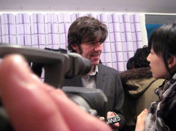
STEFAN SAGMEISTER at the opening of his curious and really unique-thinking, way ahead-of-the-curve one-person show at DEITCH PROJECTS, NYC.
Jan 31, 2008.
PHOTO: NANCY SMITH
see a few more pix: STEFAN SAGMEISTER/OPENING -THINGS I HAVE LEARNED IN MY LIFE SO FAR.
in particular check out that poster.
the title of the show: brilliant. and in typical Sagmeister speak: ‘Things I have Learned In My Life So Far.’
on a shiny metallic gun-metal gray paper – impeccable type font, of course. white.
and a way way beautiful & content-resonating image.
I have plenty more pix from the show on the archives, but alas if you’ve been paying attention – that ALNY (archive) is down . . . down and crashed. aah, the power & the glory, and the potential for wipe-out . . . of the web.
the man-made computer-based web.
just like a spider’s web . . . all at once strong, and far strung-out. functional beyond belief, a natural wonder. but ultimately flimsy and fragile, and just like a spider web. one fell swoop – and it’s down. (non-sagmeisterian speak – it’s hard to do, don’t knock it)
this was a landmark show. it was a show that crossed over big time from graphic design into ‘fine’ art. Sagmeister even put up a huge, wall-sized, traditional quilt pattern – composed entirely of yellow bananas. real ones, that started to decompose and turn black over the course of the show. kinetic graphics – get your head around, that.
so, yeah, ok. Jeffrey put on some good shows. !


