~BLACK ACID CO-OP/PRETTY MUCH DEAD
JONAH FREEMAN – JUSTIN LOWE: BLACK ACID CO-OP
DEITCH PROJECTS / WOOSTER ST.
JULY 2 – AUGUST 15, 2009
SEPT 24, 2009:
sorry for so long in getting this up – but who wants to write about the dead ? esp when a couple of weeks later, Dash Snow really died ?
of drugs. alone. and distressed. for real.
who wants to trash artists, when just being one is already bad enough. but esp when they are friends of your friends. when they’ve done stuff – you’ve really really liked. and were expecting a huge success.
the summer of 2009 was really tough – and – the last thing you needed was to find yourself invited to a party – that you really were left out of ? where the hype was high – but, the hospitality was low.
it was, sadly – the blockbuster that blew it.
though Roberta gave it a nice enough write-up. but I think that was mostly because it was a narrative-friendly type thing. not an art-magic type thing.
she had a nice descriptive take, but not a very cutting edge. I guess what I am trying to say, was you can’t deny there was a lot to look at, and wander through, but bottomline for what supposed to be real knock-out – there was just not enough: wonder. magic. or visual punch.
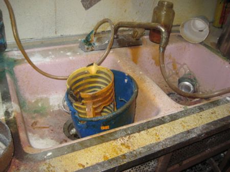
art wise – it was a simply a big production that just didn’t fly. distressed sinks, and all. painted t-shirts and jars. but no real light bulbs. like ? look no further than Michel Gondry’s recent Deitch exhibit, ‘Be Kind, Re-wind’. a brilliant set construction, a brilliant ‘construct’, as in idea . . even DAN COLEN and DASH SNOW’S ‘NEST’, also at Deitch – and a very simple deconstruct – killed this one, hands down. actually all the woodiness of Black Acid Co-Op brought to mind the URS FISCHER installation, of a few years back – his Bird House made of bread, at GBE – which if placed side by side in time and space – with Black Acid Co-Op could have taken this whole month-long multi-construction down – with one dough-y arrow.
even the opening night party – that wasn’t – was a bust. this was the kind of scene that yelled for an all out open bash – instead it was a hush hush private dinner only for the chosen few. no beer, and everybody else who made it there on the opening night, through buckets of pouring rain – was left feeling like losers. and too bad, because NYC was open to embrace the guys whose METH LAB had put the MARPA BALLROOM on the map – and had blown everybody away – at ELEANOR CAYRE’S MIAMI STATION, ART BASEL DEC 2008.
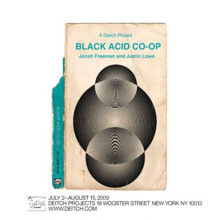
even Jeffrey is scaling back on the cards and posters. there were none. but this was the email invite.
actually pretty cool. but the change of name – from some variation of METH LAB – and the underscoring of the DEITCH PROJECT BRAND – might have been a bad sign, of things going south in the north.
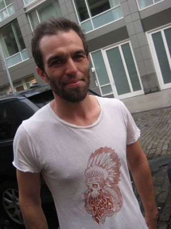
JUSTIN LOWE
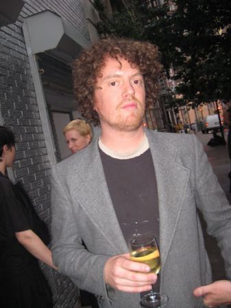
JONAH FREEMAN
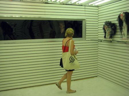
unfortunately the first room in the labyrinth – looked like a Holiday Inn bland – exam room. I hated it.
even with the see-thru window.
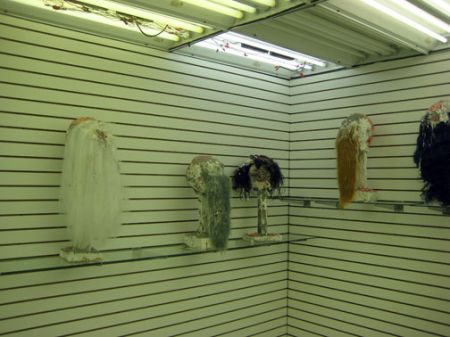
this room was blaringly white with crazy lighting that messed up the pix. I also hated it too. I can’t remember ever hating something so much before. that’s pretty bad. and those wigs. it wouldn’t have made it past a high school art class.
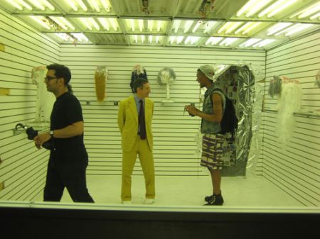
it was funny to watch the captain of the ship, JEFFREY DEITCH, in a room I hated.
. . . well, they designed a room to be spied upon, not I.
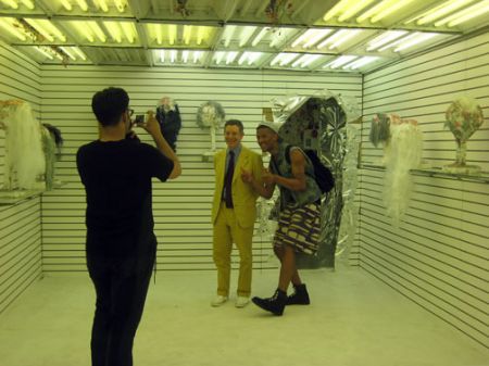
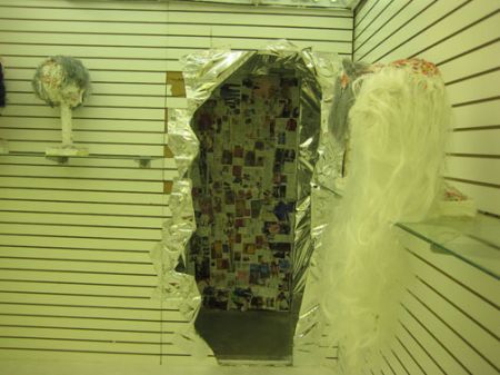
all the rooms had break away exits into other rooms or hallways. or dead ends. the newspaper collages are not very inspired.
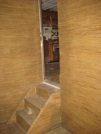
this doorway to nowhere – was a little more – impressive.
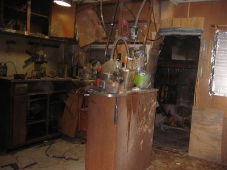
the meth lab – still the best part. totally awesome.
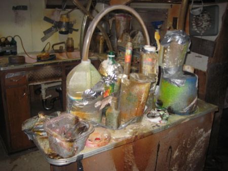
if you followed ALEXANDRE SINGH’S work, who had been a partner in the earliest METH LAB days – you might think he had a hand, esp in the empty soda bottles. he had done a few big sculptures using empty soda bottles in NYC. like at White Columns a way back.
of course if you were lucky enough to catch JUSTIN LOWE’S ‘HELTER SWELTER’, (see: HELTER SWELTER/scroll down !!) at OLIVER KAMM’S GALLERY, way back in the heady days of 27th Street, SUMMER 2006 – you might wonder – what went wrong, this time. ‘HELTER SWELTER’ was not only a brilliant re-creation, minutely detailed, of a NYC bodega in the small entryway of the gallery, but it opened up into an amazing communal and totally off-the-wall open space, where gallery goers could sit in a dark space on hand knit rugs !! and they did !! – and this ’empty’ space actually took up most of the remaining the bulk of the gallery – behind the magic school bus. guess you had to be there. esp opening night. believe me, that was some party. but, even then, it was almost as if Mr. Lowe’s ambitious intentions over-shot the small gallery and aimed (sorrowfully) for a big-time DEITCH BLOW-OUT. How sad but true, sometimes you have to watch out – for what you wish for. and although the bodega and the school bus were a re-creationist’s dream – again the contrast between the highly detailed storefront entrance and the bus – against the empty inner room – was the dynamic that made the whole – take off. that gave the painstaking re-creations – heart and soul. took it one big step up – into legendary. they for sure could have used something along these lines in Black Acid Co-Op Summer 2009. the minute detail amidst the spatial ‘construct’ was what blew the ‘HELTER SWELTER’ out of the water. it was the contrast between the highly involved ‘sets’ and the mysterious, cave-like people space that made magic. there were even seats to sit on, on the magic school bus !!
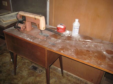
totally love love this scenario. they should have just had the whole place empty and then, the METH LAB.
or created like a faux trailer trash park diorama around it. with lots of cheap folding garden chairs to sit on, and a few strings of desolate XMAS lights. and then with all the money they would have saved – they could have thrown a huge bash all month long. with lots of free beer and red wine, and BBQ !! quelle vie.
brilliant, or what.
I think they got it all wrong. was it the Deitch input ? instead of filling the whole place with so much other (and for the most part dead !! noise) all around it – they should have done the complete opposite. taken a cue from ‘HELTER SWELTER’ and made it: void. and METH LAB. or party and METH LAB.
I didn’t see the Marfa METH LAB, or see enough pix or buzz – but I think the big success and impact of the METH LAB, in Miami, must have been that it was done the stairs, in the basement, of this gorgeous brand new hi tech hi rise tower !! must have made it feel even more, like a clandestine Meth Lab, for real !! and, of course apart from all the raves about the cutting edge art – all you hear about the MIAMI STATION – was what a great party ELEANOR CARYE threw – so voila. there you have it. METH LAB in play, artists at work, vs. Black Acid Co-Op – totally co-opted.
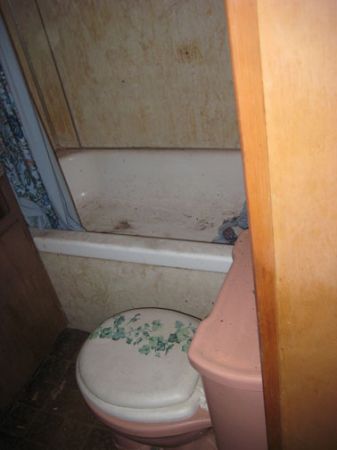
Roberta loved this part, too.
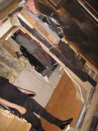
but then you had to leave the METH LAB .. and it was all pretty much, downhill.
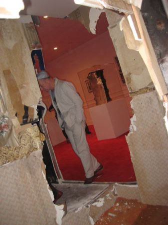
oh oh another room – I really hated.
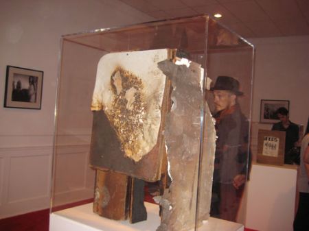
it was like they had to have small pieces – to move. to sell.
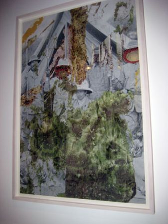
and it was pretty desperate going.
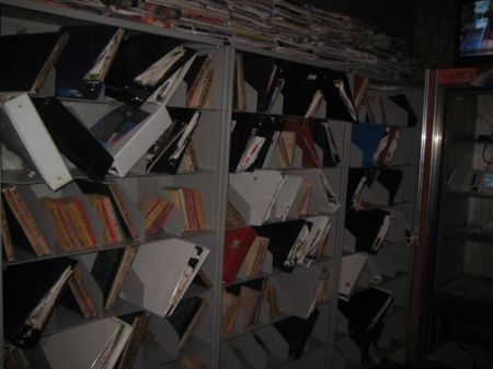
the next room was even more tedious.
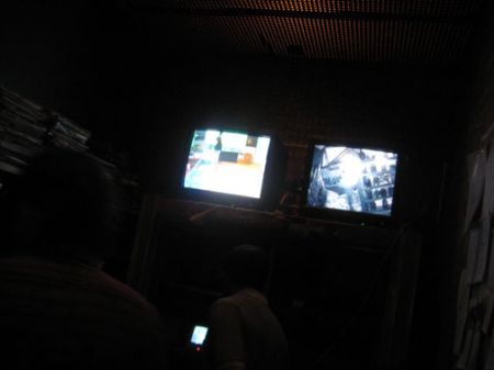
there was some half-hearted attempt with real-time camera surveillance – and, these were the only 2 monitors.
myself, having lived through the surveillance juggernaut that was JOSH HARRIS, ‘QUIET’ and ‘WE LIVE IN PUBLIC’ – I could only gasp – with shock – at the missed opportunity, to say the least.
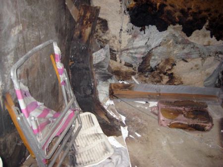
well, this scene – was what it all should have been like, around the METH LAB !!
I was wondering where I had gotten that image of a folding garden beach chair.
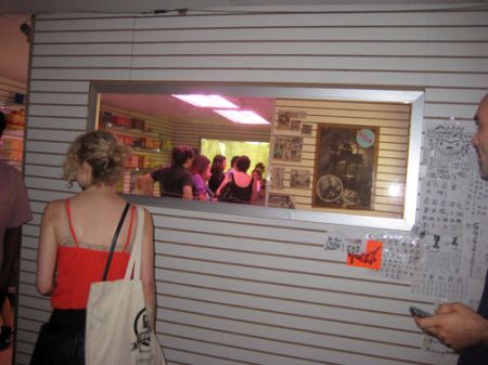
you know at some point you came across a Chinese herb shop.
but I still hate that cold long oblong window type structure used again. so blah. what kind of entrance way is that for an herb shop.
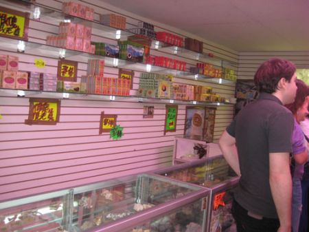
it was like a great idea, but poorly conceived. like they didn’t have enough time or money to do it right.
and the lead-up, was all wrong. just a waste of a good idea. it became distracting. strenuous to keep turning into mind-eating replicas.
like so what. give me the METH LAB.
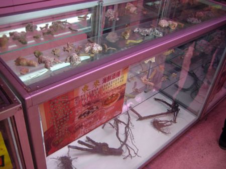
ok. but save it for another time, another exhibit, another year.
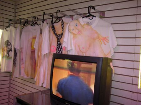
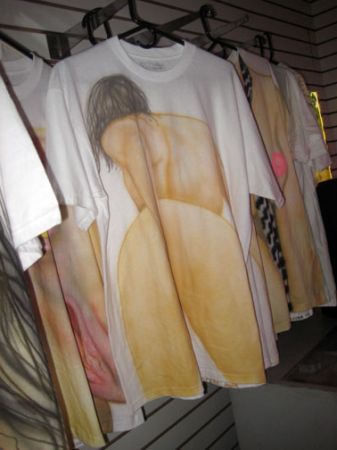
though there were some hand painted t-shirts down here, that were to die for !!


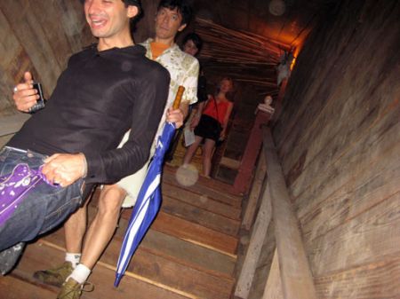
of course, there was a tour de resistance at the top of the stairs.
these guys tried their best to out-do – all past DEITCH PROJECT ghosts.
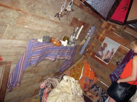
you know I love all things cowboy and Indian – but this just didn’t take off – for me. it just seemed tedious.
more me me me. they shoulda just hung some real quilts.
it made me cry for the days of the CLARE ROJAS exhibit. if you saw it, you know what I mean.
look it up in the Deitch archives.
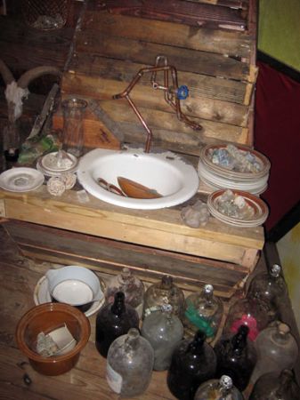
these guys should stick to sinks. they do the best sinks, ever.
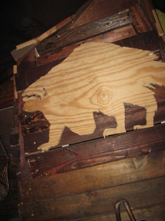
ok. but so what when the day is come and gone.
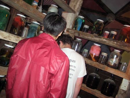
and yes, the shelves were good. but missed out in the – whole treatment, the whole show gone awry.
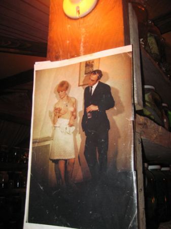
an interesting detail.
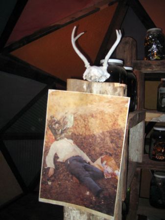
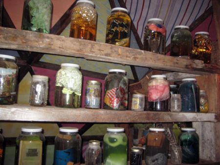
ok. awesome.
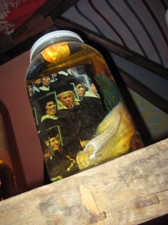
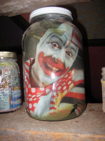
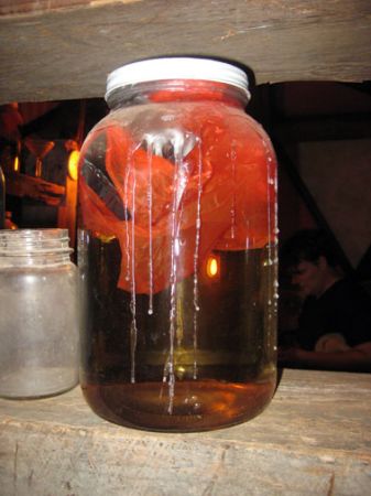
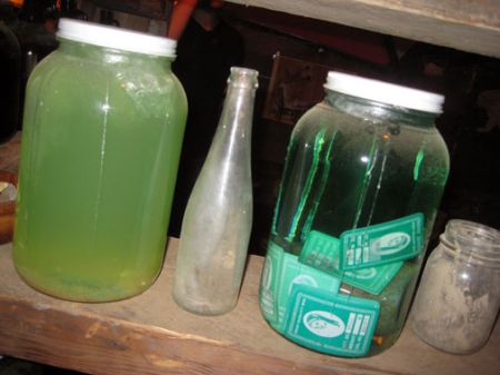
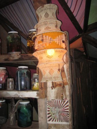
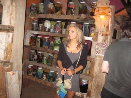
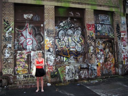
outside on the street, reality mirrored the distressed re-creation, but for real.
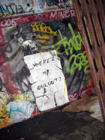
the sign says: where’s my bail out ?
PHOTOS: NANCY SMITH
FROM THE HOME PAGE – THURS JULY 2, 2009:
to-nite – an opening at DEITCH PROJECTS on WOOSTER. Jeffrey D is probably gonna wipe the summer must-see block-buster spotlight – right out from under Gavin — with the opening of his, Jeffrey’s, brand new NYC version of the JONAH FREEMAN & JUSTIN LOWE – ELEANOR CAYRE/MIAMI STATION hit – ‘HELLO METH LAB’ – resurrected here as ‘BLACK ACID CO-OP’ !! bet both openings will be huge mega-crush – events.
WRONG !!
Gavin’s was a huge party. Jeffrey’s was a dud.
turned out the Black Acid Co-Op opening wasn’t really a public opening. though if you braved the pouring rain, you could get in with the invited guests ? which was alright if you didn’t mind feeling like a loser, since it was a close quartered maze – that was much better navigated with lots of space. as opposed to crowds. the dense & detailed installation covered every inch, literally, of the gallery space.
that alone was awesome, I guess.
I heard it took the 2 artists, JUSTIN LOWE and JONAH FREEMAN, with 10 full time interns, a whole month of 24/7 to complete. but overall, it was uneven and it didn’t look they had had enough time to sit back and get it – 100%. it was uneven. there were some amazing parts, there were some static parts, and there were some dead zones. put it this way: it lacked the fire power to catch your imagination and run with it – of the recent MICHELl GONDRY installation, created on a lot less labor and parts. and though one had to marvel at how hard these BLACK ACID CO-OP artists had worked to create their best, finely detailed grimy environs, is that an end to itself ? though I did love the METH LAB kitchen. it was great to see it up close and personal.
but the experience became unrelenting. deadening your senses to what lay around the corner of the many twist and turns. in fact the whole show became a kind of JEFFREY DEITCH vs. GAVIN BROWN … enterprise … in my head. whereas Gavin provided a huge welcome-all BBQ, and all the beer you could drink – with picnic tables, and even overhead tents on the sidewalk in case of rain, hard core art fans who made it through Friday’s super heavy rains the night of the Deitch opening found naught to greet them, except the spectacle of the unsocial and uptight Deitch ‘leader’ in his yellow linen suit, reveling in his usual self-congratulatory state, amidst the smug uncoolness of the disproportionate number of ‘insiders’ – who made sure to tell you – they were waiting around for the private afterparty !! It left a bad taste – to what should have been a huge street bash.
only made the more pathetic – by the spectacle of the dude who was handing out about 2 dozen homemade chocolate cupcakes he had brought along to disperse in honor of his girlfriend’s birthday !! if that didn’t capture the irony of the moment – and so poetically, I don’t know what could.
yeah, I had been really looking forward to seeing what those 2 METH LAB dudes were all about, but DUDES – if you are going to have a party – have a party !! better to have deleted just one of those grimy re-creation dead-end corners, and at least budgeted for some beer.
maybe even – a few stacks of your own cupcakes ??
and as the night progressed with very little flair or fun, I found myself wishing it had come off with just a little more inspiration – and a lot less detail. It ultimately devolved into such an unrelenting – look at me me me me. it took real no new leaps of imagination. for NYC, anyways. I hated the white room, the white paneled entranceways. the bookcase-surveillance room was totally underserved and unawesome. I dunno, maybe some old time deck chairs strewn about for people to sit on and to let them watch the comings and goings – would have made it more accessible, and strange. not to mention less stifling. physically and intellectually. after awhile it got to be so – so what … o-v-e-r-l-o-a-d. which was too bad. maybe it just needed some more old time – art !!
come on, you can take 2 steps directly out the gallery’s front door, and across the street – are the same dirty corners, except, for real.
BLACK ACID CO-OP, for all its good intentions, hard labor, and parts – was just one big conceptual grind. an overbearing hype job, that had left its initial party – way behind.
