~APPROPRIATION GLUT !! RIGHT ON !!/NOLAN SIMON

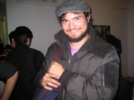
NOLAN SIMON, attends the DANIEL REICH SOIREE for SEAN RASPET, at the CHELSEA HOTEL, MARCH 7, 2008
PHOTO: NANCY SMITH
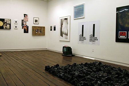
NOLAN SIMON actually has work in the JOHN CONNELLY PRESENTS exhibit – ‘A New High In Getting Low’ profiled in the previous post.

NOLAN SIMON’S 2 pieces are in the center towards the left. One, titled, ‘2001, Hatred of Capitalism, Dating Handbook’, 2008 – comprises of the two posters on the wall – with each portraying one black twin tower. The other piece is directly underneath, on the floor – a DVD Monitor (looks like a TV), with a DVD and a wool blanket, titled, ‘Leviathan’ 2008. ‘A New High In Getting Low’/INSTALLATION PHOTO COURTESY: JOHN CONNELLY PRESENTS
We caught up with Nolan Simon at the DANIEL REICH/Chelsea Hotel event this past Friday evening, and we had an interesting talk with him and a few of his friends. The NEW YORK TIMES Review of the JCP show – ‘A New High In Getting Low’ – had just come out that day, and they all seemed to be seriously buzzed about one phrase in the KAREN ROSENBERG review . . .
“A few paintings stand out from the glut of appropriation, assemblage and mixed media-works.”
They thought that, that was pretty funny – and pretty dead wrong !!! if not completely laughable – totally missing the point of the show & therefore completely alienating a big ‘drift’ among a certain – very intense group of serious young art makers – usually with serious graduate degrees under their belts, and serious intellectual artistic aspirations in their heads. .
(and usually dressed all in black, or at least in a serious young professional clean-cut sort-of-tailoring attire – with a very cool demeanor and style – but definitely not “too cool for school” – we’re not naming names here !!) Just very intense, very intellectual, usually thematically driven.
(as opposed to, let’s say for the sake of brevity and our international audience – the other art ‘camp’ – favoring dramatic or handmade costume/attire – someone like a JOE GRILLO (DEARRAINDROP) or a BRIAN CHIPPENDALE – equally intense, equally serious, and accomplished – but much more colorful in dress and personality. simple rule of thumb: artists that don’t appropriate – and generate original creative visual art favor expressive clothing with handmade accents – serious young creative visual thinkers – that do favor appropriation – seem to wear all black. the 2 groups are like polar opposites – water and oil – and, they never ever cross-over – someone should curate a show: 50-50 !! along the lines of Gavin Brown’s famous ‘Stoners vs.
Chuggers’ or whatever it was called – except it would have to called something more like: Right Hand Side of the Brain vs. Left Hand Side – / – hippies vs. hipsters !! that centuries old yin yang concept seems pretty durable – even today – in cutting edge NYC.
but yo! – this is New York Fu*king City – and that’s what makes this the hugest & most dynamic art center – in the world – that it is so huge and so diverse and wave after wave of young artists from different generations, even within the same schools – (JOE GRILLO & BRIAN CHIPPENNDALE both sprung from RISD – as did, SEAN RASPET) – land here and want to tear up the town and make it their own. A generation can be defined by single year here in the Big Apple art scene.
anyways, back to the Chelsea hotel – they were having a great laugh at the phrase: “glut of appropriation” – they were like: “right on appropriation – let’s do more !!”, and I have to say in this case I think they are right.
Several reasons come to mind, but I’ll stick to the main issues, as demonstrated in the JCP show.
ONE. these artists always make it very clear that they are appropriating. Unlike RICHARD PRINCE’S full frontal appropriation of – the JIM KRANTZ MARLBORO COWBOY series – they usually present the appropriated images – as a part of a greater whole, of their creative expression. Usually by incorporating the ‘lifted’ cultural images in: A) in a ‘sculpturalized’ format – simple example: SCOTT HUG’S ‘JFK’ (see previous post) or B) as part of a large thematic installation (see SEAN RASPET’S ‘The Ones We Work For’).
NOLA SIMON’S pieces, above, fall kind of within both definitions, sculpturual in terms of ‘posters’ with ‘2 paperback books’ and a monitor on the floor – really a min-installation – within a greater installation – which would be the show itself as a whole – tethered to a thematic discourse (NYC after 9/11).
TWO. well really, maybe you had to be at the opening – thoguh I don’t think so – but the graphic appropriated art, assemblages and mixed media pieces were the heart of the show – and note: without any reliance on text or long written descriptions. They were extremely effective and very very visual, each artist really took appropriation, or mixed media, or assemblage and really made it their own original creative statement. just check out the photos in previous post. I think it was nice the curators included some painting, but they certainly couldn’t have made the show on their own – in the very least. If you want to go see painting – go check out JOE BRADLEY’S paintings in the Biennial.
if you want to see ‘conceptual art’ – from what I’m hearing – even the Biennial is soaked with it – it seems to be pretty mid-level, and laughable – and that’s being polite. The JCP show ‘A New High In Getting Low’ – is the – real deal alternative. smarter and edgier.
two final remarks:
it was interesting to hear Nolan Simon refer to JEFF KOONS’ early work – the appropriated pieces he did – before he started acquiring copyright lawsuits – as his best pieces. but that’s a whole other story – as being a photographer, I’m pretty much behind copyright laws, but being a documentary photographer – crossing the line is hard to define – and what’s more, in this case, I agree with him.
and re: the actual exhibit at hand, SEAN RASPET’S ‘The Generation’ – for some reason – I didn’t feel like taking any photos. the actual images were black and white and not really that noteworthy – the heavy-duty theme, VALERIE SOLANAS’ MANIFESTO – notwithstanding. The best part of the show was how they were arranged with push pins – a little hastily – onto the silver mylar covered walls. a picture would have be worth a thousand words.
