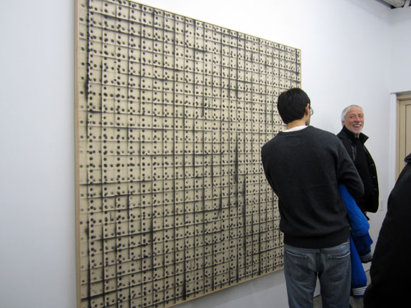
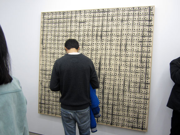
with reference to the GERALD FERGUSON SHOW. esp the off-ochre coloring of the backgrounds and the patterning, or NOT !!
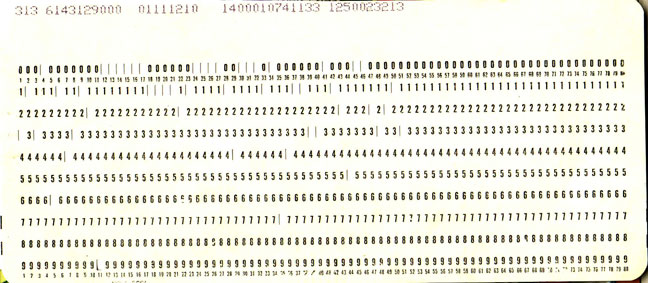
before computers became ‘personal’ . . let alone hand-held !! right up through the 70s – punch cards, like the vintage one below – were the key to entering & working data. i.e. computing.
stacks of these manilla-colored ‘IBM’ or ‘Hollerith’ cards, measuring 7-1/4 x 3-1/4 in. and approx. 2 sheets of typing paper thick – were the early ‘computer programs’.
each card had roughly 80 bytes of capacity. computer nerds walked around with boxes of the things, carefully labelled across the top – in case they fell out of order.
today, state-of-the-art hard drives, (selling for under $100 !!) handle 2 terabytes of info. a terabyte is “2 to the 40th power” or approximately one thousand (1,000) billion bytes !! or 1,000 gigabytes.
that would be a stack of punch cards – longer than the distance from New York to Los Angeles.
p.s. thanks to TEKSERVE for help – with the math. and the history !!

~Vinatge Computing . . punch cards |
Posted in The Bomb | By Nancy Smith | January 11th, 2012, 1:23pm
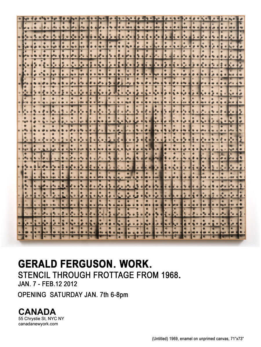
‘GERALD FERGUSON. WORK.’ – ‘STENCIL THROUGH FROTTAGE FROM 1968’
curated by . . . LUKE MURPHY.
opened Sat, Jan 7, 2012
the show runs thru Sunday, Feb 12, 2012
CANADA – 55 CHRYSTIE ST (btwn HESTER & CANAL) – LOWER EAST SIDE

LUKE MURPHY – curated the show and put together a wonderful catalog, poetic and informative . . . including fab fab photos of the works.

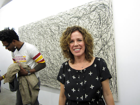
HEATHER FERGUSON, GERALD FERGUSON’S daughter at the opening, standing in front of her dad’s painting . . .
GERALD FERGUSON, ‘1 Mile Clothesline’, 2000. 60 x 108 in.
HEATHER told us that she and her brother Doug, who was also at the opening, grew up and were childhood friends with Luke in Nova Scotia, Canada, and that Luke went on to study with her dad at the Nova Scotia College of Art & Design.

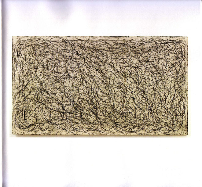
GERALD FERGUSON, ‘1 Mile Clothesline’, 2000, 60 x 108 in. from the catalog . . .
the catalog has top notch reproductions of the works, with particular attention paid to the surface quality and off-colors (esp the backgrounds) of the pieces. image scanned from the catalog.
the lines and shapes of the individual paintings are usually a tone of black – sometimes a sharp pinpoint line black, such as this, sometimes a charcoal derived black. . . . and all these blacks – are printed in a raised metallic shiny impression, while their ochre or unprimed canvas backgrounds . . . which are very true to hue . . . are matte printed on super matte white pages. with the shadows of the paintings usually framed as they hang on walls – to give them subjective stance. very very nice print & photo job.

GERALD FERGUSON, ‘Untitled’, 1969. enamel on unprimed canvas, 71 x 73 in.
this piece was the star of the show – being the image that graces both the cover of the catalog, and the email card – see: post below.
large and impressive – I guess it could generate tons of serious papers and thought. and probably did, and will, and does !!
it is animated by a randomness that is human in scale, and speaks both to code, and – throw of the dice.
in other words: rigid pattern, repeated systems, found transgression, and poetry. whether that’s random poetry, or destiny – well, I guess that depends on your own beliefs . . . as to the human condition !!
. . . and the huge huge universe we try to live in. and the small daily lives – we are constantly, since time immemorial – trying to decipher, control, understand, pre-ordain and basically: de-code.

GERALD FERGUSON, ‘Untitled’, 1969. enamel on unprimed canvas, 71 x 73 in.
talking bout code.
looking back through art history – this art patron stance is only found & readable . . . to contemporary historians !!
with one variable: is that checking out the cellphone date – or sending out a message ?
a nice mesh of art, art theory, and the human dance, or what ?
and, oh yeah – technology !!
repetition – and, sampling !! on demand !! and wireless. not to forget scaled to fit in the palm of your hand.
and oh yeah, social networking !! funny how cold technology merges best with human . . . networking !!
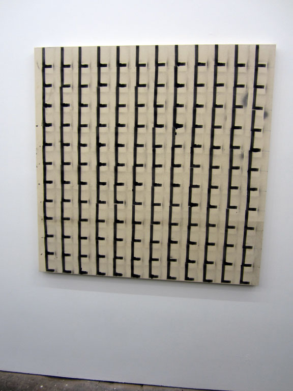
as well not to forget, last but not least – the piece, based on common hardware – looks just so much like a giant early, 1970s, computing data – punch card !! or what ?
same manilla cardboard hue, too. pre-sentient ? coincidence . . ?
or the universal (is it divine – that’s the BIG question) ‘randomness’ that meshes with all mathematical truth ? the signs . . . the pathways – the signifiers – that are there for the taking – if you can only grasp them, i.e. inspiration.
(just saying.)

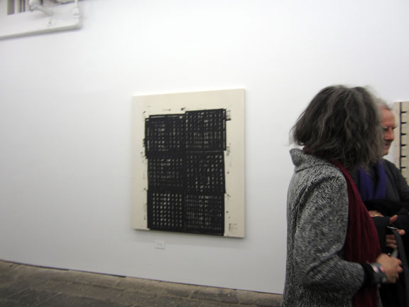
the back room also held out – a few of my faves !!
GERALD FERGUSON, ’18 Drain Covers’ , 2006. enamel on canvas, 62 x 54 in.
obviously a later work – it’s a beautiful example of the simple art of ‘frottage’ or making a rubbing from a specific real object. in pro hands, a simple drain cover – becomes a thing of elegant, almost oriental beauty. a commonplace object – is imbued with formality and distinction.
I guess they have square drain hole covers – in Nova Scotia !!

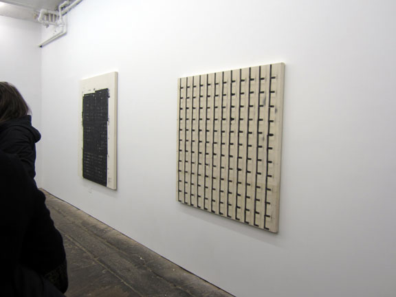
on the wall – you get a better sense of how the pieces – dialoged amongst themselves.

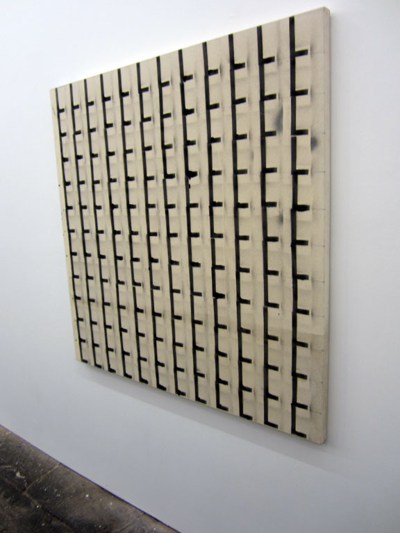
I found this earlier piece so super compelling – because it was so darn hard to photograph. deadpan, NOT !!
Kinetic, YES. and, well – really just lines and straight-on pattern, go figure.
GERALD FERGUSON, ‘L4’, 1968, enamel on canvas. 48 x 48 in.

you know sometimes, sideways – strangely enough, is a good way to go !!
GERALD FERGUSON, ‘L4’.

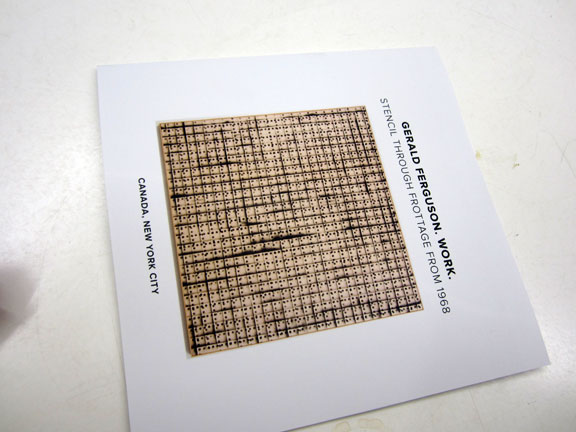
the catalog. it was free for the taking . . . at the opening.
like I said: a totally pro – and poetic undertaking. with pieces and essays by: LAWRENCE WEINER, LUKE MURPHY, DONALD KUSPIT and PEGGY GALE.

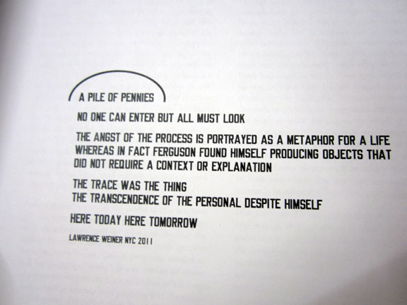
the opening page – a “poem” – by LAWRENCE WEINER . . .
A PILE OF PENNIES
NO ONE CAN ENTER BUT ALL MUST LOOK
THE ANGST OF THE PROCESS IS PORTRAYED AS A METAPHOR FOR LIFE WHEREAS IN FACT FERGUSON FOUND HIMSELF PRODUCING OBJECTS THAT DID NOT REQUIRE A CONTEXT OR EXPLANATION
THE TRACE WAS THE THING
THE TRANSCENDENCE OF THE PERSONAL DESPITE HIMSELF
HERE TODAY HERE TOMORROW
LAWRENCE WEINER NYC 2011

outside on the downtown Chinatown Street, NYC YEAR 2012 . . . talk about black water dragons: AIDAS BAREKIS.
yep, he the very same . . who made the TOXIC ROOM with AARON BREWSTER at QUIET/WE LIVE IN PUBLIC !! NYC YEAR 2000.
“HERE TODAY HERE TOMORROW” – LAWRENCE WEINER !!
PHOTOS: NANCY SMITH, unless otherwise noted.
~PIX from the GERALD FERGUSON OPENING . . . |
Posted in The Bomb | By Nancy Smith | January 10th, 2012, 9:23am

THIS SHOW is curated by LUKE MURPHY who tells us – the exhibit will include some 11 major works by GERALD FERGUSON, and is accompanied by a super interesting catalog – with essays and pieces by – LAWRENCE WEINER, DONALD KUSPIT, and PEGGY GALE.
GERALD FERGUSON, 1937-2009 – was a one-man innovative force field in the conceptual art world. I’m thinking this show is a homage to his own art, as well as to the lasting contribution and influence he had on many a young and aspiring artist – most likely including Luke Murphy himself – over his long, 37 year, and apparently legendary teaching career – at the highly esteemed NOVA SCOTIA COLLEGE of ART and DESIGN (NSCAD).
see you at the opening !!
and HAPPY NEW YEAR – a great artistic – kick-off in what looks to be a super auspicious power year: the notorious 2012 !! from the Mayan calendar on thru the return of Saturn, after a 30 year absence – yo, it’s . . . the dawning of the Age of Aquarius !!
in the Chinese Horoscope, the year 2012 – is the year of the black water dragon !! the dragon a most vivid mythical and powerful creature in many cultures, here it is defined as the ultimate power with his force coming straight from heaven, whose black water attributes mean he “is obligated to do his best for the good of others”. a nice sync with our western celestial god, and planet, Saturn – the god of agriculture (nourishment) and justice – you reap what you sow.
throw the dice, boys . . . . game on !!
for more info: canadanewyork.com
~GERALD FERGUSON OPENING – THIS SAT at CANADA !! |
Posted in The Bomb | By Nancy Smith | January 6th, 2012, 12:56pm

watch: ‘DICE FIELD’ – a random input digital animation by LUKE MURPHY, and check out some his other truly awesome projects while you are there . . LUKE MURPHY / lukelab.com !!
talk about animation that isn’t a line drawing, and isn’t human – though it sure looks human-like, doesn’t it ?
LUKE MURPHY, know as the Rev Luke Murphy – for his design and computing skills, is also the right righteous dude who has kept this low-budget, really no-budget !! indie, really really jerry-rigged site, called artlovers – up and running, and hack free – for many a year.
He’s also an extremely creative and original thinker, did we mention that ?
a big thank you – cool hand Luke !!
p.s. yes !! that is Luke’s random animation ‘banner’ – that runs such a pretty digital animated game – interactive, too !! – at the top of this page !!
~HAPPY NEW YEAR – to LUKE MURPHY !! |
Posted in The Bomb | By Nancy Smith | January 6th, 2012, 12:38pm
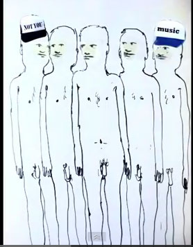
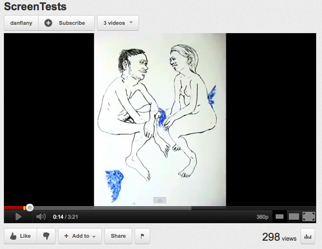
talking about line drawings, esp ones that tell stories, how about this hand drawn animation from DAN FLANAGAN.
crossing the line between cartoon and art – for me the shuffle – comes to rest on the art frontier.
not a bad way – to go forward into the new year !!

NOT YOU !! . . . . . . . . . MUSIC !!

see: DAN FLANAGAN – ‘SCREEN TESTS’ – with music by MERRILL GARBUS, who goes by the band moniker: TUNE YARDS !!
DAN FLANAGAN is a recent grad of the KANSAS CITY ART INSTITUTE. a true blue Mid-west boy who grew up in Madison, Wisconsin he spent 2 years in Indonesia before settling into our rough & tumble Big Apple, and now calls Bushwick home. He works his animation magic on a huge dry erase board in some big ole studio space. hello Brooklyn !!
we meet Dan at the super nifty – yes, clueless, you like awesome, better ? F+V ANDREW GUENTHER ‘Talking to a Fish’ opening – way back – this past Sept 2011.
scroll down, here: just 4 pix and you’ll see Dan – with his 2 equally talented buddies from the Kansas City Art Institute – TRAVIS PRATT and CHRIS BIDDY !!
and while you are there – you can check out one of the most refreshing shows of the past year, too. Andrew Guenther’s ‘Talking to a Fish’ and painting like a minimalist new age heavy metal – seer !!
Andrew Guenther – also he of the “MINE GOLD” inked fingers at the recent, in fact still up !! – ERIK DEN BREEJEN Beach Boy ode to color field letter word mash-up painting show, titled: ‘SMILE’. . . illustrating the entire lyrics to the recently released Beach Boys’ magnum opus, ‘SMILE’.
also at FREIGHT+VOLUME.
and, ok. since you ask – I’ll show you some of Dan’s pals work, soon, too. Travis Pratt takes photos of relentlessly deconstructed landscapes, and Chris Biddy is a hyper hyper-realist who paints small knock-out watercolor, and some oil on canvas, true-to-life and back again, hyper-colorized portraits – from cellphone photos of previously unknown girls who friend him on Facebook . . ring a bell ?
I covered his show at ATM a year or so back.
see: CHRIS BIDDY, ‘New Message’ at ATM, opening Feb 11, 2010.
my, how time do fly bye !!
~HAPPY NEW YEAR – to DAN FLANAGAN !! |
Posted in The Bomb | By Nancy Smith | January 5th, 2012, 5:14pm
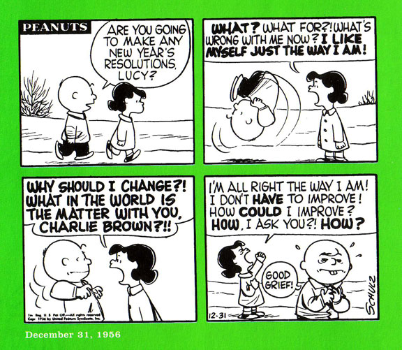
so, what about some vintage PEANUTS !! just don’t ever call me – Lucy !!
will the real CHARLIE BROWN, please stand up !!

PEANUTS – by CHARLES SCHULZ, DECEMBER 31, 1956
from: ‘THE JOY OF A PEANUTS CHRISTMAS’ – ’50 Years of Holiday Comics’.
Hallmark Books, Kansas City, Missouri. 2000.
it’s way fun to pick up an anthology of PEANUTS, and see how Charles Schulz perfected the art of the face that said it all – drop dead deadpan !! – but with fewer and fewer embellishments, over the decades.
CHARLES SCHULZ, 1922-2000. Charles “Sparky” Schultz was born to a barber in Minnesota and “grew up with dreams of writing his own comic strip.” Like many early comic book legends he went to war, he was a veteran of World War II, but was able to come back and pick up the pieces – and get on with the art !! Originally called ‘L’il Folks’ – ‘Little Folks’ and ‘L’il Abner’ already existed – PEANUTS, as it was renamed “much to Schulz’s displeasure” went on to became one of the longest running and most popular comics of all time . . . “it has been published in 21 languages, in more than 2,600 newspapers, and has spawned dozens of books, over 50 television specials and even a Broadway musical.”
~quote sources: Hallmark
~HAPPY NEW YEAR – FROM LUCY !! |
Posted in The Bomb | By Nancy Smith | January 5th, 2012, 6:18am

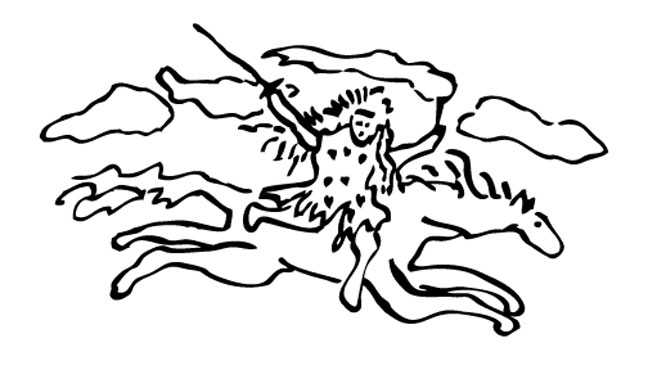
yep, that be Me.
HELLLLLLLLLLO.
even I thought this drawing was dorky – when it first sprang to life on paper – from my imaginative unconscious !!
way back in the late 70’s. yep.
hey it takes 2 turns of Saturn – to make a man wise – so, I’m down with that.
the girl, with the flying mane of wild hair – well, that was me – fierce, and Aries bright – just like a new copper penny.
but funny how the metaphor of the rider, the sword, and the ‘banner’ in her other hand, as in web ‘banner’ – get it ? all add up to the: web.
you know the www internet.
and you know there were no computers back then, or at least none less than room size !! never mind personal web access.
we were happy just have xerox machines !!
that ‘banner’ – it was supposed to be a paint brush. it started life as paint brush – I am a watercolorist by trade – but it turned into a flame, without missing a beat – and from there it evolved into a flying banner.
well I really like that cartoon-like free hand line drawing, now. pardon my french – but its so pre-sentient, or what ?
took more than 30 years – but, hey . . . better late than never.
so, I’m a late bloomer, or . . . . just really really ahead of my time. your pick.
in this case, since I scrawled this as my ‘business’ card logo way way back in the day – I’m going with: really really ahead of my time – and only catching up – because I’m doing the writing !!
if you’re into art history – the non-objective endless lines of AGNES MARTIN – were all the rage 30 years ago, so yeah, they almost flunked me out of my MFA Concordia Montreal – art program – for this. excuse my french blasphemy.
blast-from-the-past . . . Guido Molinari baby . . . be-me !!
yeah, looking back at it now, my drawing, my logo – I love it.
it’s kind of a force of nature. it’s just – the way I was born. excuse my damn gaga french.
and no, I don’t speak french, dude. that’s why I had to seriously split for NYC in 1981.
what I love most about it, besides the paintbrush turning into a flame and then finally coming to rest as a flying banner – just like knights in medieval armies used to joust by – is how the girl isn’t really riding the horse, but flying right at ya. the in-your-face power of the ‘blog’.
and so the really dorky horse, is what ? the web, duh. the internet.
which is also kinda going kinda dorky, as in wonky bye the way. hijacked by corporate commercialism, and looking to be – way bad copyright laws. whatever.
soon we, all us free thinkers, we gonna have to go back to smoke signals . . . oh, yeah.
and I’ll have to re-claim the ‘fire’, as in the flame part – of the ‘banner’. generating smoke signals, get it ?
I’ll have to say: those clouds in the sky ? really giant smoke signals, how pre-sentient !!
even the tiny hearts on the dress – get ? artlovers !! – stood the test of time.
it’s kind of like those TV specials on NOSTRADAMUS. you know, where they say he saw so far into the future . . . he didn’t know how to give ‘names’ to things . . . that did not yet exist !! so he had to use the metaphors at hand. so the burning twin towers of 9-11 were the twin brothers.
I’m still thinking it would be better off without that dorky horse – but hey, I’ll lay claim to some dorkiness. why not ?
and with the web the way it is now, all corporate big business and hacksville for the rest of us – small indie joints – I’d say, it was wise to have left it in. the web: going nowhere fast, and ass backwards.
free web content – not such a good idea after all, was it. looking to be a long term big business conspiracy to keep the original content providers down, and not the least . . . the musicians, unpaid !! though duh, of course . . . . it’s a great catalyst. like the man said: set your mind free. just if we could figure out a way to siphon off just a little loot, or alot more than those damn google ads pay !! – it would be nice. Google, fun stuff. but their web engines wouldn’t be too interesting, without us. now would they.
ok. that’s my new year’s resolution – change the world.
turn google upside down and make that web coin – disperse.
if the readers are to spoiled now – to want to pay for the content – then google should cough up a fraction of a cent for very hit – it would add up, let me tell ya. Reader’s Digest ‘gig’ – all over again.
you know they were like the first ‘modern’ (1922) publishers to figure out the ‘new’ game plan change: charge a lot of people just a few coins – and it’s a work in progress. nickle and dime em. those were happy days.
actually the comics were the better read, still . . . those guys cracked the code.
HAPPY NEW YEAR, EVERYBODY – NANCY !!
WITH MUCH THANKS TO LUKE MURPHY, that’d be the REVEREND LUKE MURPHY to you !! for getting me out of all the endless hacks, and site crashing . . . upgrades. amen.
that’d be LUKE MURPHY’S celestial randomness playing around – at the top of this page. it’s interactive, too. hit it with your mouse.
and thanks too, to TEKSERVE, for keeping me just alive enough, to see another day . . .
P. S. and, yes . . . . . SMOKE SIGNAL, pun intended !!

SMOKE SIGNAL issue #10 – cover art by JOHN SEVERIN, published 2011 by DESERT ISLAND, Brooklyn.
see: SMOKE SIGNAL
~HAPPY NEW YEAR – FROM NANCY SMITH !! |
Posted in The Bomb | By Nancy Smith | January 4th, 2012, 2:02pm
ha ha ha ha . . . .
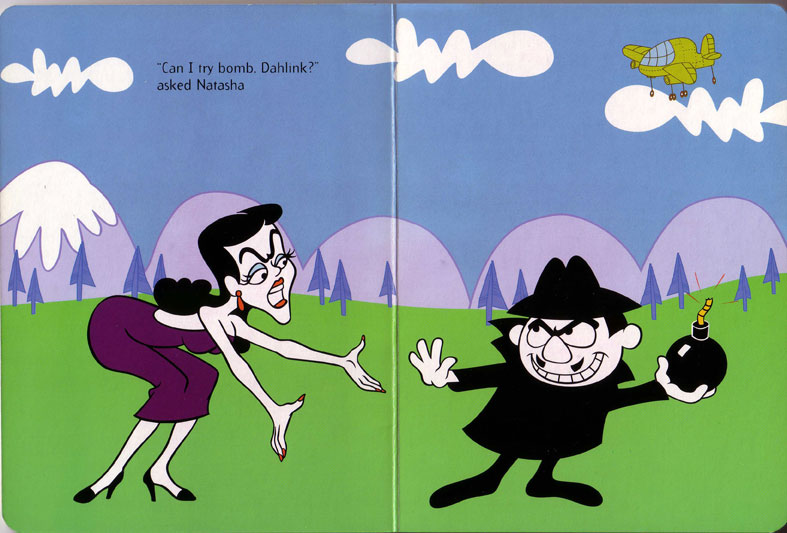
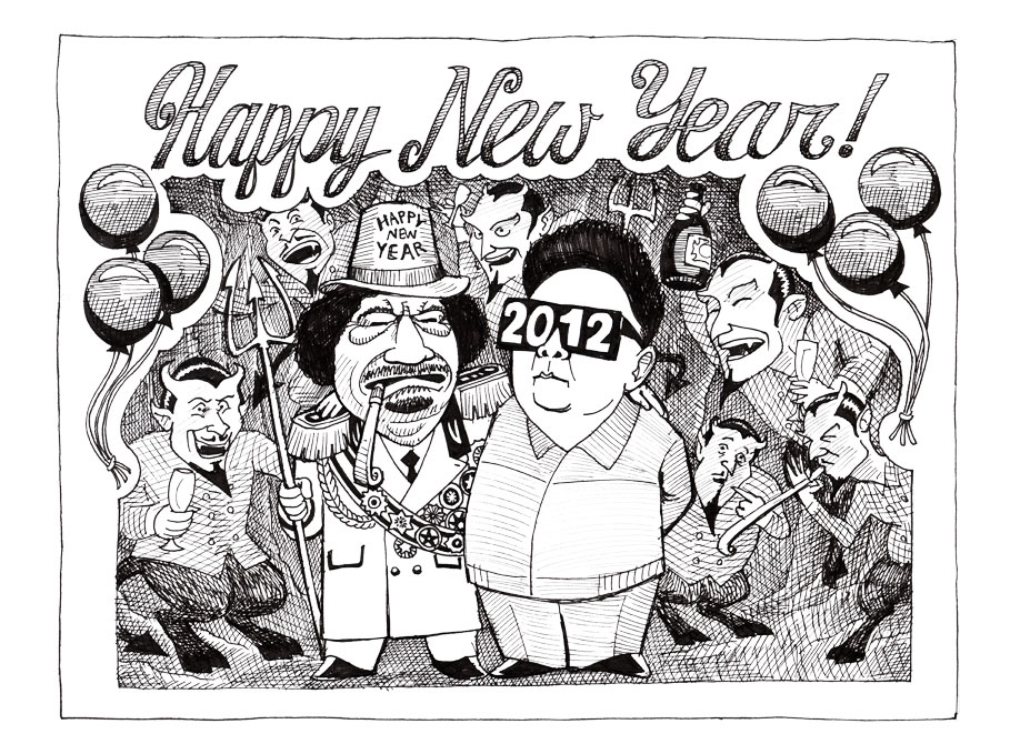
I was wondering what was so, uncannily extra double funny about BORIS RASIN’S – ‘Happy New Year’ 2012 – greeting below . . .
well, it’s got a little teensy tiny bit of R. Crumb in it’s fancy party script – but more than that,ohmibatmangodz !! that’s it, yes !! Holy Batman – that’s got to be BORIS BADENOV – you know from ROCKY & BULLWINKLE – !!- in the caricature style.
esp the Khaddafi dude.
yep, him, BORIS and that loser Khaddafi – got those same heavy, triple lidded eyes !! check it out !!
bet BORIS BADENOV wishes he was brought down by a fan in a NY Yankee cap !!
wouldn’t have been too far fetched – for those c-r-a-z-y ROCKY & BULLWINKLE capers, not at all.
calling on SHERMAN and Mr. PEABODY, too. come back – we need you to change the world. and say, what. bring back: Mr. MAGOO, too !!


images scanned from: ‘The Perfect Plan!’ – an early childhood board book. all of 5 pages, incl the covers !!
the book has no date – but looks to be ca. 1960s ?
‘The Adventures of Rocky and Bullwinkle’ series, published by Ward Productions. licensed by Universal Studios.
The Rocky and Bullwinkle Show ran on TV from 1959-1964.
the series and characters: were created by JAY WARD – quite a colorful guy – himself !!
~HAPPY NEW YEAR to BORIS RASIN – FROM . . . BORIS & NATASHA !! |
Posted in The Bomb | By Nancy Smith | January 3rd, 2012, 4:23pm

HAPPY NEW YEAR !! – FROM BORIS RASIN . . . oh yeah.
~HAPPY NEW YEAR – FROM BORIS RASIN !! |
Posted in The Bomb | By Nancy Smith | January 2nd, 2012, 4:05am

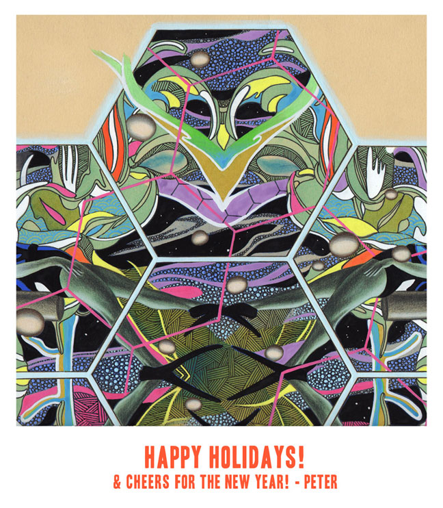
HOLIDAY E-CARD 2012 – by PETER GERAKARIS !!
the image is a small ‘detail’ segment of his larger ‘Aquarium III’ – a work on paper – original size, 15 x 15 in, dated 2011.
nice.
animalistic, ritualistic, comic book graphic, art world graphic, design world graphic, color field rich – and still, totally mysterious !!
see: petergerakaris.com

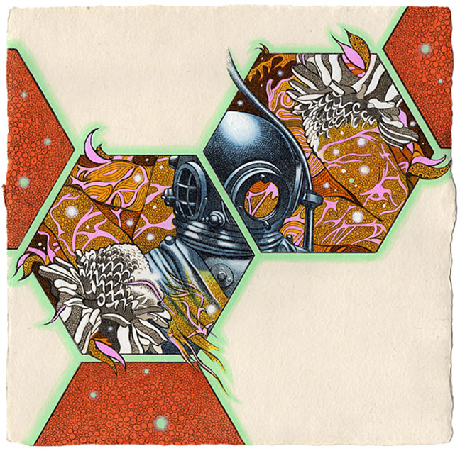
PETER D. GERAKARIS, ‘Aquarium Honeycomb’, 9 x 9 ins., gouache, ink, watercolor & intaglio on Dieu Donne Handmade paper, 2011.
ohmiholybatmangodz . . . I knew there was a comic book lover there. this is the first image on his website,
quelle fun or what !!
we meet PETER GERAKARIS at the recent ERIK DEN BREEJEN, Beach Boy ode of a show, ‘SMILE’ – which is still up at FREIGHT+VOLUME, thru JAN 14, 2012 – and yeah, of course !! what are you thinking – go see it.
here’s: the link to the opening nite pix – the one of Peter and his pal KRISTOF WICKMAN, both recent HUNTER MFA alums, is about mid-way down.
~HAPPY NEW YEAR – FROM PETER GERAKARIS !! |
Posted in The Bomb | By Nancy Smith | January 1st, 2012, 2:36pm

