~SIX THINGS: SAGMEISTER & WALSH .. FEEL
SIX THINGS: SAGMEISTER & WALSH
MARCH 15 – AUGUST 4, 2013
THE JEWISH MUSEUM – 1109 FIFTH AVE, NYC

FEEL OTHERS FEEL, text & water fountain .. the water, quote: liquid .. is activated by a piped-in sound.
IN COLLABORATION WITH SANTIAGO CARRASQUILLA
SOUND DESIGN BY FRIENDLY GHOST
(yes, GHOST…)
the text reads:
“Sympathetic empathy is central to most people’s understanding of love and happiness. I feel I’m somehow not all that good at it.
Everything that happens to me is immediate, while everything that does not happen to me needs to be mediated: There tends to be a difference between the way I process my own experiences vs. those of someone else.
The typography contains liquid activated by sound waves connecting each letter to the other and each word to the first.”
what .. the first sign of TROUBLE ?
TROUBLE TROUBLE, in the BUBBLE BUBBLE ?
of HAPPINESS.
it’s also referred to as: alienation, and being an ‘outsider’. a common creative driving force – the experience of the self, vs. the experience/struggle of the other.
well, at least he’s honest. in his sign making.
I struggle with this too. no, not being honest. being alienated
always being .. the ‘outsider’.
the consummate insider/outsider, what could be worse ?
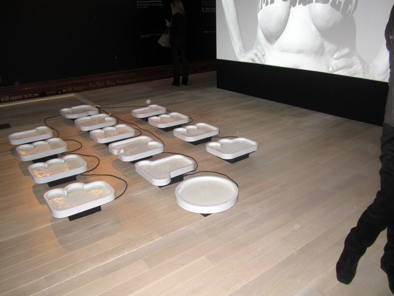
the ‘fountain’ was flat on the floor, bubbles of water .. that bubbled up and went quiet, contained by bubble .. letters.
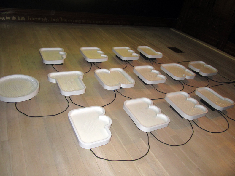
it was quite beautiful, and serene. but it was also .. w-i-r-e-d !!
trouble in the bubble ?!!
I don’t think that was the intention .. but, I found disquiet in spite of the harmless play of shape, movement and sound.
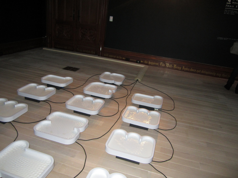
I dunno. beauty really IS in the eye of the beholder, isn’t it.
maybe beauty REALLY isn’t the point of these ‘signs’. maybe thought/communication .. is ?
OR: maybe it’s because I ‘talk’ to so many strangers, reach out on the web with this ‘blog’ .. go round and round .. wired, but have a hard time being engaged by single walking talking living specimens ?
the text is important in this show.
the text – is just as important as the ‘fonts’.
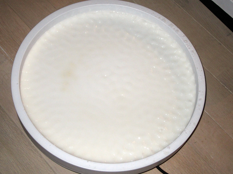
you can just .. see the how the water ripples to the sound.
but the letter shape is ominous. out of context. bland. a dish. an “o”.
I wanted to lean over, and fall head-first right into it. do an .. Alice-in-Wonderland thing.
grow big. grow small.
I didn’t want to think about others. I didn’t even want to contemplate my OWN reflection, which was impossible anyways. technically. the water did not reflect.
I just wanted to fall in, head-first. impossible technically, too. (too small) (too shallow)
though a security guard did have to tell me .. to step back. (for real)
somehow .. it made me think of .. LENA DUNHAM ?
in shape, and substance ?
ok.
with all due respect: the water ripples .. look just like the cellulite on your ‘gorgeous’, lumpy thighs.
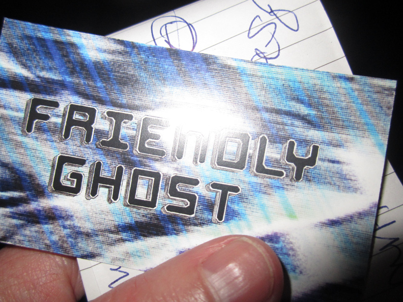
I dunno, maybe it was that ‘friendly ghost’ – that spooked me.
FRIENDLY GHOST, that be .. NATHAN RITHOLZ and ARY WARNAAR, did the sound.
they are friends of SANTIAGO CARRASQUILLA, who did that FRIENDLY GHOST card/logo for them .. and who works in the SAGMMEISTER & WALSH studio, and who collaborated on this piece,
YES !! SEE: FRIENDLY GHOST COMMENTARY/SANTIAGO CARRASQUILLA
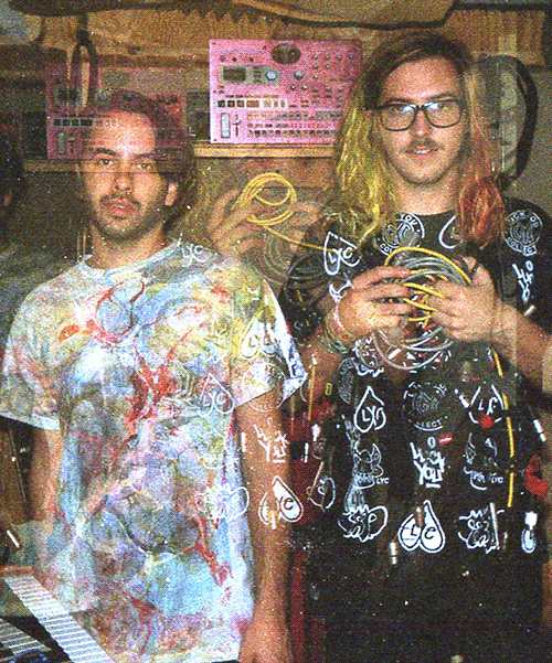
yes !! check out: FRIENDLY GHOST – love how that image wavers, on their website.

the ‘marbled’ header on the FRIENDLY GHOST website is by .. Luck You Collective
yep, for sure you want to check out: LUCK YOU
all of a sudden .. it’s lookin’ good !!
the wires connected !!
the dots got connected .. a new world IS just around, the corner.
the golden age of sign making – is US !!
well, ok. maybe it’s the second golden age of sign making, ever since those monks illustrated & calligraphed those ancient illuminated pages, of course. how VASARI skipped that, I don’t know.
I guess it was just .. folk art, back then ?
PHOTOS: NANCY SMITH
