~YALE OPEN STUDIOS: JERRY BLACKMAN
YALE GRADUATE PROGRAM – OPEN STUDIOS, APRIL 27-28, 2013
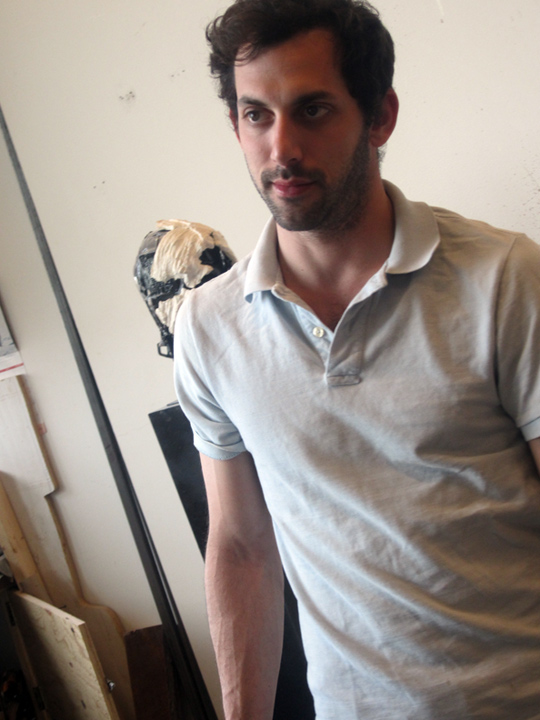
first year Yale grad student/sculpture .. JERRY BLACKMAN.
I’ve been following Jerry’s work for quite a few years now. he is a native New Yorker, who went to LaGuardia High School, yes fame .. and Cooper Union. when his work started popping up in group exhibits, most notably a GAVIN BROWN summer survey a few years back .. I was on it, with no doubt – as to his potential.

the sculpture students really have it made. their building is brand new, they all have huge studios to work in, 4 times the size of the grad painting studios !! with huge windows looking onto to a shallow border of large trees. and a lot of sunlight. you can really step back .. and look at your work.
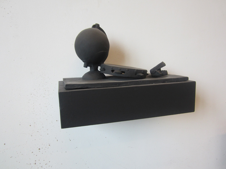
this looks to be the sister piece – to that ‘telephone’ piece highlighted in the recent 109 Gallery invite. it’s made of clay, with a matte matte black glaze/finish. it speaks to cultural stresses, and presents .. a medley of metaphor – that knows no bounds.
it is the exact OPPOSITE of an IED/pressure cooker.
but it also speaks .. to an interesting facet of Jerry’s work, that I always found compelling, and that is how .. even when his work references the real world, that is, it is OBJECTIVE / figurative .. it attains the abstract plane. not an easy feat. and the result is: a great, almost musical, theoretical tension .. runs through the work, making your brain do a nice .. visual double take.
the comes across as very straightforward, but in this aspect . . well, it’s very TRIPPY.
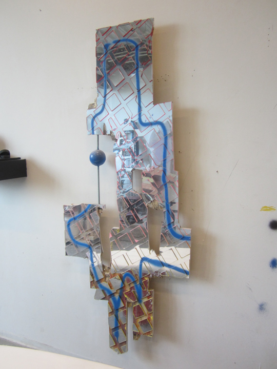
this piece is a nice upgrade to the mosaic-like mirrored wall pieces he has been showing around town, for the past few years. I like it much better than the few examples I saw in the past.
so I guess that answers: grow grow grow.
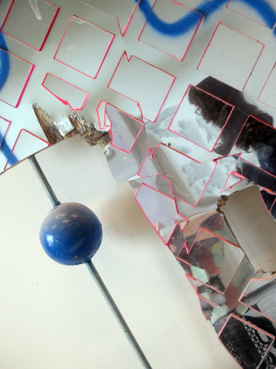
the small blue ball, is a nice feature. the open, negative space it lives in .. dances against the mosaic surface, asking .. all the right questions.
also really dig the color scheme and color choices, I mean REALLY. everybody is just so sick of bold color-block – esp as it’s all over the fashion scene right now. if the people on the subway are wearing it, and it’s splashed all over your TV 24/7 !! who wants to see it .. in your hi-end one-of-a-kind sculpture ?
that (perfecto) pink line – is just like a river running through .. me.
it’s the shade of lipstick . . that makes you do a double-take.
I guess I should be saying .. the work is sensual vs. just purely materials & composition – oriented.
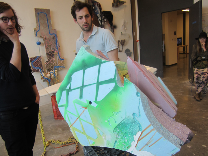
another example of his off-the-hardware-store-color-chart hue, running amidst a more purely formal, abstract piece.
how to put it. it’s like the color hue of a flower just opening .. as opposed to the worn-out attention desperate / seeking .. shout-out of a Real Housewife .. of (……).
fill in the blanks yourself.
from right: musician DARREN WILL, JERRY BLACKMAN, and designer KATE CERIGO.
of course what’s really the best element of an open studio, is the opportunity for interchange with the artist, and seeing .. the works in progress, the work tables. the environment.
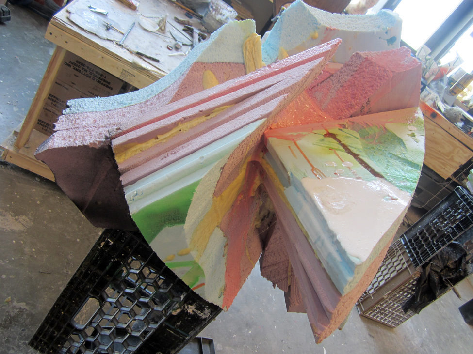
there’s that slightly left-of-center color hue, again !!
the color palette is basically the subject.
yeah, I had a fun time at YALE.
more studio visits .. to follow.
PHOTOS: NANCY SMITH
