~CINDERS OPENING PIX . . PART 2 / MARK CROSS
WATCH OUT: CROSS – OVER !!
CINDERS PROJECTS PRESENTS – DECADE OF DECADUNCE
runs thru JULY 2014 – 7 DAYS A WEEK – HRS: 12-7PM
DOSSIER OUTPOST – SOUTH STREET SEAPORT
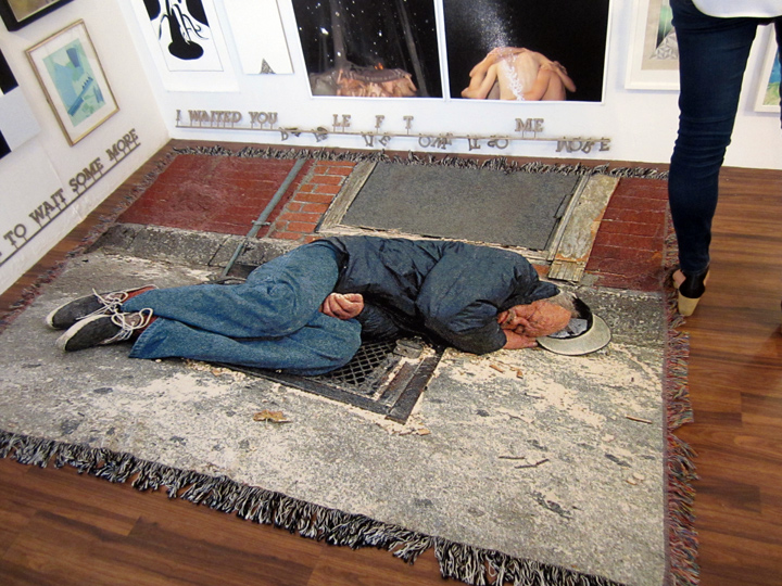
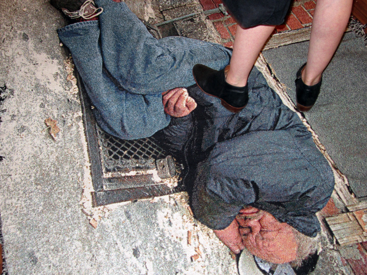
one of the most intense and striking pieces in the show, and not just because it was the largest, and the only one spread on the floor – was this custom photo woven blanket by MARK CROSS, a tattoo artist whose stature as an ‘artist’ – might just eclipse his tattoo fame.
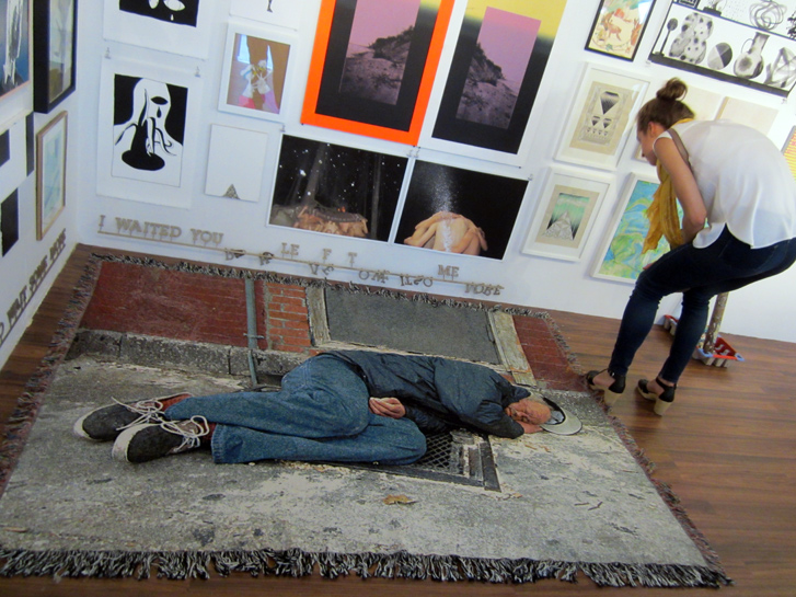
the piece was intense for several reasons, but mostly for how the homeless man curled up into his sleep, how the photo curled up into its own orientation on the blanket, and then how the piece itself . . curled up into its installation niche.
SO, I guess we have to revise . . sunny-side up !!
it’s apparently, not so sunny – out there. mean streets invade the utopian dream.
maybe the better why to quick code ‘label’ the Cinders vision and community – it just that: community. people-minded, bio-sphere minded, concerned with the present, future and sometimes even magical, or in this case downtrodden . . state of our planet’s bio beings, humans and animals, alike – and the landscape they inhabit.
and so in that sense, I have to stop and say that this 10 year wave of artists – does in fact, have a ‘political’ bent that they share with the newbie 170 SUFFOLK wave, though the CINDERS fellowship comes down . . a little more to the ‘organic’ side of 170 SUFFOLK, which is more hardcore and in a sense urban ‘radical’.
in a word: both art groups – are very pictorial, and both are very ‘statement’ – oriented.
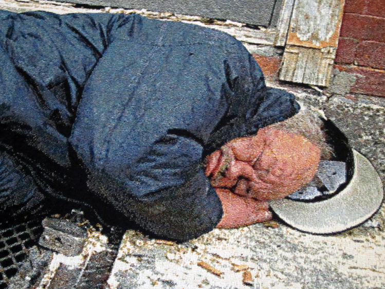
anyways, looks like there is trouble on the downside of the ‘sunny-side’ of the street. some call it: urban living, this man looks so beat-up, broken, so weathered and it’s so sad to see him curled up in a fetal position on a grate, seeking heat. it’s not like he’s a drunk, he’s just an unfortunate homeless man, and many urban dwellers, esp the free thinkers and the ‘un-promoted’ artists among us – know . . there for the grace of God, go I.
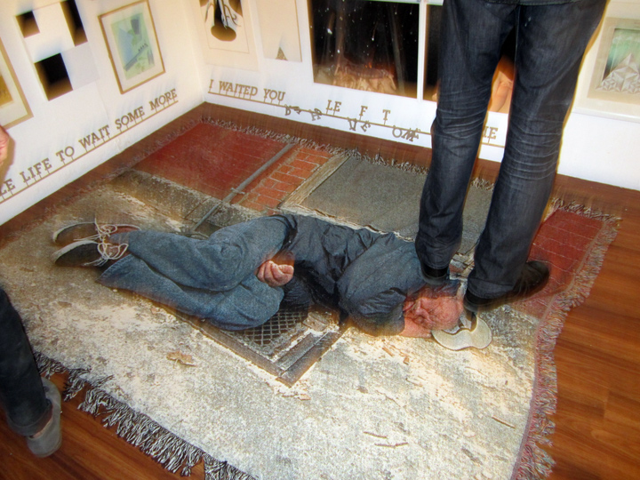
I’m thinking, it’s really the intense graphic & straightforward documentary photo – that carries the work, and speaks the truth. this is/was . . a real moment.
the way the gallery goers walk over the image – becomes an on-going moment, speaks volumes and metaphors could cascade, so you can supply your own faves.
I first saw ‘artwork’ by MARK CROSS, originally from San Francisco and now NYC-based – at the recent ‘It’s An Invasion’ group show at the National Arts Club. the piece was similar in format, except it was termed, a ‘carpet’ – as opposed to ‘blanket’, and it was also strikingly placed. in the ‘INVASION’ case – just beneath an upper crust piano / and hi-gloss fancy wood coffee table type scenario. in that piece the photo was also of a homeless man lying asleep on a grate, but the guy looked more like he was on a bender, and was kind of well, looking like his predicament was his own fault. in this Cinders scenario – the man looks more vulnerable, like he just slipped though the sunny-side of the street – the cracks are a-many. the works being placed on the floor in both shows, and with no security barriers/gates around them, means you can walk on them, or watch other people walk on them, as in: ‘walk all over me, man – I’m already so far down and out, what’s the dif’ – makes a big statement, and renders the piece kinetic’. as opposed to being large standard print on paper photographs hung on the wall, or even ‘blankets’ hung on the wall.
the foot traffic – most definitely added to the power of the ‘content’ within.
so, in any case – I also just came to realize, seeing the work a second time – how important the photo image itself was, both in subject matter and in graphic design, how it sits in it’s composition, the cropping – the takeaway was, I felt this ‘tattoo ‘ artist was also a bonafide photographer. these had to be his own images, they were too loaded – and powerful, not to be – but you never know, ‘appropriation’ being what it is today, okay it wasn’t in Gagosian Gallery and the name on the label wasn’t RICHARD PRINCE (!!), still I felt I better do double check before mouthing off. so late at night a day or so ago, yeah, I cyber-stalked MARK CROSS – and found a contact and wrote and asked him.
yes, was the reply – “these are my photos”.
again that’s also an integral characteristic of the CINDERS crew – they are very hands-on, DIY owning their own images, and all the power to them. and of course – these raw photos, including their custom woven format – define grit, and, really – one needs say . . no more.
it’s also a very ‘contemporary’ stance, as opposed to say, ‘art for arts’ sake 70s focused purely ‘abstract’ work.
if you follow this site, and . . admit it !! you have been making dough or what ?!!
you know the art hustle is a very lively ‘art’ to me – on it’s own terms.
it’s how I keep a step ahead of sleeping on the grates myself !!
skills, skills, skills, !!
I would say putting down $2 grand on this piece would be a very savvy way to spend 2 grand, and enjoy it too.
just don’t throw it in the washing machine.
plus, large scale works do better at auction, as does very unique and provocative imagery.
so it’s win win.
ps:
cyber-stalking MARK CROSS is actually quite a fun journey. lots of instagram and tattoo stuff comes up – though none of the rugs or blankets, as of yet. and none of the urban photos, as far as I could find.
just make sure you add ‘NYC’ to the search mix.
you can find a new enterprise he is connected with, too – apart from the tattoo shop he works out of – it’s a new gallery in Brooklyn, Greenpoint: called MUDDGUTS, which he runs in partnership with LELE SAVERI. located at 41 Montrose Ave, there is in fact an opening tomorrow night . . FRI JULY 18, 2014 / 6-9PM, showcasing the dark and ‘gritty’ urban photos of DAVE SCHUBERT.
the show has a rather poetic title: ‘SCATTERED SCRAPS of MEMORY’.
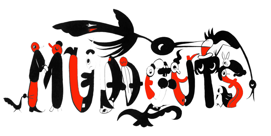
the MUDGUTTS LOGO, (by CHRIS LUX). it’s animated, so . .
check out: MUDDGUTTS
and, see: MUDGUTTS ON INSTAGRAM
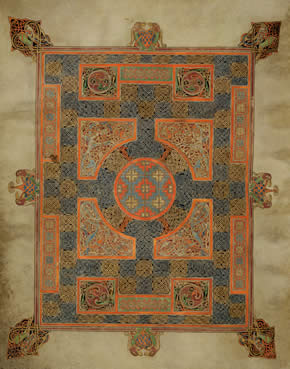
MARK CROSS CARPET, ILLUSTRATION – via LINDESFARNE GOSPELS
the other thing interestingly, that also pops up – under a very late night ‘MARK CROSS CARPET’ cyber-search, is this wonderful, historic illustrated ‘cult’ gospel archive, which actually fits . . right into the CINDERS artisan, humanity-centered creed, or what ?!!
decorating the beginning page of each intricately worked ‘LINDISFARNE’ gospel, the date we are talking lies somewhere in the 634-687 range (!!), was a . . ‘carpet’ page, which was actually called a ‘MARK CROSS’ CARPET page, because the illustrations were inspired by woven designs that – delineated the ‘cross’ orientation – on holy prayer rugs.
check it out for yourself: Carpet pages – LINDISFARNE Gospels Tour – British Library.
lyrical, and . . illuminating !!
don’t miss the ‘cult’ . . references !!
and here we are still talking ‘holy grail’ carpets, 1400 years later.
PHOTOS: NANCY SMITH

