~LEVI HASKE . . GREENPOINT OPEN STUDIOS
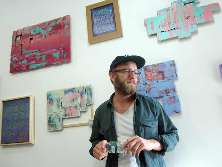
LEVI HASKE in his studio, with his work behind him – Greenpoint Open Studio Weekend, BROOKLYN, NYC.
OCT 4-5, 2014.
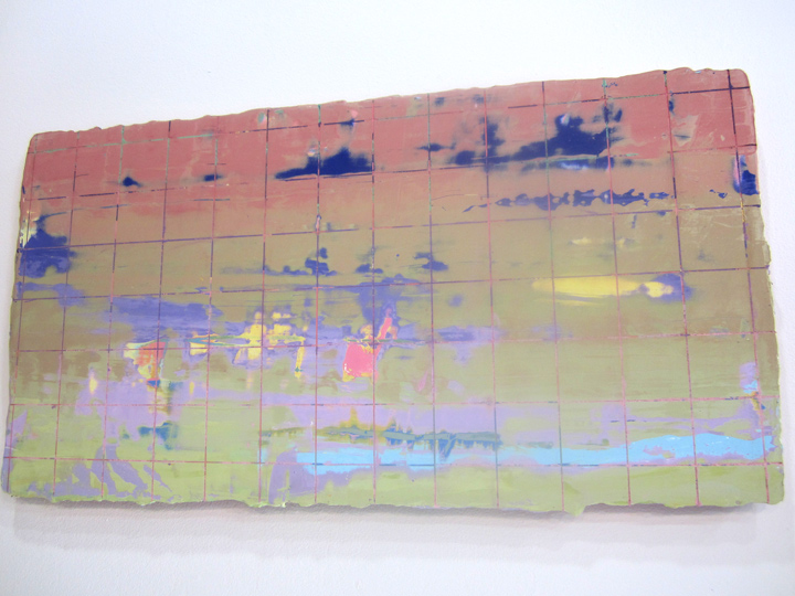
LEVI HASKE’S works, acrylic paint on plywood, were (relatively) small in scale, but a had large generous feeling.
although non-objective, and without repeated patterns either – some of them did have a atmospheric landscape narrative, one could get lost in, if one wanted to visually ‘travel’, ‘trip’ or . . ‘dream’.
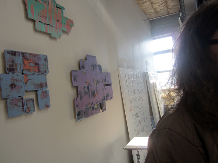
just so you can get a sense of the scale of the works . . Levi’s studio was longer and more on the narrow side.
that’s a slice of NICHOLAS STEINDORF, at the right – in this slice of a studio, slice of a photo.
NICHOLAS STEINDORF was artlovers’ tour conductor / curator for the weekend, where an overwhelming number of artists had generously thrown open their studios to the public, and they did indeed attract quite a good crowd on both days. I found it really interesting that Nicholas brought forward just 2 studios for us focus on, well, time was also a factor – those of JAENA KWON and LEVI HASKE. and now at Levi’s studio, I realized he had also set up a small sub-text: non-objective works on wood, where the painted surface was the main focal point, muted tones ruled – and the ‘shape’ of the wood was just as important – as the manipulated, almost waxy, painted surfaces – in both cases. though the 2 artists’ works – couldn’t be further apart . . on all other (over-all) factors.
if pressed, I would say, in a nutshell: Jaena’s work was more sculptural, often large scale and that a sense of craftsmanship and patina – was a big part of the ‘experience’. Levi’s work on the other hand was more atmospheric and compact – it brought the viewer a dreamy narrative that was both inward and outward, a pictorial fluctuation, rather than a tactile sculptural state, even though his work did also depend on (sculptural) cut-out wood, which made the perceived contrast even more interesting.
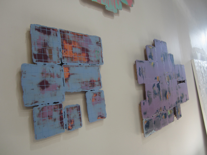
Levi’s ‘wall works’ were flat cut-outs, almost like puzzle pieces. some of which contained inner “negative” or open spaces, as part of the composition.
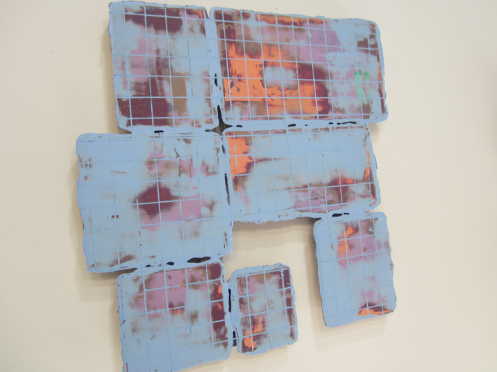
muted color was key. but true tonal contrasts were in play – though they were soft and organic. reminded me of late stage Turner sky scapes. Jaena’s work also had color as a key element – but Levi’s were ‘colorful’ in contrast to her minimalist surface-of-a-polished-rock sensibility. having just come from Jaena’s studio made it much more easier to appreciate what was going down in both artist’s works.
thanks, Nicholas !!
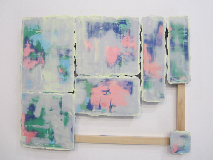
a larger and more ‘colorful’ work by LEVI, with more complex sculptural wooden elements worked into the dynamic . . very Turner-esque pushed to the 21st Century, or what ?
or maybe that’s a riff on the American landscape painters, you know, a Hudson Valley School of painters type sunset ? anyways, I was thinking, that pink and blue is a classic early American quilt / needle arts color combo – esp of the folk art of the North East, the earliest colonists. if you have ever stopped to watch a sunset over NYC, even today – you know why !!
pink and blue – just like this.
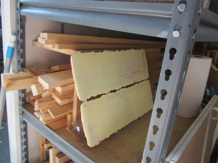
looking around his studio, a work in progress !!
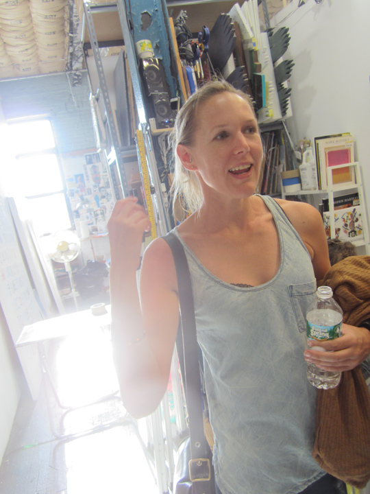
also looking around the Levi Haske studio, photographer PIPPA DRUMMOND.
Levi’s studio got great natural light flooding in from that one key window.
but wait a minute.
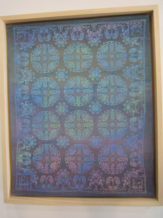
I knew it !! – American folk art was indeed a part of the larger picture in Levi’s work !!
this was indeed, as Levi told me, a pastel transfer he had made, and re-colored !! of an early 19th century American hand-embroidered coverlet.
the most striking detail / clue which immediately gave away its origins, was that the corner blocks at the very top and bottom edge of the borders – were inverted. the right side block reads correctly, look at the eagle – while the left side images were like . . reversed stencils.
and that’s – that’s just what they were.
early American folk artists, esp quilters, or in this case a coverlet embroidery mistress – were very aware of ‘hubris’. one can take pride in one’s handiwork, but not too much.
PRIDE COMES BEFORE THE FALL.
even the very skilled . . must bow humble in the presence of the larger maker of the Universe, God. the father of all. the Puritans, the Colonists, onto the Amish, etc – retained this respect and reverence by deliberately making a ‘mistake’ in their patterns – it was their way of stating and reminding all who viewed their work – that man was not perfect, or alone. that there was a higher power. religious expression / experience was the center of their life experience as they lived it, in all ways and being.
you’ll also note, the maker’s initials, ‘E.E.’ – are stitched into the bottom left border ‘hubris’ inverted pattern block. ‘E.E.’ whoever she was, though proud enough of her work to ‘sign it’ was well aware that . . tis better to be humble in the face of God, and the greater universe / creation. she was happy to have made this piece, and to put her name, her initials on it – but she brought her ‘respectful’ world view to the process.
the stencil block ‘inversion’ or ‘mistake’ – that is, a deliberate skip in the pattern, has roots in all handiwork, but esp weaving, going all way back – in all cultures through-out the world, where a small slip in concentration, that one could not go back and fix – did not ruin the piece – but was said to be placed there – by the very hand of God. a mistake was a sign of God. and that we are only human. so a work with a mistake came to be seen as very special, blessed, as opposed to driving the weavers to endless frustration. as there is always a slip of the hand.
HUBRIS . . is a very interesting concept, esp for governments as a whole, to ponder.
as concerns military superiority supposedly based on advanced technology.
as in advanced / sophisticated American & European medical superiority vs ‘backwards’ Africa and a tiny little virus running rampant in the age of globalization.
yep, all ‘quilters’ and hand-stitchers, (just like bloggers in some big sense too), contemplate their world, as they stitch away those endless hours.
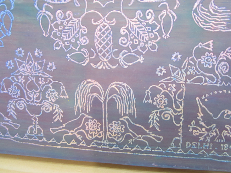
although the work says ‘DELHI’ (1847) in the right-hand bottom block, that might NOT be the local/place of origin, though it well could be .. but it also likely refers to the coverlet’s ‘format pattern’ which was derived from: Jacquard all-over pattern – repeating . . weaving.
apparently back in the day, the early 1800s – a skilled Scottish JACQUARD weaver settled in DELHI, NY.
this pattern is based on Jacquard over-all effects.
see: DELHI
though, changing the colors of the coverlet as LEVI HASKE has done, makes a . . very big big difference. in the content, re a contemporary art piece vs. the original. and in fact, even in real time / technical / digital formats. if you try to google-image the work – you see that google-image is solely based on color !! and you can get no further historically, than to pull up other images with the same ombre shades of blue !!
google-image is not subject matter – oriented. damn. and hard to believe.
the exact historical nature of this quilt is therefore not ‘fingertip’ easy to find, and – as well by changing the original colors, which would have been key to its meaning, Levi has transformed it.
for example, red and green would signify a Christmas quilt, etc. etc. pink is for (marital) engagement, yellow for happy and sunny . . red is sometimes a signifier for: danger.
just looking at the coverlet, and being influenced by the way it’s color scheme is ‘leaning’ now, which might be deceiving, but still . . I would take a leap of faith and imagine this quilt might be a ‘death’ or ‘bereavement’ coverlet. witness the somber tree of life, witness the somberness of the pattern as a whole. perhaps those birds, unlike the eagles in the end blocks – are crows or ravens, early folk art symbols of earthly ties to the dead.
see: CROW POEM
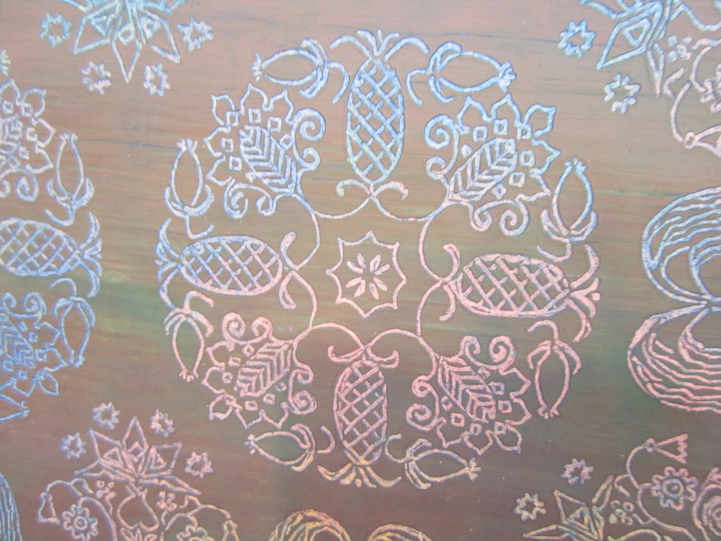
but at the end, there is renewal.
the pineapple stands for hospitality, and thus . . rooted in home, and family – the circle of life, goes on.
just like the seasons. let the circle be unbroken.
hubris, death and the eternal circle . . the tree of life. I’m on it.
folk art.
count me – in.
it struck me as as very ironic – how a visit to see cutting edge new work in Greenpoint – esp of a very abstract nature – had brought me back to my – quilt-maker ways.
something about a pineapple (open studios – !!) and . . the circle of life.
and I do mean circle of life,
quilting, and all.
PHOTOS: NANCY SMITH. OCT 5, 2014
