~ERIK DEN BREEJEN . . paints AHMET ERTEGUN MURAL
ERIK DEN BREEJEN PAINTS . . a wall-size, 2 floors in height, acrylic mural portrait. in his singular op-art, color-field ‘text’ brick-block style, of the legendary founder of ATLANTIC RECORDS . . . AHMET ERTEGUN, for their newly designed, Atlantic Records headquarters, in midtown Manhattan.
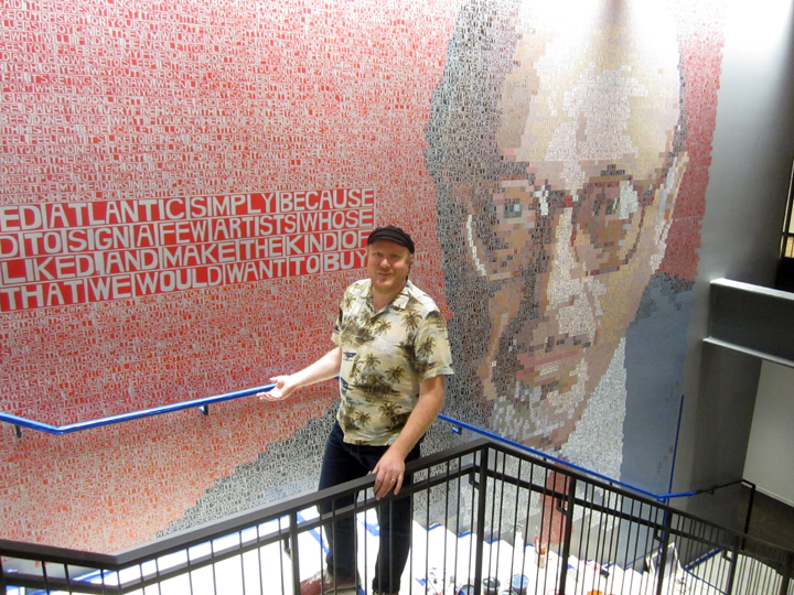
ERIK DEN BREEJEN beside his 2 story tall, very life-like mural of Atlantic records founder, and music industry legend: AHMET ERTEGUN.
just as AHMET ERTEGUN was larger than life, so this mural is larger than life. skillful, playful. hyper-real, hyper-narrative, hyper-lyrical, hyper-abstract – the total dynamic . . is a tour de force.
no doubt about it.
ERIK DEN BREEJEN: rock and roll !!
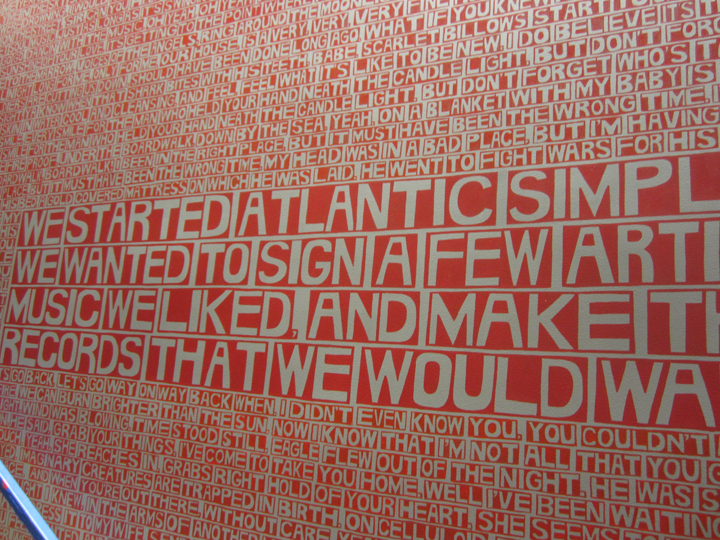
this high-lighted, i.e. larger ‘block’ – boldly states the simple, but powerful motto behind the man, and his success throughout the years:
“WE STARTED ATLANTIC SIMPLY BECAUSE WE WANTED TO SIGN A FEW ARTISTS WHOSE MUSIC WE LIKED AND MAKE THE KIND OF RECORDS THAT WE WOULD WANT TO BUY.”
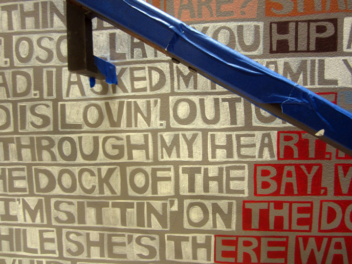
otherwise the mostly uniform horizontal ‘lines’ are composed of hand-lettered ‘word-blocks’, or ‘bricks’ that convey the narrative, and also form the dominant infrastructure of the whole. in this case – the words running through those brickwork lines – are composed of . . one line of the actual lyrics, and the chorus of about 100 of Ahmet Ertegun’s and Atlantic’s biggest hits.
the songs are arranged in alphabetical order by artist.
as in all of Erik’s recent color-field, ode-to-music paintings, the words themselves play more as building ‘blocks’ of color, quietly lying amongst the dynamic rumble of the background, and only jumping forth upon closer, more focused inspection, or as in this case . . when a well-known phrase, really does . . jump out at ya.
“SITTING ON THE DOCK OF THE BAY” – OTIS REDDING !!
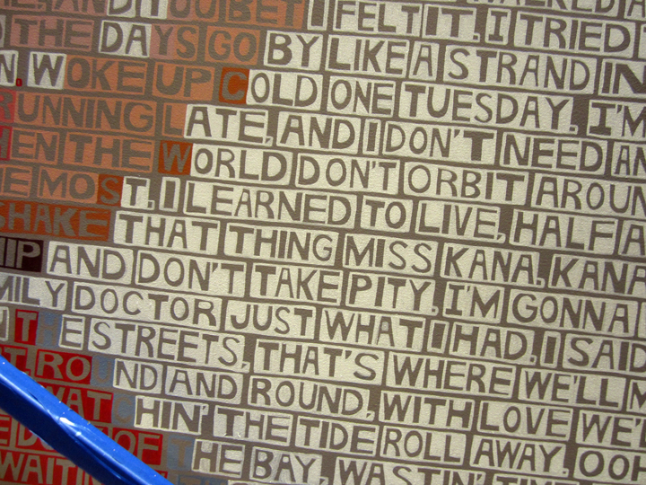
“WATCHING THE TIDE ROLL AWAY”.
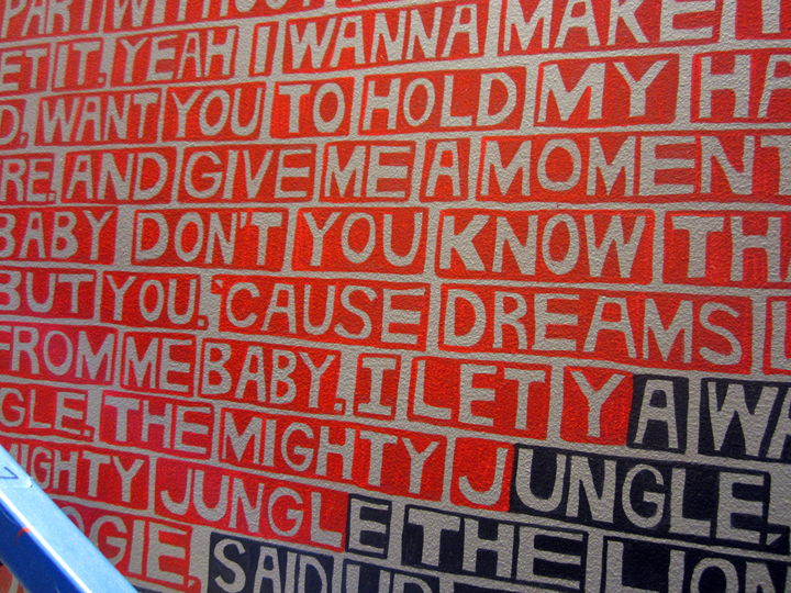
“A LION SLEEPS IN THE MIGHTY JUNGLE, TONIGHT”.
something, like that.
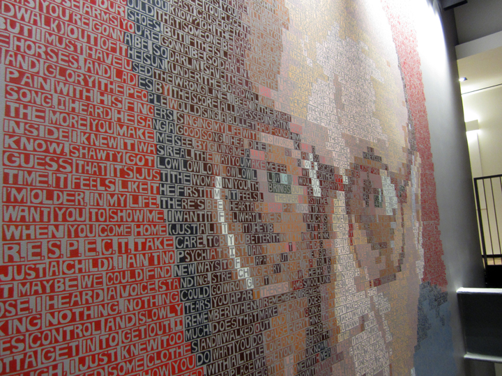
this is Erik Den Breejen in top form. and he’s not fooling around with purist concepts, with a capital C anymore, or as much. the color-field ‘building’ text blocks are still there, but when he gets to the subject, the portrait – they are carefully hued for clarity, and depth – as much as for overall pictorial resonance. this portrait rings clear as a bell, it is very, in fact not only hyper-real,as in photographic – but it also astonishingly . . conveys great emotion, great depth of character.
and in that sense, this ‘commissioned’ mural differs from his most recent past solo show where the faces in the paintings – only coalesce into familiarity, under the compression of a camera lens. so in effect you really have to see them firsthand, otherwise you are seeing them compressed through a lens. very hard to explain in words, sometimes you really do need to ‘witness’ painting firsthand, in the flesh, on the wall.
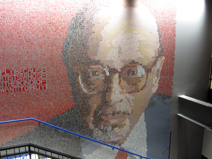
it is a beautiful, and skilled rendering . . perfectly aligned, perfectly brought to totality.
Erik emphasized to me, that this “was NOT A PROJECTION.” it is all hand-drawn, in simple graphite pencil at first, then hand-painted in acrylic, with the color ‘charting’ being key to both the high contrast dynamics of the fluctuating op-art ‘background’, and the realistic ‘depth’ and 3-D shadowing, or contouring, of the central photographic portrait.
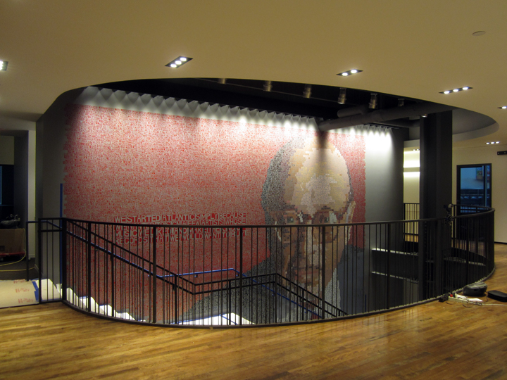
the mural, measuring 20 x 23 feet, is painted directly on a wall that spans two floors of a custom-made stairwell, carved out between 2 mid-height floors, in a huge modern midtown skyscraper.
the project was conceived by GENSLER, ‘an integrated architecture, design, planning and consulting’ firm whose motto, according to their website – is: “Leveraging the power of design to create a better world.”
I’ll say, right on !!
apparently one of the GENSLER architects saw Erik’s ‘DAVID BOWIE’ mural, on the side of the RAG & BONE at the corner of Elizabeth and Houston, on the Lower East Side last year, and set the ball – in motion.
that’s so . . New York !! you just never . . know.
who will see your work.
and . . where it will go.
this is a view of the mural from the top of the staircase – beautiful, and intense. sophisticated, musical, what more can one say – it all came together so well: concept, design, production. it’s a wonderful ode to the – man, AHMET ERTEGUN, because as we all know, if America has a heart, and it does – it beats to . . music !!
ps: a little hard to see, but check out that small bit of ‘hardware’ on the railing, near that black pillar – close to the right hand side.
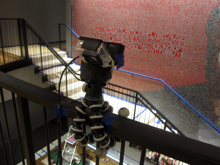
yeah, it’s . . a go pro camera capturing the whole project’s unfolding, in fast forward.
so I guess even my brief visit . . is part of the digital – record !!
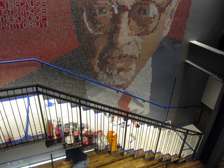
looking down at the nearly complete, but still unfinished work, from the top of the stairwell.
Erik started the project on Oct 6, 2014 – but it was totally cool to visit, and document it when I did, in early November 2014, when it was almost complete. that way I could get to access the true breath and gist of the finished mural, but also . . still be in place to catch some of the behind-the-scenes production . . also known as . . the action !!
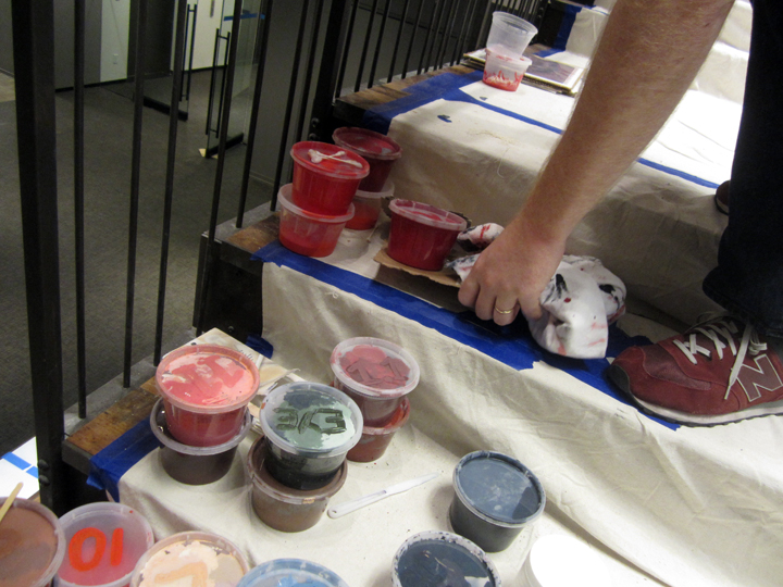
shades of RED !!
little cups of carefully mixed, hand-blended acrylic paint still perched on the stairs.
to my way of thinking, above all – Erik Den Breejen is a color-field painter.
hue. tonality, contrast . . is everything.
or at least the backbone, the engine that does all the heavy lifting.
while the actual words, the song lyrics – are the deeper . . soul and spirit.
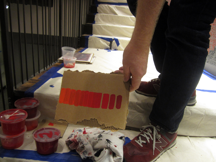
‘charting’ . . the right shade of red . . for different areas.
it’s called: skills.
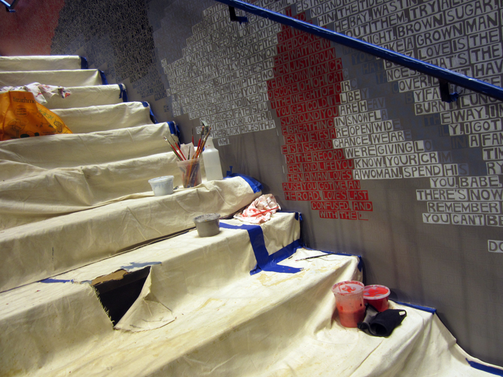
work still-in-progress, at the very bottom of the wall . .
everything is hand-drawn out at first, the block outlines, and their text font/characters – with pencil. it’s a form of ‘primitive’ block calligraphy that is characteristic of Erik’s natural hand, then the letters and backgrounds are carefully painted, colored-in with carefully charted . . hues. maximized for effect, and in the subject’s face . . for 3-D depth, and clarity of expression. and, no doubt about it, that face does have an amazing . . emotion.
it’s a . . showstopper.
the fact that the word ‘bricks’ recall actual songs, just gives the whole piece a real ‘depth’, a real ‘soul’, in fact, an actual pictorial record, a code.
a written history of achievement . . which visually matches, the depth and vision – of the subject himself, Ahmet Ertegun.
a real love of music imbues the piece, from the painter’s point of view as well, as it does all of Erik’s work.
look it up.
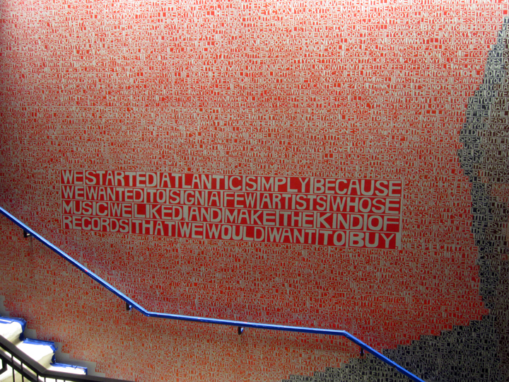
‘scale’ also plays an important part in this mural, that’s that founder’s motto, “WE STARTED ATLANTIC RECORDS . . .” a kind of a musical/visual interplay, for sure. art and music – so hard to define in words, but esp when they come face-to-face, a real ‘beauty’ reigns. like a 5th dimension.
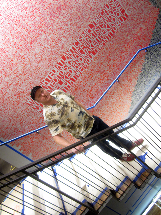
ERIK DEN BREEJEN, taking me down the stairs, to see the more unfinished parcel of the mural.
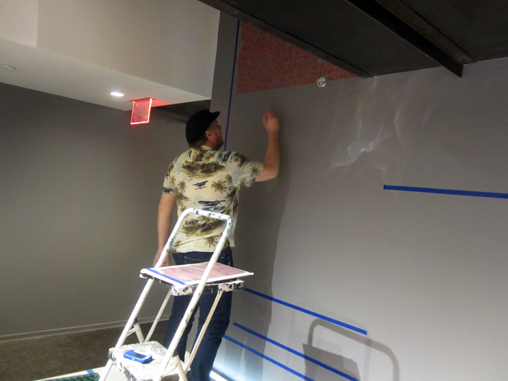
at work on the lower level, it’s all hand-done, from start to finish.
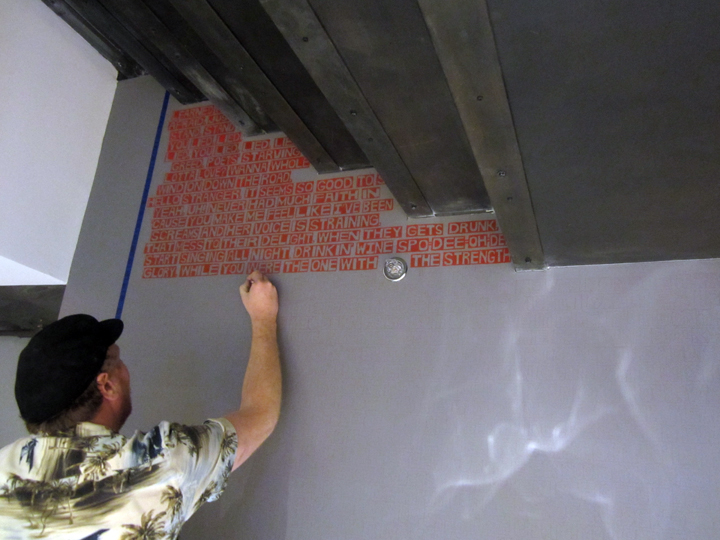
first he pencils in the outlines of the block letter ‘calligraphy’. all caps !!
this more or less, grid charted, but free-form hand-lettering, also provided some fluidity, helped . . in fitting together the words – as they meet edges of the wall, or shaded-in the planes of the face.
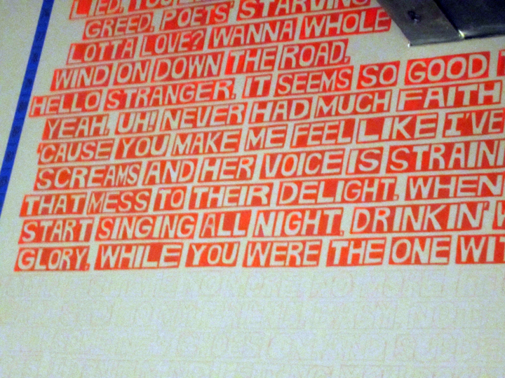
“WANNA A WHOLE LOT OF LOVE” – !!
you can just make out the raw . . pencil marks, going forward – as yet, un-painted.
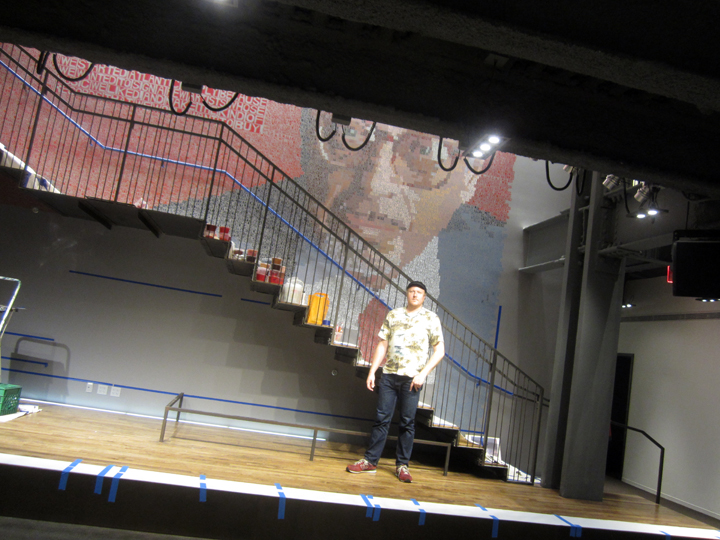
ERIK DEN BREEJEN . . PAINTS AHMET ERTEGUN. ATLANTIC RECORDS, NYC HEADQUARTERS, FALL 2014.
PHOTOS: NANCY SMITH. NOV 7, 2014
ps: for some interesting background . .
read: about Erik’s ‘DAVID BOWIE’ mural at RAG & BONE, KATYA KAZAKINA, BLOOMBERG NEWS.
where it is noted, in a currently – very timely (!!) fashion, that:
“in DEC, (that would be 2012), den Brejeen’s solo booth at UNTITLED Art Fair in Miami sold out during Art Basel Miami Beach with prices ranging from $7,000 to $20,000, according to NICK LAWRENCE, owner of FREIGHT+VOLUME which represents the artist.”
see: ERIK DEN BREEJEN artist page & other images – on the FREIGHT+VOLUME gallery website.

