~office space: JIMBO, BHQFU / FOR THE RECORD – JOHNNY MISHEFF
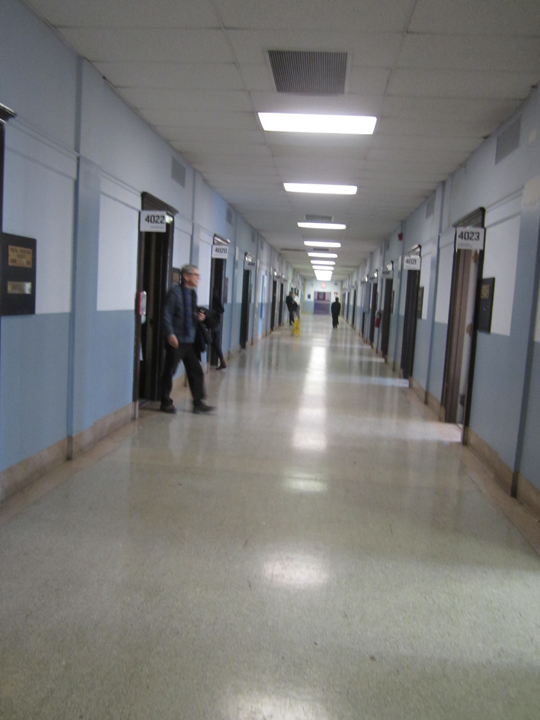
SPRING BREAK 2015 . . in the old post office building, was itself – a warren of small spaces, you never knew what you would find once you stepped into a room. mostly it was art exhibits, group, singular, projections, installations, and even a few . . faux offices !!
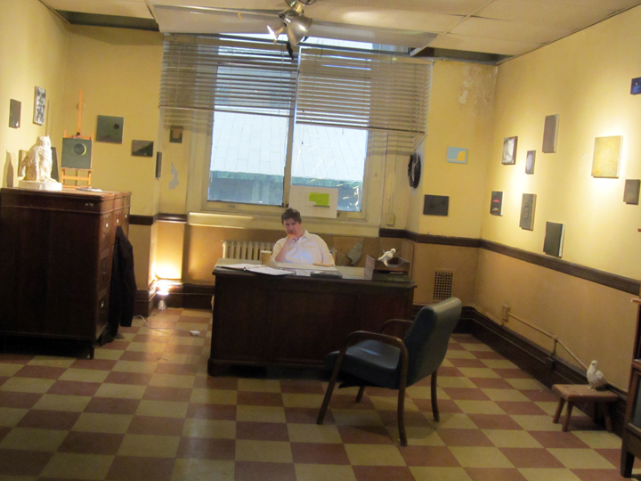
painter JIMBO BLACHLY . . in his ‘deadpan’ office at SPRING BREAK 2015.
curated by EVE SUSSMAN.
I guess that would be . . category: fictional replica !!
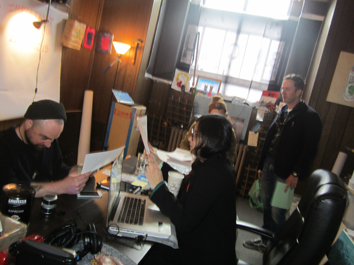
BHQF / BRUCE HIGH QUALITY FOUNDATION . . . seemed to have transported their entire BHQFU headquarters over to SPRING BREAK, and it was . . . business as usual.
and, yes . . that is JOHNNY MISHEFF, of FOR THE RECORD . . that I just happened to catch – on the right !!
Johnny . . be good !!
see: BRUCE HIGH QUALITY FOUNDATION
see: BHQFU – with a super great homepage illustration
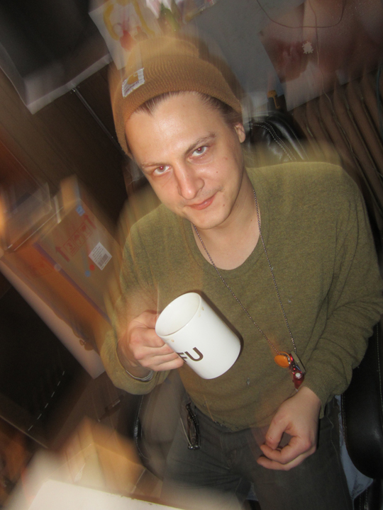
JOE KAY – BHQFU events director.
BHQFU / BRUCE HIGH QUALITY FOUNDATION UNIVERSITY – was an installation that was always in flux or, business as usual . . !!
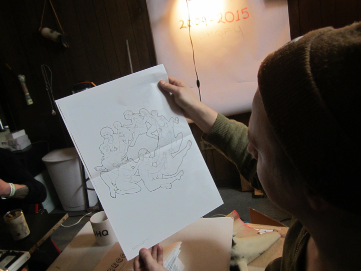
at the moment a one-sheet ‘broadside’ called . . FOR THE RECORD – was the object of interest. this is the back page, an illustration/line drawing . . by JIM KREWSON.
like a random connect-the-dot, dot dot dot . . that sticks: FTR / FOR THE RECORD caught not just the moment, but the greater ‘formalism’ and ‘ethos’, alternate reality . . of BHQF in general. a very low-fi, on the move, constant start-up, in-your-face, art world weary, contrary, stubborn, even if slightly convoluted, no diss – as in COMPLEX . . . raging indie spirit held in check by . . played-down, pared-down – ‘visuals’.
the focus on ‘learning’ is accentuated, in fact – by a most minimal visual style, a kind of grey on grey, with special attention paid to . . text, type, as in type-face / fonts, text-related graphics. this was a room, a simulated office, probably even an exact ‘mini-me’ replica ? . . . with a lot of stuff, but ironically presenting . . with a very minimal look. you can skip ‘pictorial’ saturation, and even, color. industrial hardcore . . does come to mind.
steely, a bit cold. not so much at play, as . . in play.
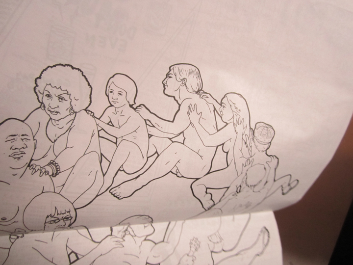
detail, JIM KREWSON, ‘Group Therapy’, 2015.
Sharpie and pencil on paper.
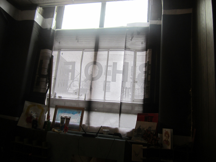
the most ‘arresting’ visual in the BHQF room, and most suitably for a place in flux . . variable upon the light !!
this summed up the BHQF aesthetic – in a snap-shot. very subtle, very minimal, fluid, stark, idea-centered, text-driven, and, curiously ‘organic’ for such . . grey-on-grey.
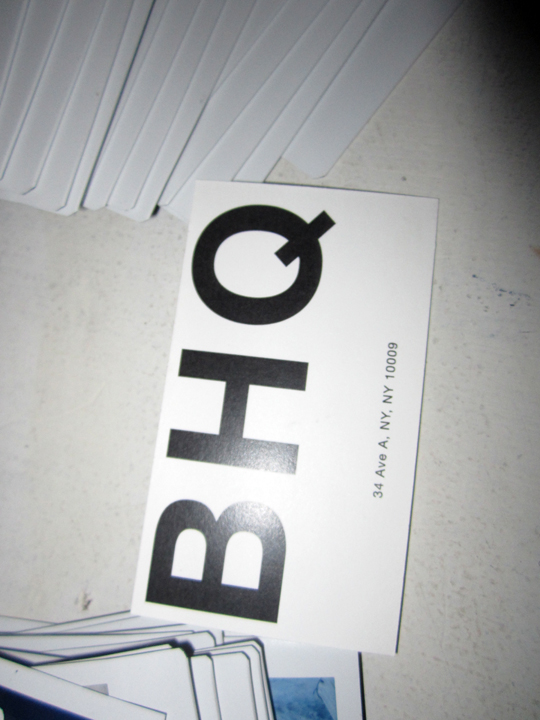
this was their best . . ‘nano’ – moment – their biz card.
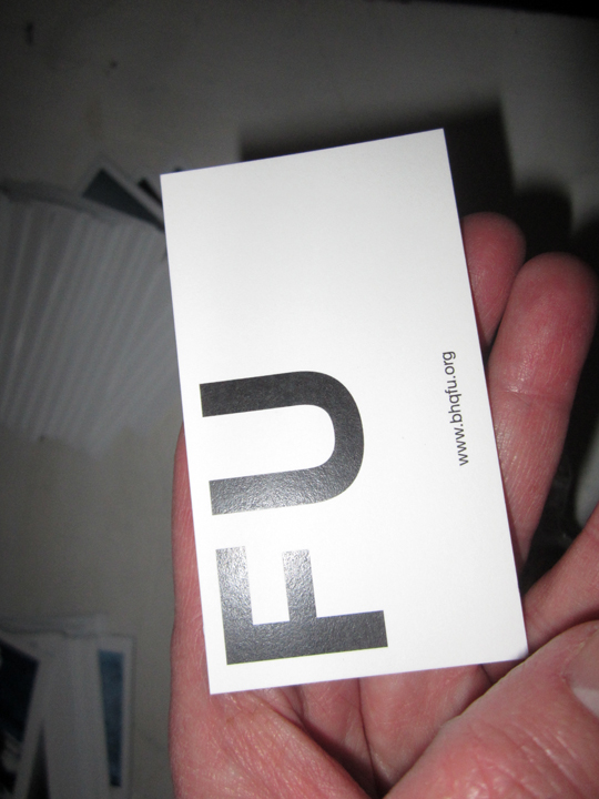
the graphics were superb, even on the reverse.
FU. take it or leave – it.
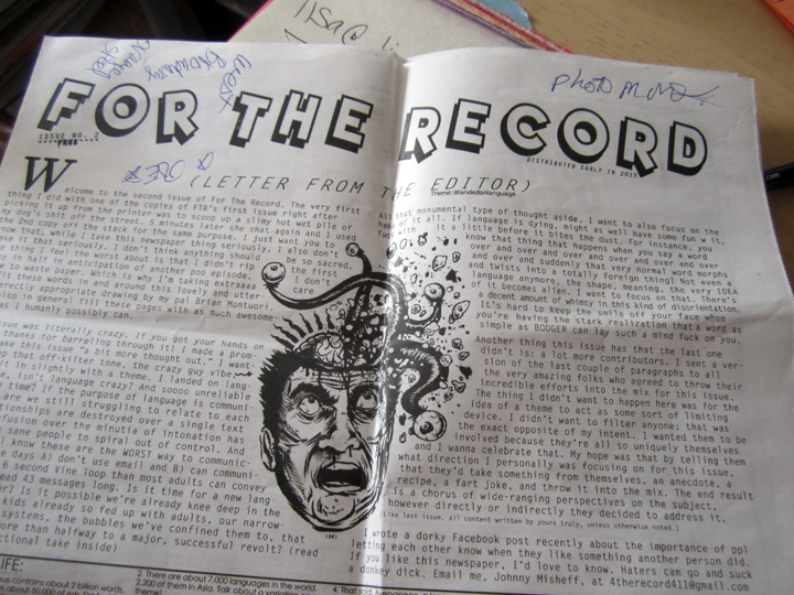
meantime, a closer look at FOR THE RECORD, revealed some choice, pared-down, but more expressionistic !! and, outright MOODY . . ‘nano- moments’.
like a tiny magician’s trick, or those stacking, I guess that’s ‘nesting’ Russian dolls – that keep on giving, while getting smaller and smaller . . in size.
kind of like a one-man ‘snow’ globe of thought, FOR THE RECORD is put out by editor/founder JOHNNY MISHEFF.
this is ISSUE NO. 2 **** FREE **** – & – ‘distributed early in 2015’.
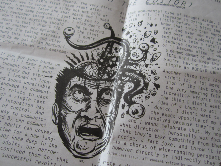
the illustration on the front page – is by BRIAN MONTUORI.
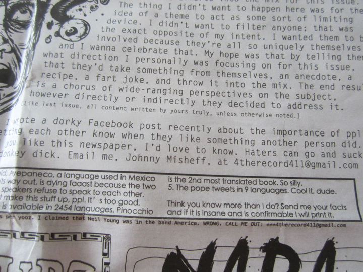
the . . FOR THE RECORD mission statement:
“I wrote a dorky Facebook post recently about the importance of ppl letting each other know when they like something another person did. If you like this newspaper, I’d love to know. Haters can go and suck a donkey dick. Email me. Johnny Misheff, at 4therecord411@gmail.com”
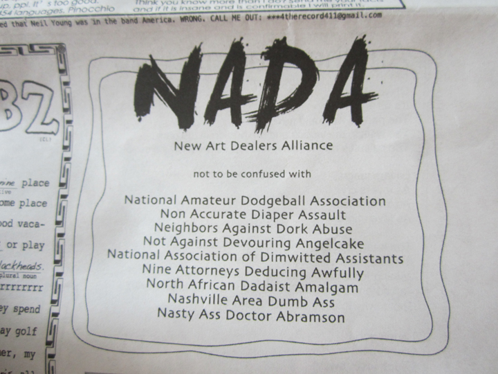
right there on the front page, for all to see: is a apt, and well-deserved poke at that annoying, elitist, poser organization known as NADA, and sad to say based in NYC.
as if.
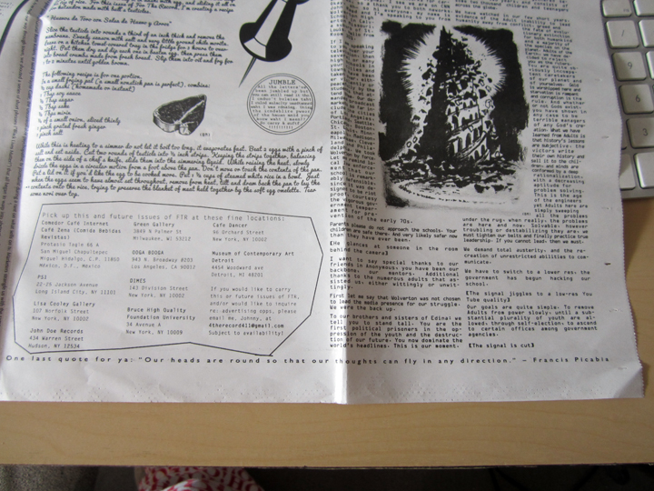
with one last communication, to send you on your MFing way, category: intellectual ‘transaction’.
FOR THE RECORD:
‘One last quote for ya: “Our heads are round so that our thoughts can fly in any direction.” – FRANCIS PICABIA’
PHOTOS: NANCY SMITH

