~PAT McCARTHY . . bringing it all, home
SYLVAIN COUZINET-JACQUES: ‘EDEN’
with additional works by FRED CAVE, THOMAS HAUSER, JESSE HOYLE, AMELIA RINA, PAT McCARTHY, and UGO SCHIAVI
NOV 16 – JAN 19, 2016
APERTURE FOUNDATION GALLERY
PIX FROM THE OPENING – WED NOV 16, 2016
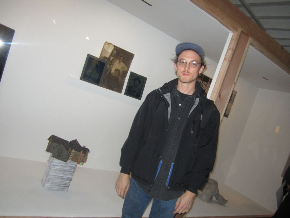
PAT McCARTHY at the opening, with his ceramic . . ‘mini mini mini me’ tiny little ‘replica’ school house, sitting on a stack of low-fi zines, which he had also made – for the project.
and they are wonderful.
though you couldn’t get to them obviously – or even divine what they were, in this stodgy and misguided presentation.
‘BORN TO KILL’ – ISSUE 90 – ‘BUILDING A FIRE’
‘IN EDEN’ – !!
luckily Pat laid a copy on me.
get ready for a rant – KANYE more over !!
because then, as you will see, burn baby burn, then it’s all downhill, from there.
ps: in the background, higher up, . . that is a ‘composite’ photographic / historical piece / collage by JESSE HOYLE.
nice. I most definite wanted to step in closer to see it, but no could do. there was a serious glass wall in front of this constructed wall box – display ???
sometimes . .
no matter how much you to look forward to the actual ‘hard copy’, esp when, as was the case here, the online images are so exceptional – and, the accompanying concept just jumps double time – it just doesn’t pan out, and unfortunately this evening was one of those ‘things gone – south’ quickly . . kinda nights.
I got completely undone – by the exhibit’s ‘construct’. so frustrating.
put me in such a bad mood.
the problem was with the display production & the exhibit design more specifically. it was hung badly. the worst. if there is a word for poetic – then what’s the word, for . . NOT ?
the room, the displays were too dark, to the point of no visibility. the pieces staggered against their backdrop and could realize no conversation with their neighbors.
this display ‘wall-box’ was how the show began, and it was totally un-accessible, both visually and physically. the gallery itself, was a huge space, so why was crowded up against wall ? and barricaded behind a floor-to-ceiling . . shallow, airless box of a viewing ‘window’ ? here you see Patrick is standing in front of the glass wall. the wooden beams support it. you couldn’t walk into the actual display space.
it was a construct that made no sense, and took away – even more.
and, if trying to view the show was frustrating, forget trying to photograph it.
and this from a venue that specializes in photography shows, and has done so, for decades.
yep that bad.
the works might have been good, they sure looked good online – and I know for sure Pat’s is, and JESSE HOYLE’s piece was also so so intriguing, but it was just like looking at the road – through a downpour, there was – no seeing it.
it was possibly the most appalling and frustrating show ‘design’ – that I have ever stumbled upon, and since I’m not one to endure poor quality workmanship / vision . . after saying hello to Pat, I abruptly left. and I didn’t see the rest of it, and if it got better, that’s good, but . . you lost me at the first wall,
if you think these words be cruel, this is a tough town, and people have to work very very hard, and be very very sharp to stay in the game, be at the top of their game & make their money.
there’s no free lunch in this town.
if you can’t take the heat, this is one kitchen you should stay out of, altogether.
put it this way:
I see indie, shoe-box venues with poverty line budgets – muster better showings, ALL THE TIME !!
and by that I mean visually dynamic, accessible and damn it . . ‘inspired’ presentations, that run the gamut from straight-up classic . . to free fall deconstructed, all of which make you shiver when you walk in, all the time.
name two recent ones ?
still up: ‘Aethelred Eldridge’ at ESSEX FLOWERS, & the ‘SHROOM SHOW’ at HELPERS.
so if you think this is harsh, you are walking the wrong streets, with your head – on the wrong setting.
sorry to crash your party, but . . you break the vase, you buy it.
who dropped the ball, here ?
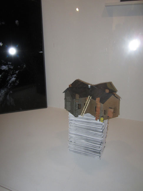
PAT McCARTHY, ‘Eden Schoolhouse’ 2016. stoneware, steel, paper, epoxy resin.
approx 12 x 12 x 16 in.
well, I don’t know what the hell was happening on the left, could anything be more dim, more black and more un-view-able ?
it’s only because I know Pat’s work so well, that I know how much they bungled this.
this is a painstakingly & lovingly hand-built, piece that needs to stand, or sit . . . on a pedestal at eye-level, so you can really gaze at length, and with clarity – at all the glorious / poetic / industrial detail.
it needs to be perched on a pedestal or table,
so you can walk around it and get the ‘big picture of the little wonder’ . . from all angles.
this was the only view. this is a 3D piece, a miniature replica of a 3D building.
this is . . NOT A PHOTOGRAPH.
. . . you need to WALK AROUND IT.
and even that STATIC view – was un-accessible, lying as it was, despite the stacking of the zines, too low to the ground.
like they say:
what I was supposed to do, twist my head off my body . . and lay it down on the floor – the better to see ?
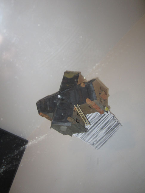
not to mention the lighting is horrible.
the floor and walls couldn’t be more boring if they tried, where’s Yayoi Kusama when you need her.
just joking. desperate.
a classic standard ‘gallery’ setting – would have been quite fine.
like how they did up that decade old . . WIILLIAM CHRISTENBERRY retrospective. (google it)
anybody out there – catch that ?
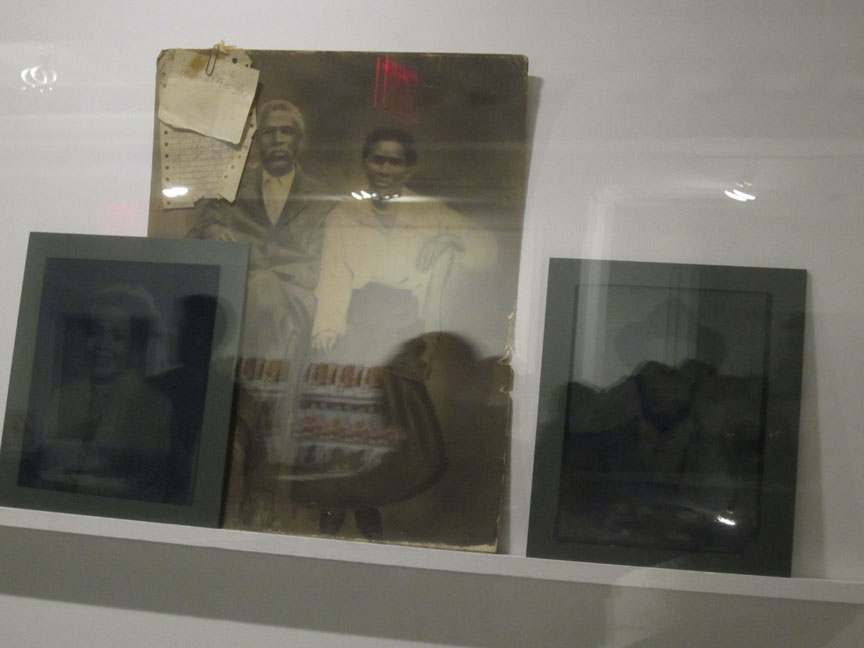
JESSE HOYLE, ‘(re)Write Yesterday’, 2016.
cyanotype on glass, paint, vintage photograph on loan from the Eden Historical Society, 28 x 12 in.
I mean, I guess this was meant to be ghostly, but I don’t think, quite as ghostly / as in absolutely un-viewable . . ghostly – !!
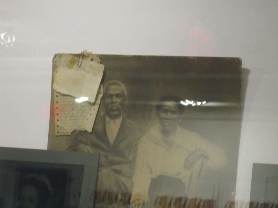
which is too bad, because it was . . really intriguing.
and I do so love . . photographs, all things vintage. history, rarely seen documents, and esp . . black American ‘story-telling.’
ps: they have a nice post card of that great, romantic / fizzy red SYLVAIN COUZINET-JACQUES ‘schoolhouse’ . . . at the front desk.
PHOTOS: NANCY SMITH
