LOREN MUNK . . ‘YOU ARE HERE’ – OPENS SAT FEB 15, 2014 / 6-9 PM
the show runs thru MARCH 15, 2014
FREIGHT+VOLUME – 530 W 24th St, Chelsea, NYC
read more about: LOREN MUNK aka JAMES KALM, the “artworld bicycling reporter-at-large.”
check out: THE JAMES KALM REPORT
my take ?
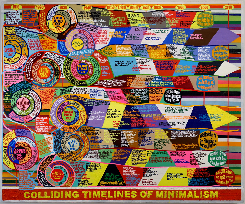
above all, LOREN MUNK is a great colorist, a painter . . . whose diagrammed canvases hold a huge amount of data . . a narrative that bursts forth with great energy. he is not so much skating on the slippery, sliding cutting edge, as he is obsessed with marking territory and linking history. animating the directions, rays and plays of . . of inspiration and influence.
make that histories.
of art. of New York City. of the . . scene. yes, even of . . the galleries that led the way.
and, obviously: he’s got to have some pretty incredible video archives.
he can paint, and he definitely has something . . to say.
his loud, joyous color sense, and the bright fluid patterns, remind me of early satin and silk ribbon quilts, esp log cabin confections, bold Amish quilts, and eccentric, dynamic turn-of-the-century . . crazy quilts.
in other words, I find in his work a great Americana !!
it’s about time, more artists from the great vivacious 80s . . get their due.

LOREN MUNK, ‘Colliding Timelines of Minimalism’, 2012-2013. oil on linen, 60 x 72 in.

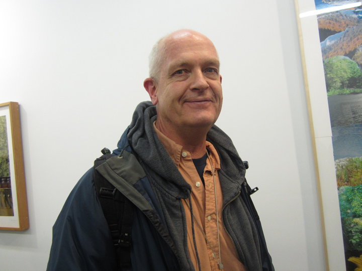
LOREN MUNK at the PETER HUTCHINSON opening, FREIGHT+VOLUME, NYC.
MARCH 7, 2013.
PHOTO: NANCY SMITH
~LOREN MUNK . . YOU ARE HERE |
Posted in The Bomb | By Nancy Smith | February 15th, 2014, 10:28am
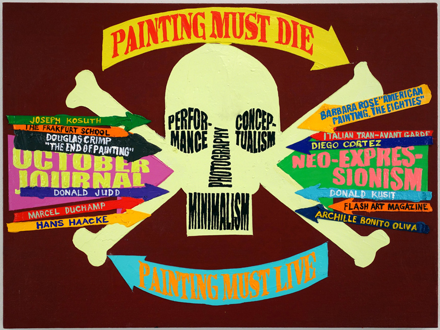
PAINTING MUST DIE . . to live ?
wow, how did we get from ‘light’ and ‘science’ . . . to SKULLS & CROSS BONES ?!!
I guess via, JAMES MOORE.
did you catch, that he serious rides . . high performance motorcycles ?!!
I wonder if his friends call him: TRON.
I know bad joke .. but still !!!!
funny, how deeply the ‘science of art ‘ . . resides on the dark side !!

LOREN MUNK, ‘Painting Must Die Painting Must Live’, 2013. oil on linen, 18 x 24 in.
LOREN MUNK is having a major show of his work at FREIGHT+VOLUME, opening tomorrow SAT FEB 15, 2014 / 6-9 PM
more on the show soon. just want to enjoy the ‘pure’ image for a while.
great ‘info graphics’, or what ?!!
Mr. MUNK, he’s also . . a GREAT, GREAT (BRUTE) COLORIST.
~LOREN MUNK . . PAINTING MUST DIE |
Posted in The Bomb | By Nancy Smith | February 14th, 2014, 12:40pm
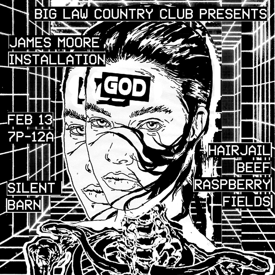
BIG LAW COUNTRY CLUB at the SILENT BARN – 603 BUSHWICK AVE . . .
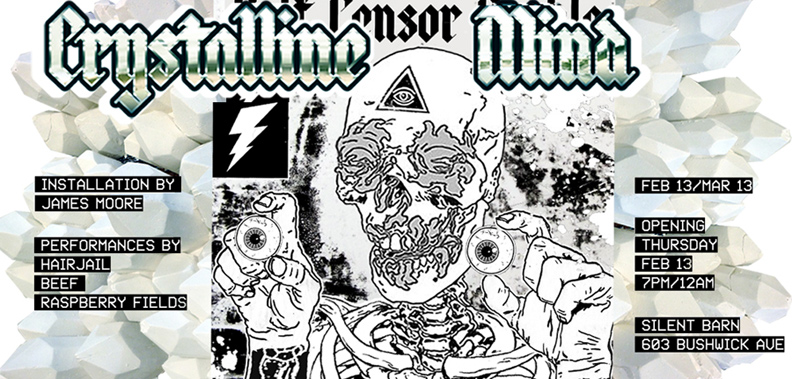
PRESENTS ‘CRYSTALLINE MIND’ – A SITE SPECIFIC ART INSTALLATION – by JAMES MOORE
OPENING THURS FEB 13, 2014: 7PM – 12AM / FREE 7-8 / 8PM-12AM – $5-$7 SLIDING SCALE / OPEN TO ALL AGES
THE INSTALLATION RUNS THRU . . MARCH 13, 2014 / SEE: BIG LAW COUNTRY CLUB
CURATED BY: ALISON SIRICO
WITH OPENING NIGHT PERFORMANCES BY: RASPBERRY FIELDS, BEEF, and HAIR JAIL.

haha, UNDERGROUND PLAYERS !! – PICK . . YOUR EYEBALL !!
CAN I HAVE – BOTH ?!!!!

from the press release:
“ARTIFICIAL LIGHTS overwhelm the exhibition space in an arch, simultaneously attracting then repelling those who enter. CRYSTAL SHARDS emanate from FLUORESCENT LIGHTS. Omnipresent, they inhabit all corners of the gallery acting as space generators and PSYCHIC extensions. Interconnected, they intertwine like a HUMAN NERVOUS SYSTEM. On the back wall, a mural depicts a powerful woman garnished by a crown of thorns, the PURE WHITE CRYSTALS which form an iron maiden around her. HALF HUMANOID, HALF CYBERNETIC ORGANISM, she staggers between an ORGANIC and TECHNOLOGICAL STATE. Imagery pervades with questions about the possible decline of the AMERICAN EMPIRE, while at the same time exalting images of classic American idealism and power. Illustrations allude to haunting eagles, the Illuminati, and alien cover-ups.
Like much of MOORE’S practice, ‘CRYSTALLINE MIND’, is a rhizome of dichotomies – it is an INVESTIGATION between the divergences of the natural and artificial world, the past and the present, the KNOWN vs the UNKNOWN. It reflects upon OUR BREAKING POINTS – the moments in which a situation can teether in either direction, but at that moment is caught fighting forcefully somewhere in between. It researches our sensory endurance and our primal systemic triggers of fear. The title, ‘CRYSTALLINE MIND’, eludes to our microbiological compositions and to our macro spiritual quests; the crystals are a metaphor for the sharp mind full of awareness and the wish for a more UTOPIAN society. ‘CRYSTALLINE MIND’ is about overcoming sacrifices made to a potential corrupting force and is an investigation into the possibility of evolution psychological states that lead to immortality.
JAMES MOORE . . . born 1986, Atlanta, GEORGIA currently lives and works in BROOKLYN, NY.
. . . is an interdisciplinary artist who creates work inspired from scientific models involving cosmic exploration and biology, horror and science fiction films and literature (and their function as psychological gateways for transformation), occult mysticism, American experience, and also . . enjoys riding high performance motorcycles, an action he sublimates into his art making practice.”

JAMES MOORE . . . at the PAOLA PIVI OPENING, GALERIE PERROTIN, NYC.
SEPT 13, 2013.
PHOTO: NANCY SMITH
I’ve followed JAMES MORRE’S work ever since I first met him at a BROOKLYN COMICS and GRAPHICS FESTIVAL – a few years back, where he was manning a small table of his works on paper. including some pretty intense & ‘gothic’ . . mushroom cut-outs !!
the most recent show I posted for him was 2 summers ago, a pretty ‘psychadelic’ pop-up at MR. FINE ART.
see: NEON AND CANDLES – OPENS TO-NITE at MR. FINE ART
see: PIX FROM THE OPENING – NEON AND CANDLES
see: more, JAMES MOORE – NEON AND CANDLES

check out: JAMES MOORE – ONLINE PORTFOLIO
I’M THINKING . . it’s somewhat pretty ironic – he hails from Atlanta, GEORGIA !!
the epicenter of that huge, killer winter storm just about to devastate that area, again !!
well, you have to give James credit, proof is in the pudding.
with all his new age ‘science’, crystals, ‘light’ games, and intuits . . he did get himself !! one friggin step ahead of . . murderous, treacherous, ole analog ole school . . mother nature.
must be some mighty bad karma . . down there in GEORGIA.
forget your crystals, light, and micro-future science . . KARMA is a bitch.
ya . . gotta be good. talkin bout: BIG LAW !!
the BIG LAW, if it isn’t Karma, I don’t know . . what else it could be.
BIG LAW COUNTRY CLUB – great name, for an art gallery.
~JAMES MOORE . . BIG ART PARTY / BROOKLYN / THURS |
Posted in The Bomb | By Nancy Smith | February 12th, 2014, 11:30am
there’s so much going on out there . . this month.
some real good stuff.
but before we move on, ONE LAST LOOK.
ONE LAST ‘TRIPPIN’ the light, lightly !!
ONE LAST ‘TRIPPIN’ . . the light fantastic !!
KEITH SONNIER – ‘ELYSIAN PLAIN + EARLY WORKS’
JAN 24 – FEB 22, 2014
PACE – 510 W 25th ST – CHELSEA, NYC

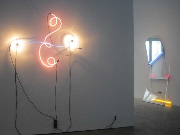
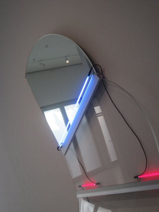
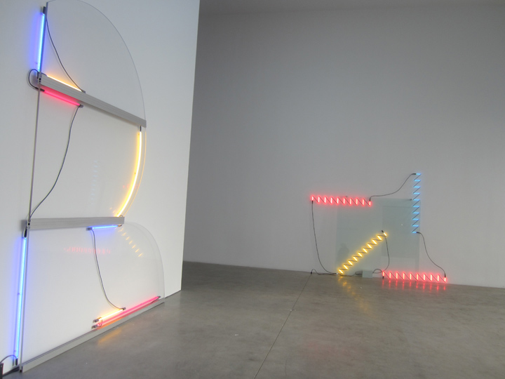
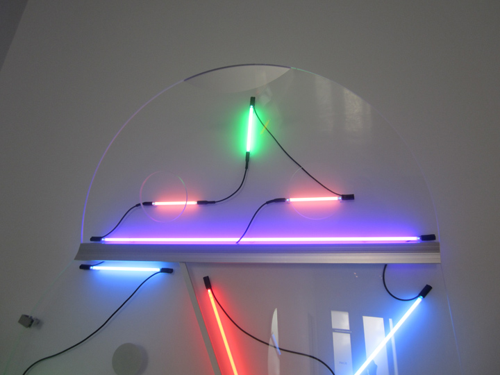
KEITH SONNIER, (left) ‘Neon Wrapping Incandescent’, 1969. and, (right) ‘Mirrored Slant’, 2013.
this is an interesting juxtaposition of .. an early work, and a later, as in ‘happening . . right now’ piece.
we lose the incandescent bulb, the roping neon tube . . and gain instead, as dancing partner: a shaped flat mirror, and a shaped flat acrylic surface. more ‘ghost’ in the machine . . less ‘drawing’.
more . . ‘scientific’.
it’s also pink and blue, though the pink is more acid, but that sharp rind . . yellow – nails it.
the neon light elements move further back into the ‘distance’, and decrease in ‘volume’ – but their dynamic, the visual play of their ‘sharp’ color hues, and minimalist spacing . . is just as strong – wherein lies the great beauty of this piece.

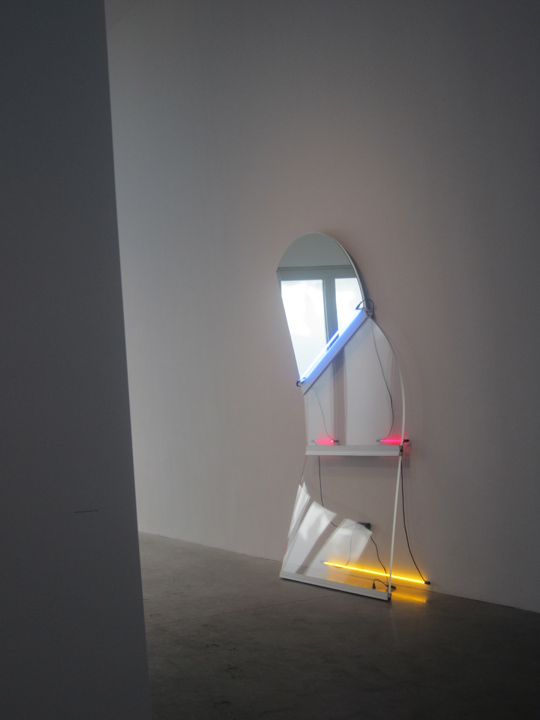
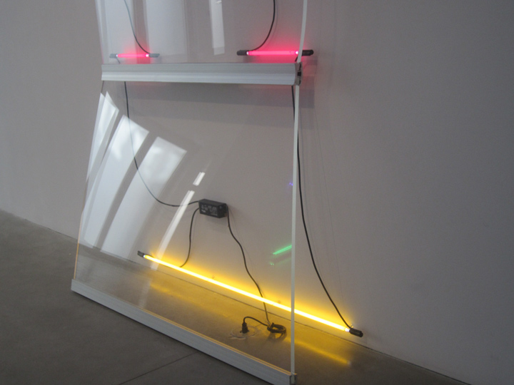
KEITH SONNIER, ‘Mirrored Slant’, 2013. neon, glass, mirror, acrylic, aluminum, electrical wire, transformer.
9′ 6-1/2″ x 76-1/2″ x 17″.
($225,000)
reflection, refraction. transparency, hue. dot dot dash.
what I also love about this piece, is . . how anthropomorphic – it is !!
it looks just like a little robot man – from a future planet !!
or maybe even us, when our bio/wired digital integration is . . complete.
what . . they say: a brother from another . . mother.
I was thinking, too bad it’s not wireless, but then again, maybe it’s just ‘charging’ !!
I mean there is always going to be the ‘juice’, the energy source, even in TRON.
but if you also read about the inherent ‘fold’ and ‘open’ power in micro bacteria, you know what.
maybe . . NOT !!
yep: energizer bunny !! Bacterium !!
see: BACTERIA as GENERATORS of ELECTRICITY – WALL ST JOURNAL
(if the link doesn’t work for you, just re-paste ‘THE ENERGIZER BACTERIUM’ in your browser / as if we all don’t want to get paid for content . . )

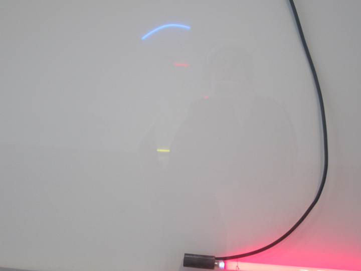
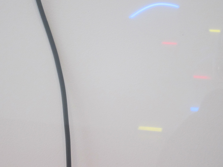
it’s interesting to ‘integrate’ with the piece, even though it’s flat and structurally ‘finite’ on the wall, as you move, you can see different depths of field in the reflections.
so, go on: break that . . ‘plane’ !!
it’s also interesting to compare the ‘mirror’ to the ‘acrylic’ surface . . very subtle, but quite the game changer.

I absolutely adore how those two dashes of acid pink sit there, so exquisite.
like two . .
little hands.
and then .. how the bottom acrylic panel extends slightly outward, with almost human balancing stance, and then, how the yellow neon tubing was put against the back wall, instead of up against .. that jut forward.
it’s all those little details that bring great humanity, and beauty, to the piece.
it’s like the opposite of ‘brutality’.
it’s like the hand of god, the presence of man .. in its most graceful aspect .. that you would follow, and hope could change the world, and it does . . for the brief moments you spend with it.
it’s the opposite of ‘Wolf of Wall Street.’
that’s . . the take-away.

it’s definitely: interactive.
finite / infinite.

it’s definitely: the ghost in the machine !!
some people trade in hedge funds, penny stocks, and IPOs . . and others / in dash dot dash . .
PHOTOS: NANCY SMITH
~KEITH SONNIER . . ONE MORE LOOK |
Posted in The Bomb | By Nancy Smith | February 10th, 2014, 3:25pm
KEITH SONNIER – ELYSIAN PLAIN + EARLY WORKS
JAN 24 – FEB 22, 2014
PACE – 510 W 25th ST – CHELSEA, NYC
see: SONNIER: Elysian Plain + Early Work / Gallery

KEITH SONNIER, ELYSIAN PLAIN + EARLY WORKS
left: ‘Lunar Slice’, 2013. neon, acrylic, aluminum. electrical wire, transformer.
11’1″ x 9’3-1/2″ x 4″
($250,000)
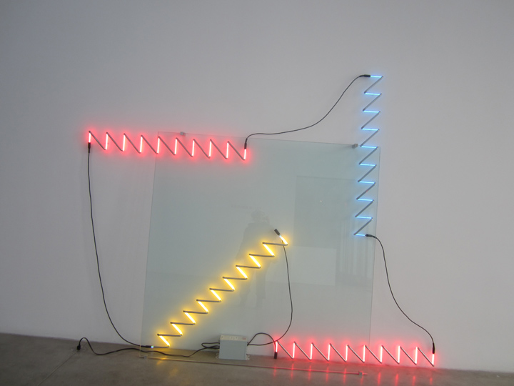
right: ‘Zig Zag Square’, 2013. neon, enamel paint, glass, aluminum, electrical wire, transformer.
96″ x 9’11” x 9-1/2″
($175,000)

KEITH SONNIER, ‘Zig Zag Square’.
after being so entranced by the use of light, esp neon light – in the raw 15 WARREN St. underground pop-up show, I was drawn to see this exhibit by KEITH SONNIER, one of the the founding fathers of neon light . . wall sculpture.
and it did not disappoint !!
damn, if I wasn’t entranced, all over again.
yes, it was blue chip. yes it was white boxed, but yes, it was also . . supremely – on the ‘edge’.
right at the very point of: well, basically . . great art.
totally abstract, it was evocative of . . nothing except, the subtle intersection of art, creation and man.
it was evocative of ‘nothing’ . . except: supreme creative judgement.
it was living .. zen. perfectly balanced, perfectly at ‘play’.
just like 15 WARREN . . colored light reflected and refracted like a 4th dimension . . playing with you, as you took a foot forward, or changed viewpoint. dancing, ever so lightly, but dancing, yes.
an interactive plane, from a stationary art piece, yes.

the workmanship was precise. and very light handed.
but despite the perfection, and technicality, yes: the ghosts of art to be seen . . came out to play !!
I found myself wondering what ARSENIY, and all the other young, new age & ‘under-budget’ artists of 15 WARREN, would be thinking of these sleek ‘corners’ !!
all this hi-budget and very pro handling, including the sleek metal wall mounts.

light at rest / stationary, and . . at play.
Mr. Sonnier (now 72) “gained recognition in the 1960s as part of a group of artists, among them RICHARD SERRA and BRUCE NAUMAN, that experimented with nontraditional materials for sculpture – from found objects and organic matter to video and light.” – a quote from a very appreciative review by ANNA RUSSELL, that posted in the WALL STREET JOURNAL, a few weeks, ago.
most interesting, also vis-a-vie the 15 WARREN ST show, which included much ‘light’ – but also dialoged so insistently . . on the childhood influences . . of these young downtown NYC artists, many of whom who grew up in the shadow of the Twin Towers inferno, was the last 2 paragraphs:
“The artist said his fascination with neon began in his hometown of Mamou, Louisiana, about three hours outside New Orleans. ‘I grew up in the dark – when it was dark at night, it was dark,’ he said. ‘You had the stars and the moon and the neon sign of the roadhouse,’ one of the few bright spots after sunset.
‘We always seek out the light and the warmth,’ Mr. Sonnier said. ‘Even if it is this artificial light.’ ”
read the article: ‘An Artist Who Is Always Looking Toward the Light’ – WALL STREET JOURNAL

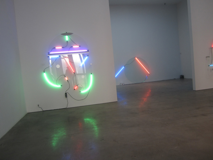
KEITH SONNIER, ‘Lobbed Claw’, 2013. neon, acrylic, enamel paint, aluminum, electrical wire, transformer.
93″ x 75-1/2″ x 15-1/2″
($225,000)
not too whimsical. nowhere near ‘sweet’.
just right.

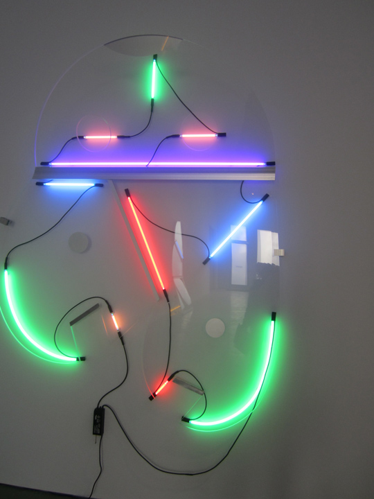
detail, ‘Lobbed Claw’.
a tinge . . sci-fi.

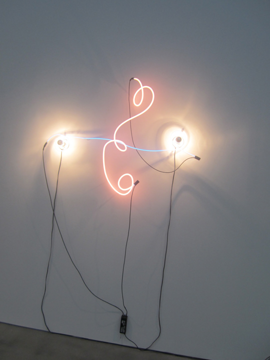
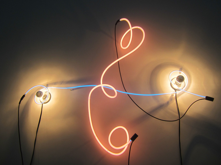
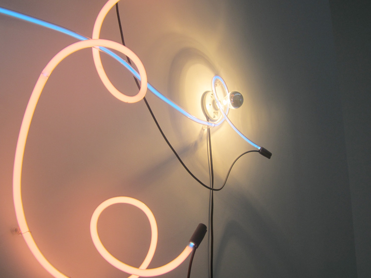
KEITH SONNIER, ‘Neon Wrapping Incandescent’, 1969. neon, incandescent light bulbs, transformer.
94″ x 64″ x 13″.
($185,000)
this was an example of an early work.

even in the early work, the play of the elements was precise, supremely balanced.
exactly, on .. point.
graceful, playful, but not too playful.
maybe ‘entrancing’, really is . . the right word !!
pink and blue are such American colors. such early colonial, founding colonist colors. if you study early American quilt arts, and, the big revival of the form, in the 1940s, and including decorative embroidery from that time – you well know, this shade of pink and blue. it backed many a quilt. it livened many a threaded & hand stitched nursery ‘sampler’.
if you have ever stopped to watch a North East American sunset, then you know, why . . these are the colors of American folk art.

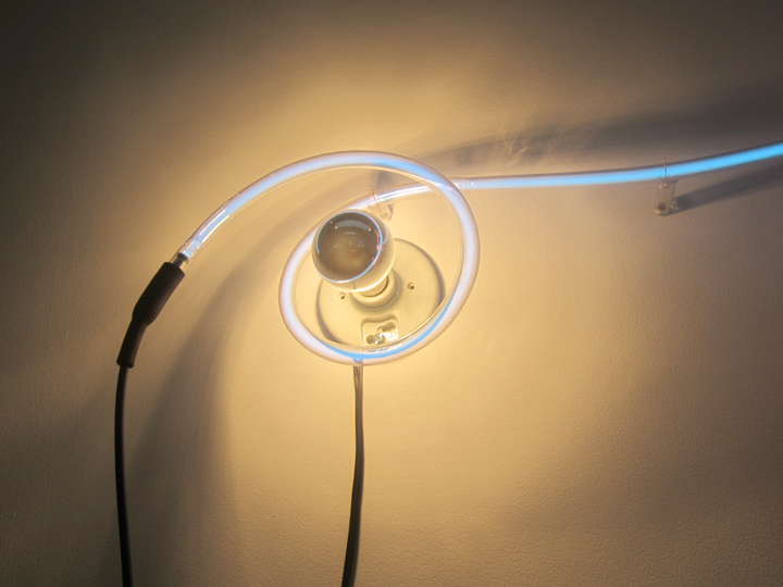
this early piece plays the colored neon tubing . . around incandescent light bulbs.
electricity, and the light it produces is just as much an American folk tale, as . . quilt stitching.
the innovation of the founding fathers.

even in his early works, Mr. Sonnier had the technology down. precise.
not to forget the . . F-L-O-W.
the elegant, slightly twisted . . glow of the flow.
supremo.
under-statement . . is a hard thing to do.
PHOTOS: NANCY SMITH
~KEITH SONNIER . . NEON LIGHT |
Posted in The Bomb | By Nancy Smith | February 5th, 2014, 4:19pm

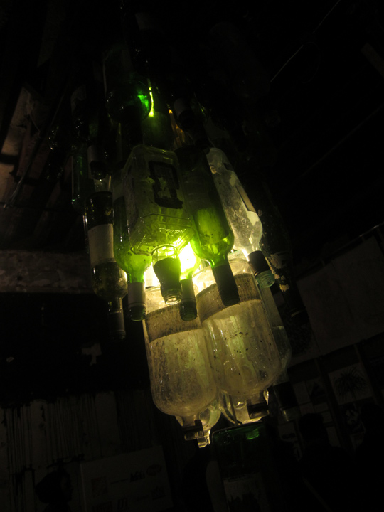
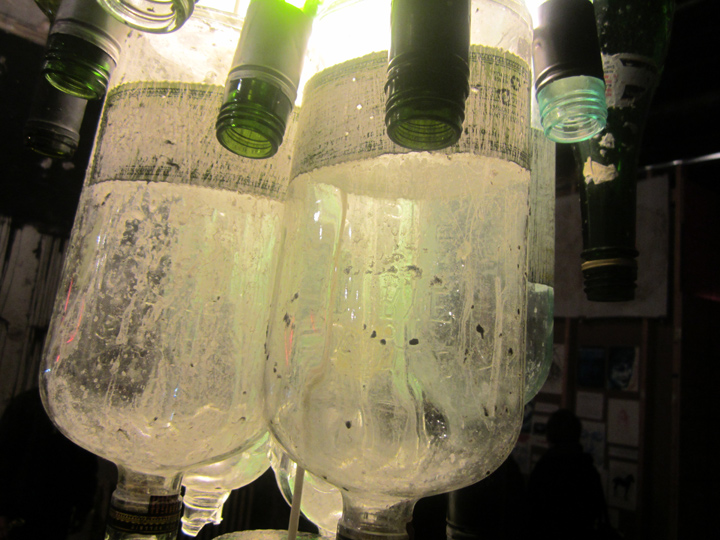
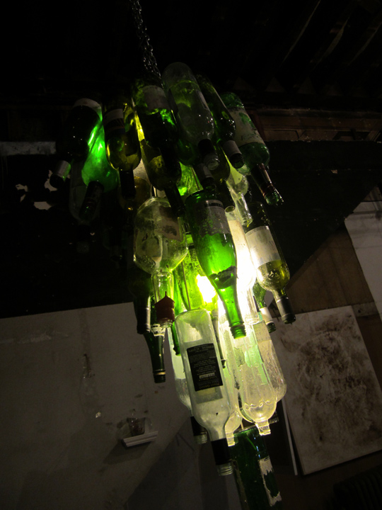
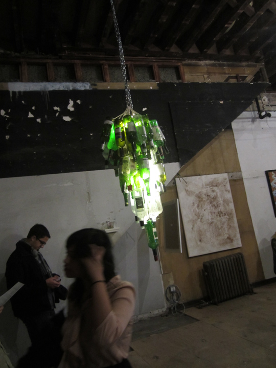
a lime green light emitting . . recycled bottle ‘chandelier’. .
greeted you – at the show’s main floor entrance.

innovative, spirited. sad. funny. futuristic, elegant and clumsy, but g-l-o-w-i-n-g.

glowing acid shades of green, like a veritable dracula of light . . fix-tures !!

this light fix-ture stood, or I guess ‘spoke for’ . . a lot of what this one week show, put together in less than 2 weeks, by 3 young downtown artist / curators, SEAN VEGEZZI, ABELINE COHEN and ANDREW KASS . . was all about:
namely,
1. raw-ness . . a thrown-together hyper party-mastery of the new, splashed onto the old (building).
2. freshness, as in cutting edge expression, arms asunder . . world !!
3. technically: site-specifc under-pinnings . . of all manner.
4. thematically: childhood, and often, specifically a Tribeca, NYC childhood.
5. the Tribeca twin towers that were crashed down. directly, implicitly, or just bye the way . . as fallen empires, go.
6. TRI. TWIN. SINGULAR. a lot of word, mind & life gaming. mapping. reaching out for.
7. and . . l-i-g-h-t.
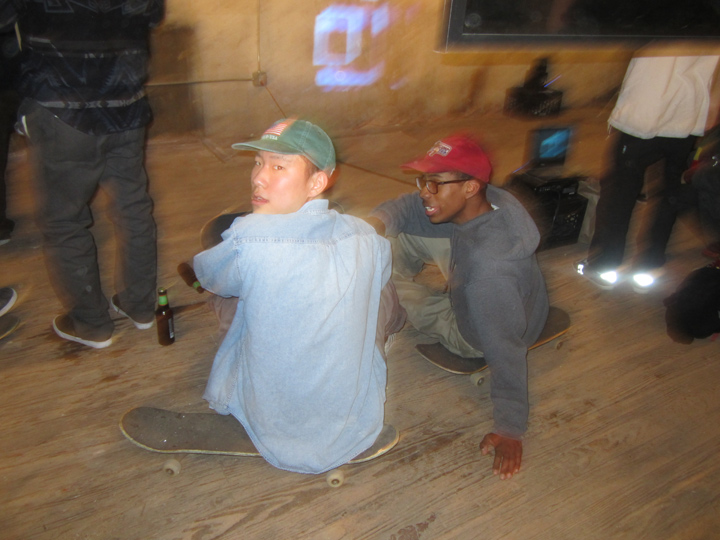
light flickered, and light cast. light produced as above, and light pin-pointed. light as by-product, and light as subject . . light as fire, and light as candles. light as reflection and light as refraction / both off-shoots of digital screens pulsating here and there. or dancing: thin strings of party lights overhead. serious: florescent tube lights that framed windows, glowed .. pink. defined depths, turned alcoves into hauntings, lit open coffins, lit tiny subterranean gardens . . as much light as could be defined in as many different ways, and s-t-i-l-l, the place was dark, and mysterious and spoke to the nighttime, the New York City night. all the children of the night . . had come out to play.
light sparked, life energy crackled . . the real NYC downtown ‘underground’ had came to life, lit up . . and spoke up.
for a moment, outside the usual routes & rituals of ingrained & over-grown art system – it had flared up . . into being, with a huge walking on the dark side . . gorgeousness.
a huge bang-up rebel outlaw bonfire !!
of an artist-run, found space, one week long art show party opened year . . 2014.
apparently, surprisingly. the downtown heart, is alive and well,
and keeps on . . beating.
15 WARREN ST, 10007
PHOTOS: NANCY SMITH
~15 WARREN ST . . NIGHT LIGHT |
Posted in The Bomb | By Nancy Smith | January 31st, 2014, 10:14pm

catchin’ the scene / checkin’ out the vibe.
diggin’ the new art ‘rays’ . . . .
literally. note the diversity, of the light sources . . duh.
15 WARREN ST, 10007
MORE PIX, to follow. one more post !!
GIVE ME . . LIGHT !!
PHOTOS: NANCY SMITH
~15 WARREN ST . . NEW ORDER |
Posted in The Bomb | By Nancy Smith | January 31st, 2014, 3:47pm
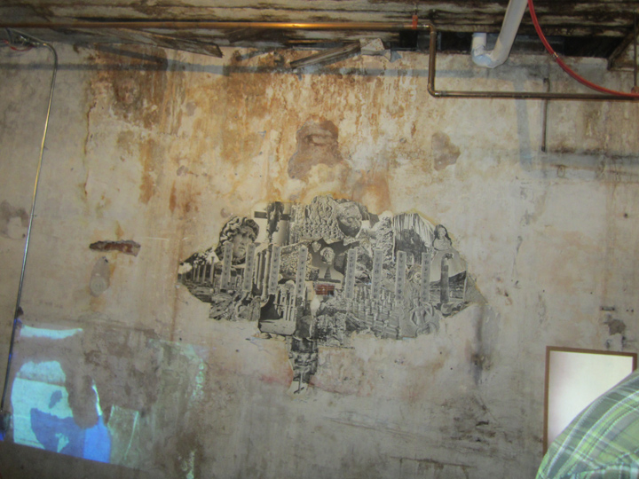
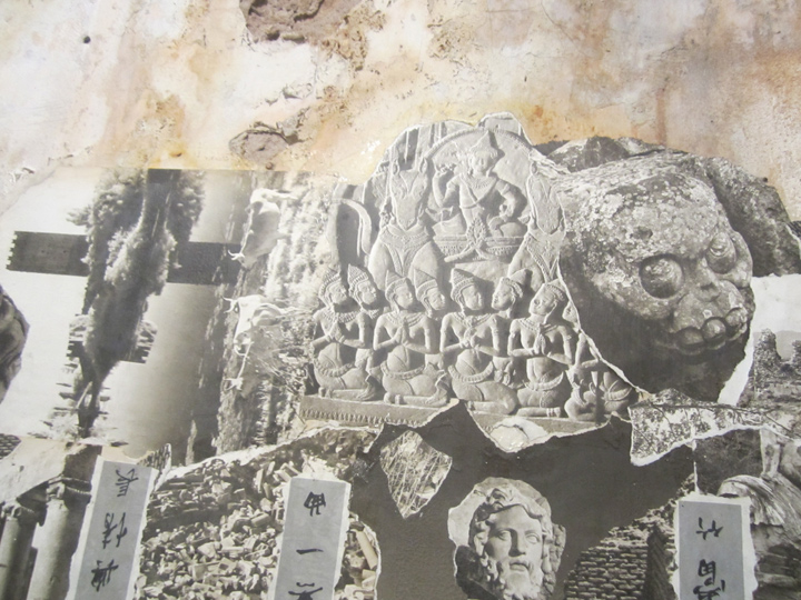
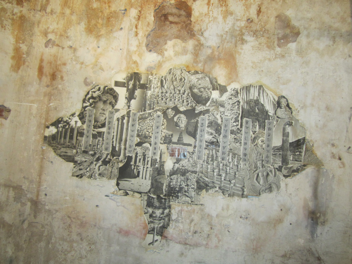
NEW GENERATION . . ARTISTS.

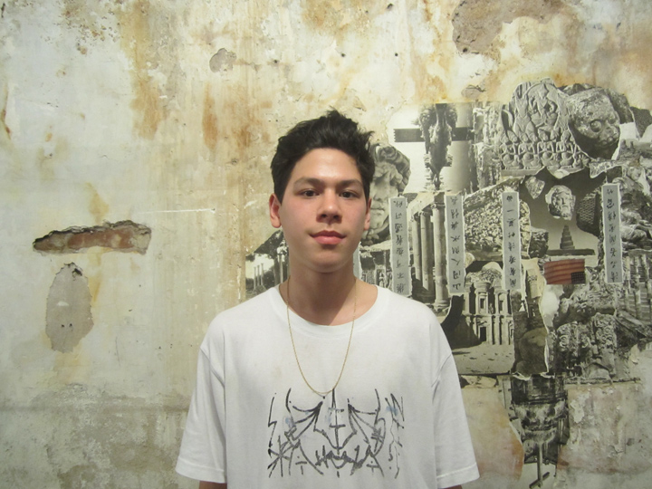
ADAM ZHU.
this was a first time / debut exhibition . . for this young artist.

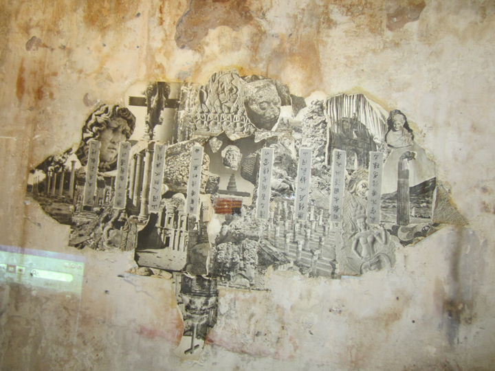
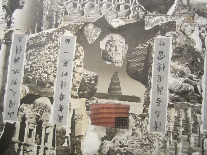
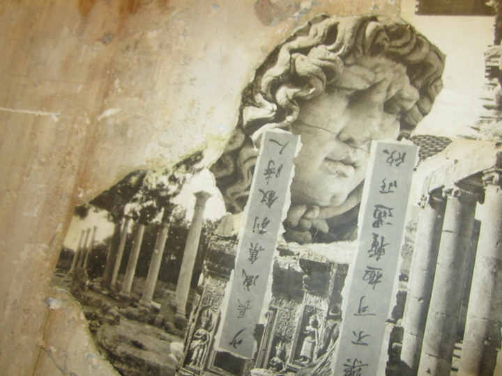
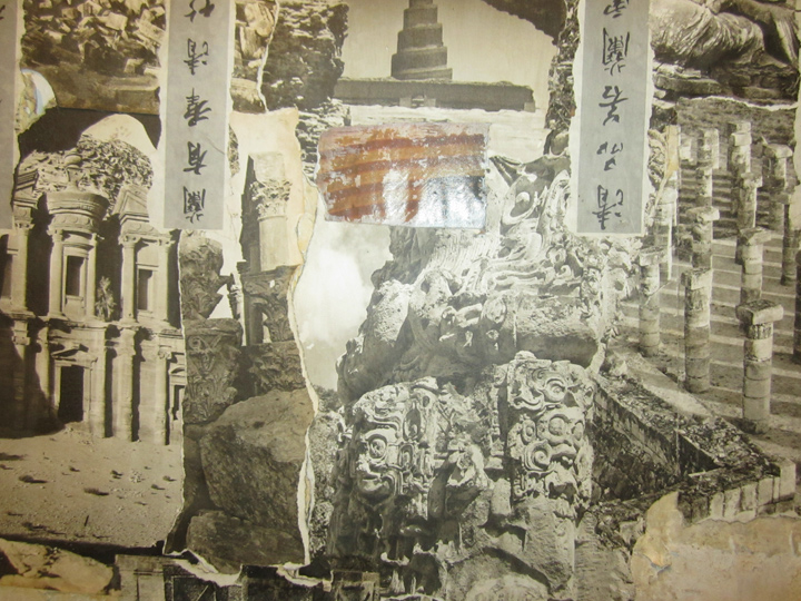
a sienna grey monotone, a site specific collage . . that looked to be pasted directly onto the raw wall.
it was both graphic, eroding, full of history, and . . political.
if you didn’t know Chinese, you didn’t know what the vertical banners said.
but even so, and perhaps, because of . . . this piece spoke to a lot of people.
I saw it pop-up in the online dialog that immediately sprung up, following the opening night . .
the other thing that struck me, from my vantage point of observing the cutting edge scene, the so-called ‘underground’ in NYC since the early 80s . . was how consistently some people just land like . . cats.
they land . . right on the thin fine line, the vibrating edge – in the heart of a huge scene within a huge ‘art’ focused city. the power of the individual voice vs the mass momentum.
for sure, that’s one of the things that makes covering the ‘frontier’ in New York so interesting, this consistent dynamic of landing so perfectly, in such a vast environment. and, making your ‘singularity’ mark.
New York is very very magical that way.

the piece worked just as perfectly, within the raw confines of the show – it was a ‘perfect’ storm.
from the the eroding wall, the old copper pipes overhead, to the reflections of new media, and light (!!) from the sides.
cut and paste.

the collage spoke of lost civilizations, eroding empires, history. the rites of time. entropy.
virtual time travel via the diverse cultural pathways of past artistic visions, & . . glories.
but: the American flag ?
upside-down. and in color. blood .. red.
and dying, seriously.

the piece seemed to be dominated by a heroic ‘sadness’.
a kind-of overall Greek tragedy blow-out. human civilization .. flawed. the Lotus eaters.
even ancient civilizations that were capable of such heights of artistic wonder, fall prey to political destruction.
and even on a personal destiny: we are born . . to fail. or at least, surely to struggle.
it made me think of Simon.
it made me think of JOE BRADLEY, and his abstract story, of last year. but still the same story: the Lotus Beaters.

and, the . . ferocious ancestors, they all knew:
walking on the face of the earth, is not such a gentle . . gambol, after all.

all the ancients knew this. Greek, Hindu, Mayan . . Minoan. whatever.

when people say . . a work of art is: authentic, this is what they mean.
it resonates . . without needing an accompanying verbal narrative.
it connects to an untapped, or unspoken knowing-ness, and willingness . . within the intuitive, collective unconscious of each individual viewer, who can walk away with his own . . message, and ‘meaning’.
the powerful magic of the piece . . seemed to find a ‘echo’, or a ‘sign’ . . in the eroding wall.
for sure, that was some ancient god’s all-seeing ‘eye’ . . hovering, a-b-o-v-e.
APOPHENIA
PAREIDOLIA
ALGORITHM
TO PROCESS . . . KNOWLEDGE.
15 WARREN ST, 10007
MORE PIX, to follow.
PHOTOS: NANCY SMITH
~15 WARREN ST . . NEW ART |
Posted in The Bomb | By Nancy Smith | January 30th, 2014, 9:27am
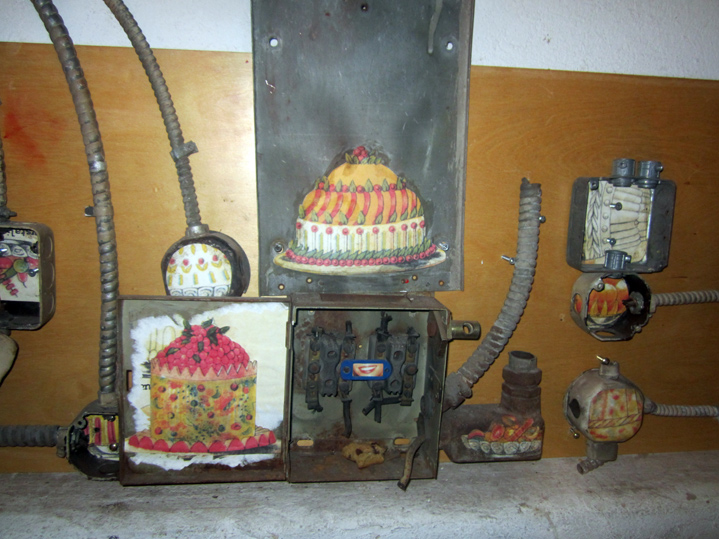
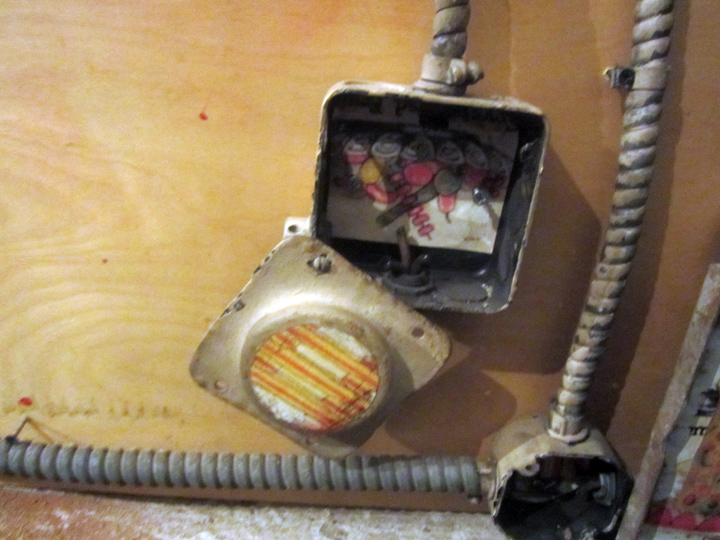
GIRL ART ?

these pretty little paintings were found among an array of old electrical ‘findings’ . .

they couldn’t be more than 4 x 4 in. ea, maybe 4 x 6 inches at most, site specific tour de force !!
I’m thinking they speak to a female’s gentle hand . . .
and peaceful i-m-a-g-i-n-a-t-i-o-n !!
as well as to: childhood . . . esp children’s book illustrations, ca. 1980s.
the sunnier side of . . growing up.

they were there . . on the left, halfway down a staircase.
15 WARREN ST, 10007
MORE PIX, to follow.
PHOTOS: NANCY SMITH
~15 WARREN ST . . GENTLE ART |
Posted in The Bomb | By Nancy Smith | January 28th, 2014, 9:33am
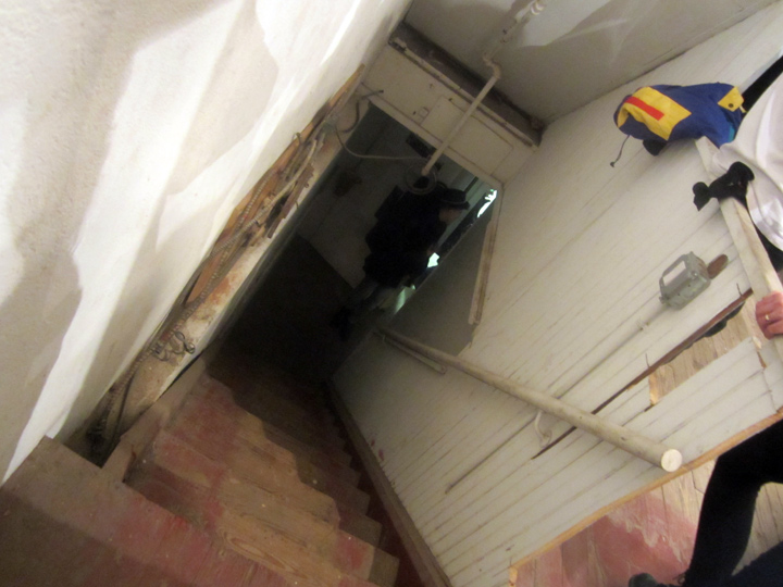
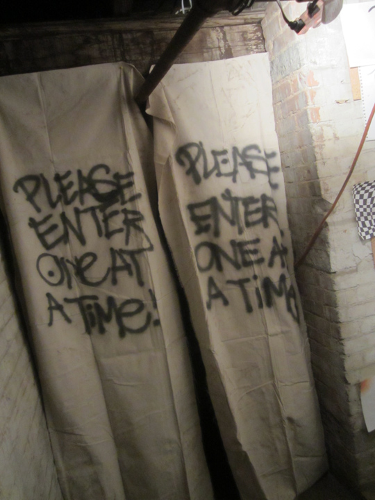
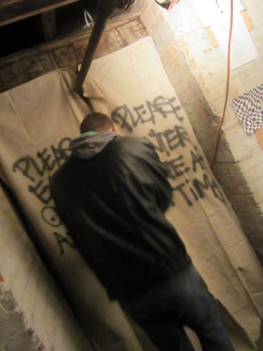
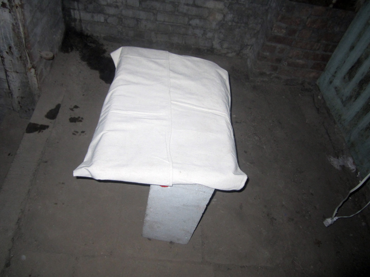
BOY ART ?


15 WARREN STREET, 10007
MORE PIX, to follow.
PHOTOS: NANCY SMITH
~15 WARREN ST . . HARSH ART |
Posted in The Bomb | By Nancy Smith | January 27th, 2014, 11:06am

