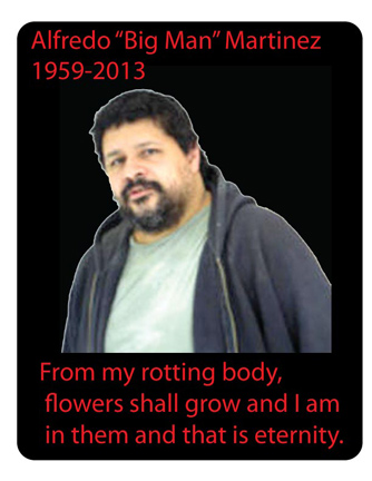
ALFREDO MARTINEZ – MEMORIAL ‘CARD’ – BY MATT ENGER. NYC, APRIL 2013.
actually not so funny, esp since the guys behind this wanted me to post an obit – like it was for real. they weren’t really being mean, they just wanted to, I’m guessing .. pump up the price of the artwork and get the money flow started ?
as if . . .
I think what I really responded to was the poetic text .. living on thru flowers.
that was the good part.
and that the deep dark edge .. of black humor, even in the face of real-time tragedy, still lives on in the deepest, darkest reaches of the NYC underground .. art scene.
just saying, as opposed to Sagmeister’s ‘NOW is BETTER’ package.
which is worse ?
if you even want to follow, I know .. it’s a s-t-r-e-t-c-h.
too many ghosts and too much violence. the human condition is pretty s-a-d.
we’re just so damn b-i-o. what do we expect. literally .. we are just blood and guts.
and top of it all. if it’s not for being totally messed up. psycho. faulty wiring, bad genes. then it’s for being competitive. greedy. territorial. and lost. and then accidents kick in too. fate ? how come nobody talks about ‘fate’, anymore.
if we weren’t bio – and totally lived on as ciphers, avatars .. then what ?
what if they could just put your brain on a hard drive, and into another test tube matched body. would you opt to be a drone .. to escape tragedy.
a world without tragedy, I mean isn’t that the ultimate future shock .. nightmare.
TOP TEN WAYS TO BUG – ALFREDO MARTINEZ
1. Start a false campaign announcing that he is dead.
2. Add 10 years to his actual age.
3. Invoke his dad Pedro’s name as the RSVP contact for the soon to-be-announced memorial.
4. Refuse to sell a phony Basquiat for him.
5. Get evicted from your tony Park Ave Apt for throwing loud, drug-fueled all-night parties .. so he has nowhere to crash.
6. Lose the farm .. so he has nowhere to crash.
7. Tell him CHINA .. is on the phone.
8. Tell him FEMA .. is on the phone regarding that little SHOOTING GALLERY GIG .. in WE LIVE IN PUBLIC.
9. No, just because Simon died, doesn’t mean you can move in.
10. and, yes the SENATE wants YOU – as poster boy for gun control.

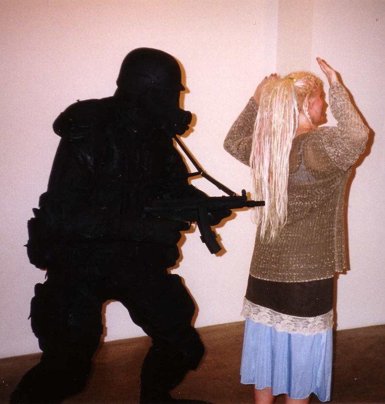
ALFREDO MARTINEZ, ‘REPLICATE WEAPONS’, hand-built from found parts, 2001.
COLLECTION: ANDY MORRIS
first exhibited in …
‘QUIET, GUNS & QUILTS – JOSH HARRIS, ALFREDO MARTINEZ & NANCY SMITH’
JUNE 26 – JULY 20, 2001
SILVERSTEIN GALLERY, 520 West 21st St, Chelsea, NYC

on the left: ALFREDO MARTINEZ, ‘PIG MAN’, life size sculpture, found parts, 2001.
‘QUIET, GUNS & QUILTS’.
that’s SISSEL KARDEL, on the right.

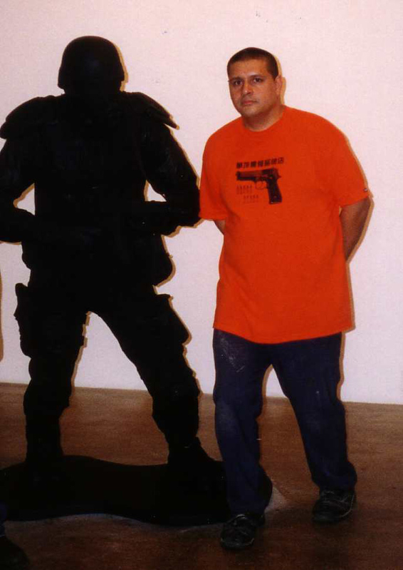
ALFREDO MARTINEZ with ‘PIG MAN’ at the opening.
‘QUIET, GUNS & QUILTS’.

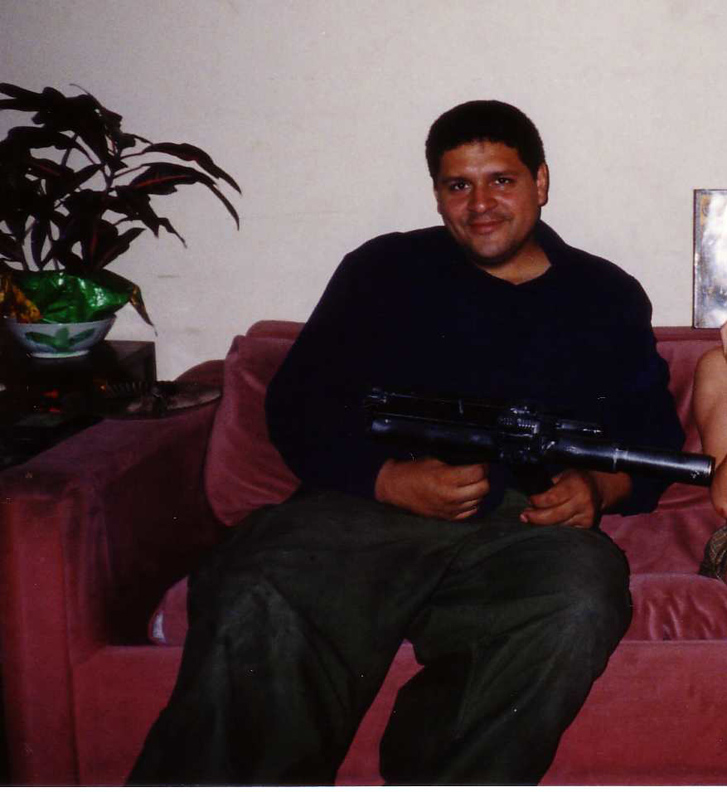
ALFREDO MARTINEZ with one of his home-made ‘Saturday Night Specials’. NYC.
OCT 30, 2001 .. yep a couple of weeks, after 9-11.
yes, that 9-11.
CHECK OUT: WE LIVE IN PUBLIC – THE OFFICIAL WEBSITE
ALL PHOTO BY & COPYRIGHT: NANCY SMITH
~ALFREDO MARTINEZ .. DEAD or ALIVE |
Posted in The Bomb | By Nancy Smith | April 19th, 2013, 2:40am
NEEDLES & PENS, TBW BOOKS and TWIN PALMS PRESENT:
‘A PERIOD OF JUVENILE PROSPERITY’ by MIKE BRODIE
BOOK LAUNCH & SIGNING at NEEDLES & PENS – FRI APRIL 19, 2013 / 6-8 PM
NEEDLES & PENS – 3253 16th ST – SAN FRANCISCO, CALIFORNIA


MIKE BRODIE, 2006. PHOTOGRAPHY BY PAUL SCHIEK – IMAGE C/O LOS ANGELES TIMES/PHOTOGRAPHY
CHECK OUT: reFramed: In conversation with MIKE BRODIE – posted by BARBARA DAVIDSON. APRIL 8, 2013 / LOS ANGELES TIMES
&
FOR DEFINITE SURE .. don’t miss the slide show – at the top of that post !!
CHECK OUT: TRAINS, PUNKS, PICTURES AND BOOKS YOU MAYBE SHOULDN’T READ – by CLAIRE O’NEILL. APRIL 12, 2013 / NPR
which begins
.. “before he discovered trains, BRODIE was bagging groceries in PENSACOLA, FLORIDA.”
he meets a girl, she takes him back home, “and that’s where, for the first time, he met a train-hopper, an 18-year-old Tennessee kid . . . ”
~MIKE BRODIE .. A PERIOD OF JUVENILE PROSPERITY |
Posted in The Bomb | By Nancy Smith | April 18th, 2013, 7:50am
wow, what a BUBBLE we do live in.
I only meant BLEEDING EDGE, as a metaphor, for cutting edge art .. I didn’t expect to see blood and gore and carnage all over the media and in the streets of Boston – just a day or so later.
thick and red .. on the streets.
SIX THINGS: SAGMEISTER & WALSH
MARCH 15 – AUGUST 4, 2013
THE JEWISH MUSEUM – 1109 FIFTH AVE, NYC
at any rate it shows you just how relevant art really is .. to the global conversation.
SAGMEISTER might not have it called it, exactly right .. but he asked the right questions.
so .. yes life is a slippery slope. (was it ever not ?)
so .. yes, maybe it was just the calm before the storm.
SO:
no, I don’t think it’s a BETTER time in human history – just a very different one. the implications and impact of diverse cultures colliding because of the web .. is just as ‘exponential’ in potential as any other impact digital technology .. is playing out.

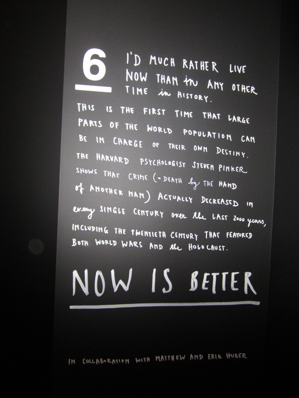
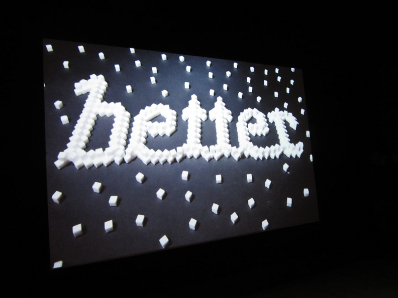
this is the actual text that ran with the SAGMEISTER & WALSH project no. 6 – NOW IS BETTER / animated video.
(in collaboration with MATTHEW & ERIK HUBER.)
it reads:
“I’d much rather live now than in an other time in history. This is the first time that large parts of the world population can be in charge of their own destiny. The Harvard psychologist Steven Pinker shows that crime (Death by the hand of another man) actually decreased in every singe century over all the last 2000 years including the Twentieth Century that featured both world wars and the Holocaust.
NOW is BETTER.”
no, Now is different.
and a few, as opposed to hundreds of thousands, of terrible bloody mutilations .. arriving graphically, in your face and immediately .. around the world simultaneously .. does have an impact .. that cannot be denied.
it’s just different.
it’s also .. ironic that the mass universe of the web information today, makes smaller numbers – more lethal ?
it might not play out in the body bag count, but it takes a toll on all, and at all levels, not the least which is freedom of speech and .. whole generations not only growing up under threat, but living in downsized dreams and opportunities due to the vast sums of money & energy diverted to counter-terrorism & hi-level security.
I’m thinking .. and it’s just my PERSONAL take .. that as a ‘graphic’ designer, crossing the divide into no-holds barred design / content & then onto .. artist, by asking the BIG questions, and opening up a cross-cultural dialog .. that therefore, hopefully results meaningful thought and reflection, not to forget : HAPPINESS (!!) .. that SAGMEISTER comes off as a being in a BUBBLE .. with some of his conclusions, because he is a professional – ‘PACKAGER’.
he makes his living, bottomline – packaging goods, and services and websites, etc etc. and as such .. he is used to having a tidy & attractive .. wrap.
but consider .. SETH MacFARLANE & ‘THE FAMILY GUY’ . . .
it is SETH MacFARLANE’S job, and ART .. to make cutting edge .. comic book genre / humor that hits the ‘commentary’ button. i.e. more commonly termed: adult cartoon.

PHOTO: AP via DAILY MAIL
caption reads .. Pulled: Fox will not re-air an episode of the adult cartoon ‘Family Guy’ that depicts mass deaths at the BOSTON MARATHON
the episode, which first aired this past MARCH 17, 2013 and is becoming notorious through a souped-up edit going viral on Youtube .. (read the article ..) .. “features the show’s main character Peter Griffin, unwittingly befriending a terrorist who is planning to blow up a bridge and then accidentally detonating two bombs using a cell phone the friend gave him. In a separate and unrelated scene, the episode depicts Griffin reminiscing about how he won a former BOSTON MARATHON by mowing over runners in his car.”
surprise surprise .. some people don’t like being made fun of . . even if they deserve it (?)
and two: sticks and stones .. it’s only a cartoon.
though, I dunno, you know what they say: maybe the pen is mightier than the sword ?
I don’t think it’s a far stretch to say this episode might have triggered things, or given up a ‘tasty’ target . . considering the fact that ‘they’ say, in a nutshell, pressure cooker bombs .. can’t travel far, or they blow up prematurely. which I think might mean, they also can’t be built too far back .. before they are supposed to go off.
not that terrorists don’t have their own sense of humor. did you catch the name of the article that details how to make a homemade bomb like this .. that was put out by, I read this in a few sources .. Al Qaeda’s Yemen branch in 2010, in the 2010 issue of “Inspire” Magazine .. ( yes, this is for real !!) under the title:
“Make a Bomb in the Kitchen of Your Mother.”
well there’s the cultural diff in a nutshell, DIY bomb manuals vs gross American TV humor.
that’s also, further demonstration of what I mean .. by the insidious nature of this century’s war(s) .. and how everything is impacted by the information explosion.
case in point: (made you look !!) (see post below)
never mind, with the .. NOW IS BETTER.
BETTER WATCH it .. is more like it. or we are all gonna end up fat STUDIO GHIBLI characters .. speaking a new global language: blandspeak, yeah I’ve gone on about this before.
I did make a bad joke on APRIL FOOLS last year, inspired by that ridiculous two-ton all-steel life-size train engine that STUDIO JEFF KOONS was floating to hang from a crane .. over the Chelsea Highline. so I know from what, I speak.
next thing you know an internet ‘souvenir’ post card .. stating Al Qaeda is coming to New York pops up on the radar .. and it’s in the NEW YORK POST & being investigated by HOMELAND SECURITY, turns out it was .. just an ‘art’ student in Cairo ?
and I’m thinking damn. either artlovers has bonafide fans in Cairo, or the these guys .. really watch the web.
damn, it’s a complicated world. it’s a slippery slope.
the cutting edge .. really does, bleed.
funny .. how everybody thinks of technology as so .. non-bio.
oh for the faded days of the FRENCH IMPRESSIONISTS breaking the art barriers .. depicting the newest dress styles on their mistresses (MET MUSEUM).
and apparently even .. the subject of mistresses wasn’t controversial ?
on which note: museums in Boston caned their admission fees this week – so people, I guess esp visitors from the marathon .. could have somewhere to go, to rest their weary heads.
1. well guess that takes the heat off TALLULAH (WILLIS) for smoking ‘weed’ (?) behind a dumpster.
2. and p.s. next thing you know, LENA DUNHAM will be blamed for setting off some 3rd party bomb, or does JUDD APATOW have it all – covered ?
and 3.
just wondering, since my daughter is 27 or so, and it’s no problemo (!!) .. just how old do you have to be .. for your mom to let you watch .. GIRLS ?
if I was 10, or even younger & I went to a kid-friendly (?) or maybe not, maybe just Artforum friendly .. Purim party .. I know I’d sure be CURIOUS, YES. about the guest of honor !!
BUT, you know what . . maybe that’s a … GOOD THING !! all things considered.
oh, the things that go in in your mom’s kitchen today, or what !!
PHOTO: NANCY SMITH
~SIX THINGS: SAGMEISTER & WALSH .. NOW IS BETTER, after BOSTON is BOMBED .. ? ? |
Posted in The Bomb | By Nancy Smith | April 17th, 2013, 9:52am
SIX THINGS: SAGMEISTER & WALSH
MARCH 15, 2013 – AUGUST 4, 2013
THE JEWISH MUSEUM – 1109 FIFTH AVE, NYC
final set of PIX – FROM THE OPENING: MARCH 12, 2013

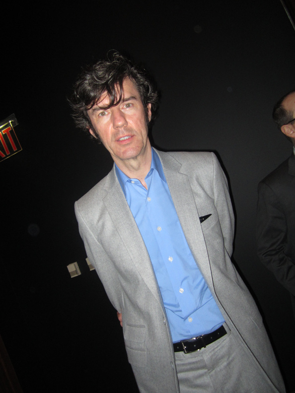
STEFAN SGAMEISTER . . .
b. Bregenz, Austria, 1962. established the design firm Sagmeister Inc, now SAGMEISTER & WALSH, in NEW YORK in 1993.
I remember reading somewhere that his father, or was it his grandfather .. was was a signmaker – back in the old country, and that he grew up around lots of old signs painted on wood, that is around lots of handpainted, handlettered .. calligraphy !!
anybody who is up to speed on contemporary art – knows the art of signmaking has entered a golden age. you can start with POP ART & ANDY WARHOL, continue with ED RUSCHA, and keep on going through STEVE POWERS aka ESPO, onto RETNA .. with innumerable stops, ok, such as .. SERF + MINT = MIRF .. in-between.
though Sagmeister’s forte seems to go beyond the ‘script’ itself, per se .. and into broader conceptual/thematic territory.
which is also an interesting ‘twist’ since unlike most of the purely ‘visual’ artists who explore and revel in ‘calligraphy’ he runs .. a commercial design firm.
go figure.
it’s hard/impossible to put a ‘defining’ number on creativity.
thank the lord, we really don’t live .. in boxes.

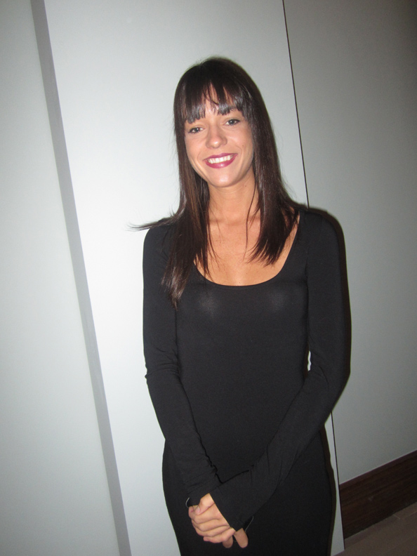
JESSICA WALSH . . .
b. New York, 1986

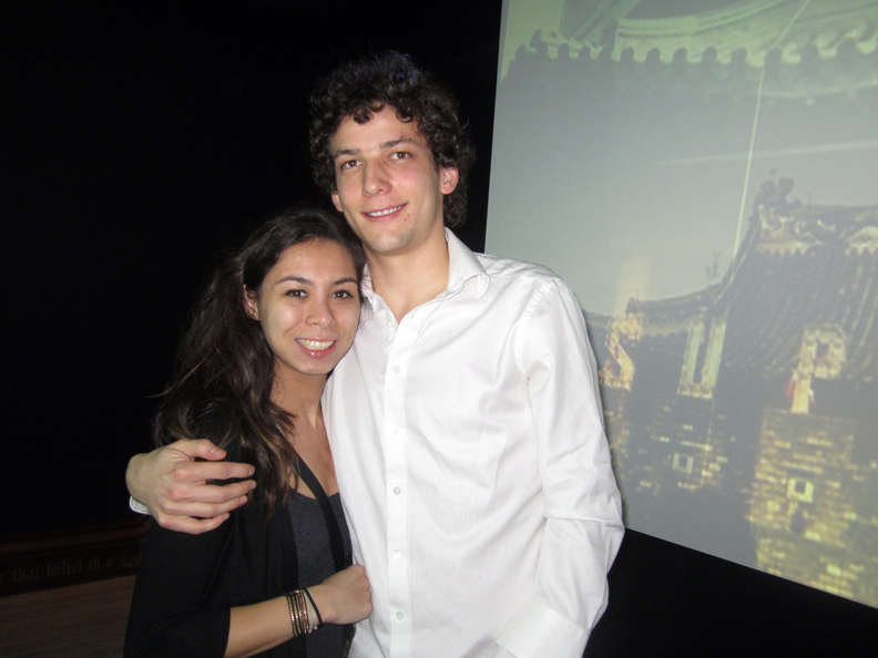
on the right, SANTIAGO CARRASQUILLA, a young designer who works in the SAGMEISTER & WALSH studio.
he is listed as a collaborator on the FEEL OTHERS FEEL – floor-based bubble letter water ‘fountain’ ..
with him, a friend .. JANE MILLAN.

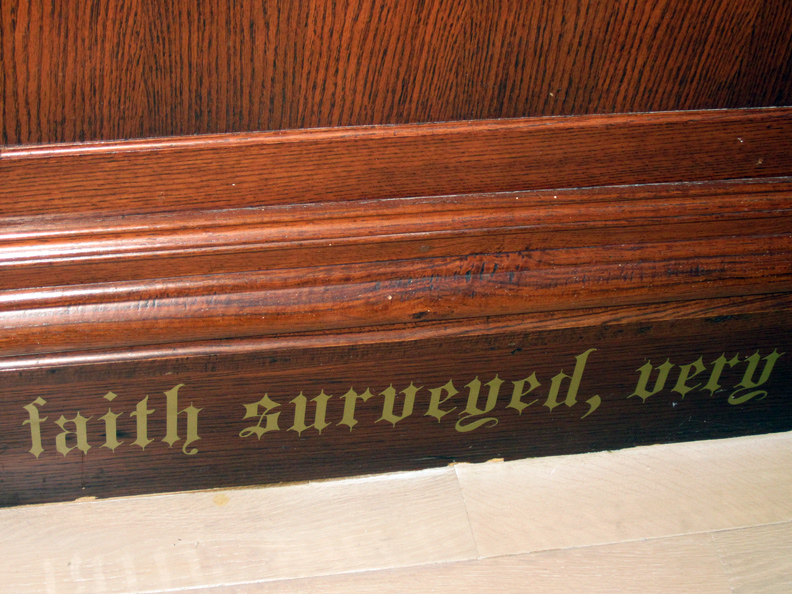
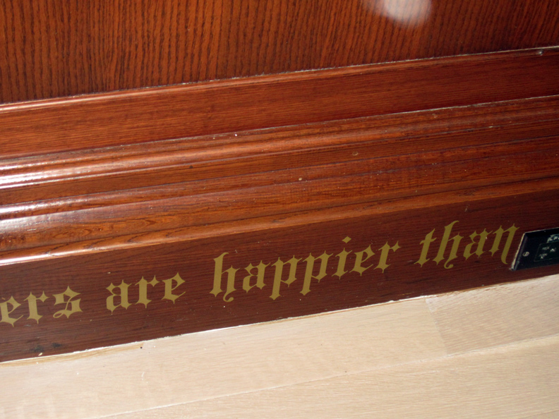
excerpt: gold-lettered script running along the board where the walls meet the floor in the exhibit.
from the press release:
“In addition, intrigued by a 2010-11 nationwide survey in which JEWS reported the highest levels of well-being of all religious groups, the studio has placed a text in the gallery that connects scientific data to the personal exploration of happiness.”
oh oh .. speaking of which, TROUBLE IN THE BUBBLE !!

I dunno, maybe it takes one – to know one, but . . . OY VEY !!
that’s so GOYESHE !!
and so is the ‘font’ – bye the way ?!!
I mean even JERRY SEINFELD will tell you, first off:
well-being does NOT EQUATE to HAPPINESS . . . or, as he puts it .. more or less, and is he is huge successful on every ‘scientific’ chart you could throw at him, career, family, wealth etc etc .. “LIFE SUCKS”.
“it might suck a little less for me, than you. but LIFE SUCKS”.
I mean Jews are famous, for being .. unhappy.
come on .. design maestros .. on the your Path to Happiness – don’t strip us of .. OURS !!
where’s LENA DUNHAM, when we REALLY need her. or even WOODY ALLEN, for god’s sake.

I mean everyone knows how fragile the connection between surveys and conclusions .. really are. it’s such basic science, even a hard-core artist .. knows every interpretation of a survey .. comes with a disclaimer.
and in this case, it is so .. off the mark .. it makes an off-color remark by JOAN RIVERS look .. good.
or is this the “small glimpse of humor” SAGMEISTER is quoted, in the press release .. on hoping, you’ll be finding in show. NOT.
I mean I really wouldn’t be so upset, and I wouldn’t in any want to take away from a show that brought me to my knees .. in appreciation and delight ..
but who let that tone deaf text – go by the curator’s final edit ?
and it’s not that I’m insulted religiously or ethically, au contaire, the reverse. major.
it’s that these very people, who he concludes are the most happy because they score so well on a well-being survey (?!!) i.e. the most religious/observant .. would be the VERY first to say his, Sagmeister’s, work had NO place in a JEWISH museum.
the issue of ‘Modesty’ .. aside.
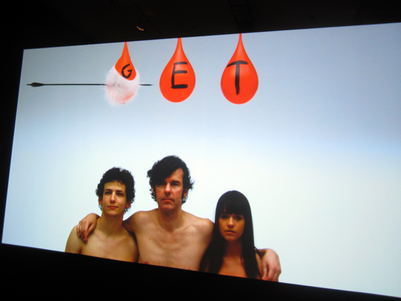
these are also the very first people most likely, IN ALL CASES, to get in the way of creative expression, art .. and acting/thinking outside the box – on the most basic level .. across the board, and would object to this show, from the very first image: implied NUDITY, even if covered up by water balloons, never mind the stark naked old lady .. further on.
and forget the so-called ‘happy’ observant applauding .. this foray into the “cutting edge” aka “contemporary art” scene .. which is why I presume, and applaud – the Jewish Museum for putting on this show – in the first place .. I mean, if you read my first post on this show .. I did question, and not in JEST .. I KNOW MY PEOPLE (!!) the tribe .. and, the artists at hand !! .. just how much the museum was prepared “to bleed” . . in the name of wanting to step forward with a higher profile .. in this culturally .. dense city.
as for the fact that .. “SAGMEISTER & WALSH has been engaged to create a new graphic identity for the Jewish Museum” .. haha.
what til they get a whiff of the naked .. SAGMEISTER & WALSH calling card !!
YEAH, you MOST DEF !! want to check out: made you look !!
maybe a quote from BAL SHEM TOV .. would have sufficed ?

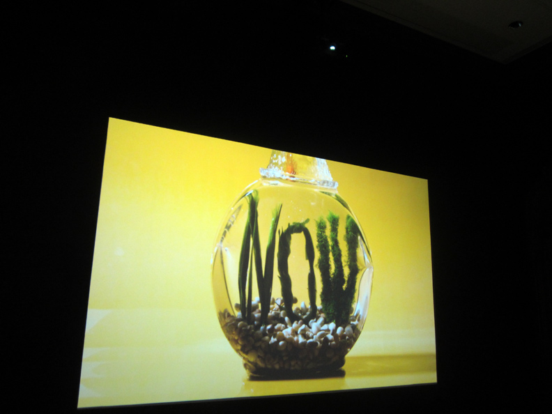
image from: SAGMEISTER & WALSH, NOW IS BETTER
in collaboration with: MATTHEW & ERIK HUBER
and yes, it’s a goldfish, and yes it says: NOW.
and yes. to nakedness. in-your-face and, hard-core creativity .. anyway,
but but esp .. over the losers of the world, and esp the so-called observant who would have you live life in a box .. and then, be the first to rob you blind.
apart from, you know .. just saying, piggy aunts parading as pillars of society .. who rob your inheritance, so-called mainstream, and alternative/hipster (even worse !!) ‘journalists’ who steal your ideas & copyrighted photos, all the way to .. fat little baby-face dictators with itchy trigger thumbs, and the war machines inherent in our own ‘machines’ , not to forget: greedy super fat cat art collectors who buy art based on your direction, and then claim, when someone tells you they have just put up 3 Rob Pruitts .. on their living room wall .. no it wasn’t your advice .. I heard it at a party !!
.. you know, the whole god damn sorry – human spectrum.

NOW IS BETTER – oh my god .. does this goldfish talk to you .. the way it talks to me ?
like a flicker of coppery shimmery life, art, thought .. but so s-l-i-p-p-e-r-y.
slippery is the road to happiness .. or what ?!!

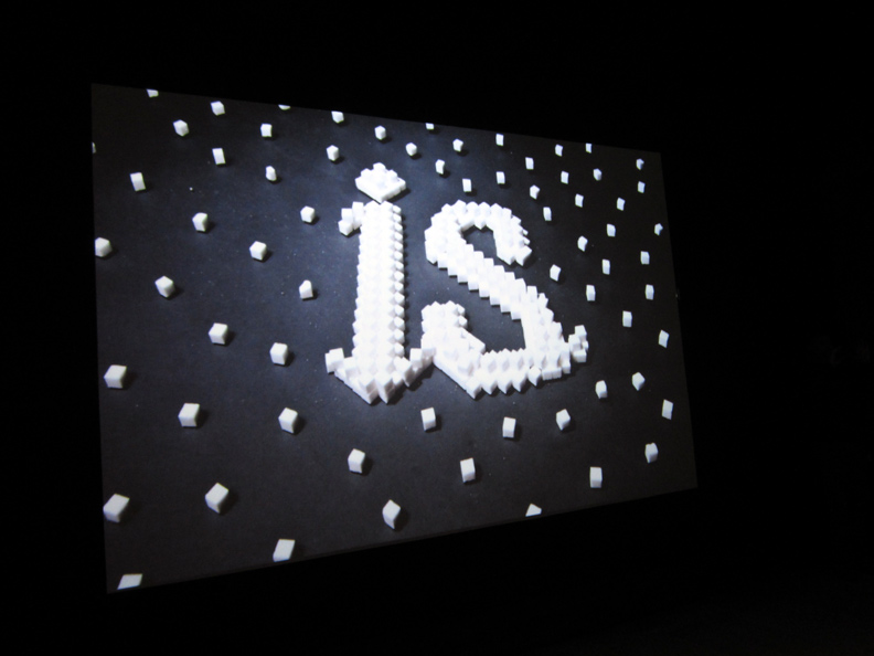
sugar cube, sugar cube on the wall ..
in the light of suicide, lethal ‘self-medication’ and nuke ’em war threats from a pudgy bubble cartoon figure come to life, STUDIO GHIBLI & ‘UP’ do come top mind, (!!) .. HAPPINESS seems particularly relevant, and you know what .. so is asking the big questions.

the funny thing is, the text – that accompanies this animated clip, refers to the times we LIVE IN (!!) sic, and not to the zen .. behind it all.
who knows, maybe it’s just the .. calm before the storm (/) if these days are the best days .. our world can come up with .. as the Sagmeister team posits, because there is less personal crime (?) and the ‘holocaust’ is behind us ?
meanwhile .. the globe is totally (scientifically) degrading ?
and all my best friends .. are dead ?
my last thought:
if ‘designers’ want to step into ‘big’ concepts they ought to get some ‘editors’ or producers or whatever you call them, JUDD APATOW (/) aboard . . I mean, did you ever notice how many of these guys’ names .. run on the closing credits for .. GIRLS ?
ok, my second-to-last thought:
for a text .. that could have, more successfully .. run in gold along the museum’s floor, (you know put your money where your mouth is Nancy ..)
and it’s from .. ISSAC BASHEVIS SINGER !!
“KINDNESS, I’VE DISCOVERED, IS EVERYTHING .. IN LIFE.”
PHOTOS BY & COPYRIGHT: NANCY SMITH
~SIX THINGS: SAGMEISTER & WALSH .. NOW IS BETTER |
Posted in The Bomb | By Nancy Smith | April 13th, 2013, 9:55am

GALLERIST DANIEL REICH .. at the opening of ‘JACK EARLY/VIEW JACK EARLY’S EAR CANDY MACHINE’, DANIEL REICH GALLERY, 537A W. 23rd ST, NYC.
JAN 21, 2011.
PHOTO BY & COPYRIGHT: NANCY SMITH
wow, it’s been a sad year in the art world.
. . . a banner year for ghosts.
GOING SNOW-VIEWING
ONE BY ONE THE
WALKERS VANISH . . .
WHITELY FALLING VEILS – KATSURI
according to artinfo .. via Artforum, Daniel’s family just went public with the fact that Daniel committed suicide this past Dec 25, 2012.
the artinfo article doesn’t say much more, but it ends with an excellent quote of Daniel’s .. that is very telling and very true .. of his aspirations and actual accomplishment.
see: RIP Chelsea Dealer Daniel Reich, 1975-2012 / artinfo
~DANIEL REICH, RIP |
Posted in The Bomb | By Nancy Smith | April 10th, 2013, 7:53pm
SIX THINGS: SAGMEISTER & WALSH
MARCH 15 – AUGUST 4, 2013
THE JEWISH MUSEUM – 1109 FIFTH AVE, NYC

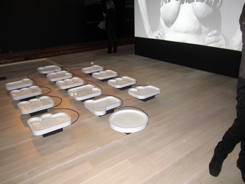
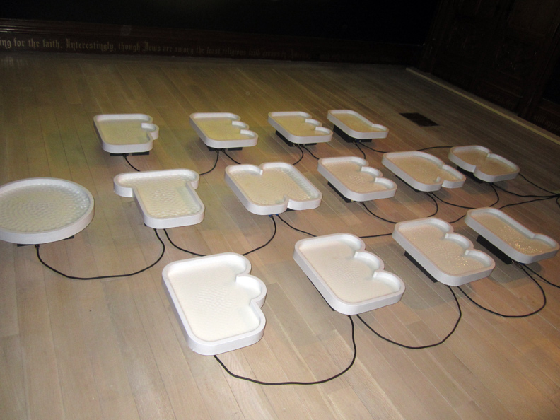
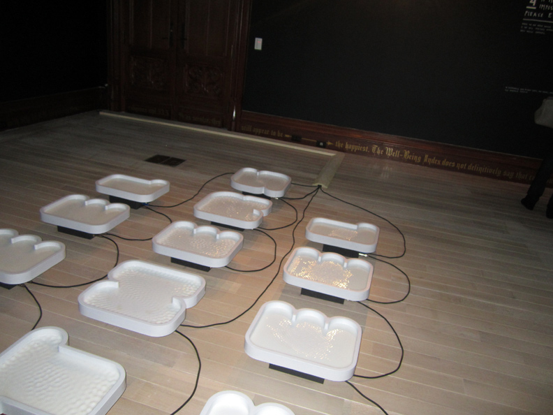
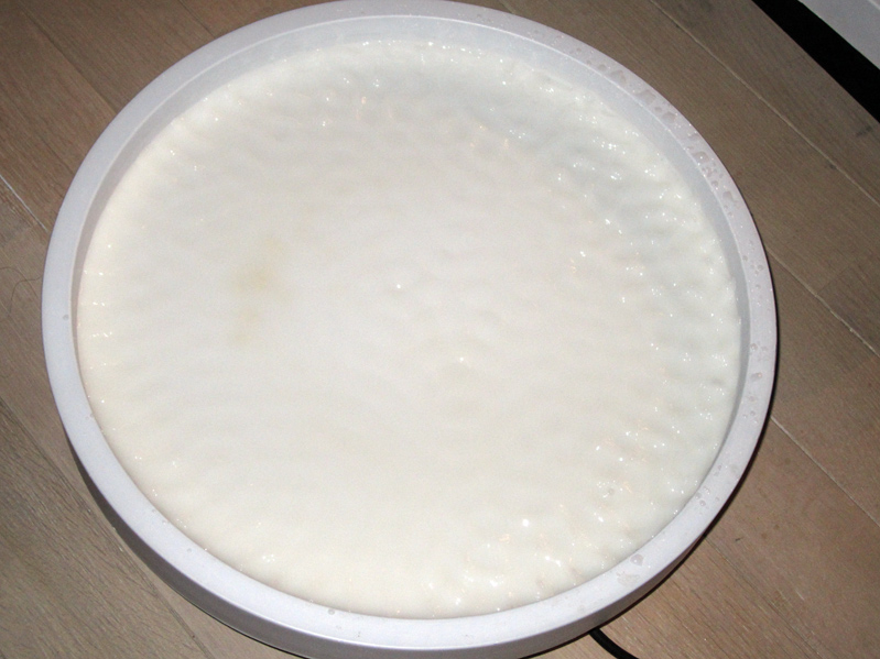
FEEL OTHERS FEEL, text & water fountain .. the water, quote: liquid .. is activated by a piped-in sound.
IN COLLABORATION WITH SANTIAGO CARRASQUILLA
SOUND DESIGN BY FRIENDLY GHOST
(yes, GHOST…)
the text reads:
“Sympathetic empathy is central to most people’s understanding of love and happiness. I feel I’m somehow not all that good at it.
Everything that happens to me is immediate, while everything that does not happen to me needs to be mediated: There tends to be a difference between the way I process my own experiences vs. those of someone else.
The typography contains liquid activated by sound waves connecting each letter to the other and each word to the first.”
what .. the first sign of TROUBLE ?
TROUBLE TROUBLE, in the BUBBLE BUBBLE ?
of HAPPINESS.
it’s also referred to as: alienation, and being an ‘outsider’. a common creative driving force – the experience of the self, vs. the experience/struggle of the other.
well, at least he’s honest. in his sign making.
I struggle with this too. no, not being honest. being alienated
always being .. the ‘outsider’.
the consummate insider/outsider, what could be worse ?

the ‘fountain’ was flat on the floor, bubbles of water .. that bubbled up and went quiet, contained by bubble .. letters.

it was quite beautiful, and serene. but it was also .. w-i-r-e-d !!
trouble in the bubble ?!!
I don’t think that was the intention .. but, I found disquiet in spite of the harmless play of shape, movement and sound.

I dunno. beauty really IS in the eye of the beholder, isn’t it.
maybe beauty REALLY isn’t the point of these ‘signs’. maybe thought/communication .. is ?
OR: maybe it’s because I ‘talk’ to so many strangers, reach out on the web with this ‘blog’ .. go round and round .. wired, but have a hard time being engaged by single walking talking living specimens ?
the text is important in this show.
the text – is just as important as the ‘fonts’.

you can just .. see the how the water ripples to the sound.
but the letter shape is ominous. out of context. bland. a dish. an “o”.
I wanted to lean over, and fall head-first right into it. do an .. Alice-in-Wonderland thing.
grow big. grow small.
I didn’t want to think about others. I didn’t even want to contemplate my OWN reflection, which was impossible anyways. technically. the water did not reflect.
I just wanted to fall in, head-first. impossible technically, too. (too small) (too shallow)
though a security guard did have to tell me .. to step back. (for real)
somehow .. it made me think of .. LENA DUNHAM ?
in shape, and substance ?
ok.
with all due respect: the water ripples .. look just like the cellulite on your ‘gorgeous’, lumpy thighs.

I dunno, maybe it was that ‘friendly ghost’ – that spooked me.
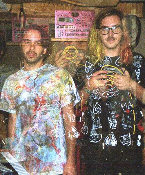
FRIENDLY GHOST, that be .. NATHAN RITHOLZ and ARY WARNAAR, did the sound.
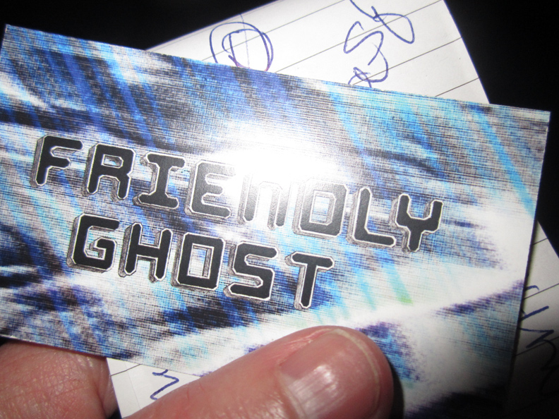
they are friends of SANTIAGO CARRASQUILLA, who did that FRIENDLY GHOST card/logo for them .. and who works in the SAGMMEISTER & WALSH studio, and who collaborated on this piece,
YES !! SEE: FRIENDLY GHOST COMMENTARY/SANTIAGO CARRASQUILLA

yes !! check out: FRIENDLY GHOST – love how that image wavers, on their website.

the ‘marbled’ header on the FRIENDLY GHOST website is by .. Luck You Collective

yep, for sure you want to check out: LUCK YOU
all of a sudden .. it’s lookin’ good !!
the wires connected !!
the dots got connected .. a new world IS just around, the corner.
the golden age of sign making – is US !!
well, ok. maybe it’s the second golden age of sign making, ever since those monks illustrated & calligraphed those ancient illuminated pages, of course. how VASARI skipped that, I don’t know.
I guess it was just .. folk art, back then ?
PHOTOS: NANCY SMITH
~SIX THINGS: SAGMEISTER & WALSH .. FEEL |
Posted in The Bomb | By Nancy Smith | April 7th, 2013, 9:37am
FILE UNDER: didn’t KIM JONG UN .. get the memo ?
SIX THINGS: SAGMEISTER & WALSH
MARCH 15 – AUGUST 4, 2013
THE JEWISH MUSEUM – 1109 FIFTH AVE, NYC

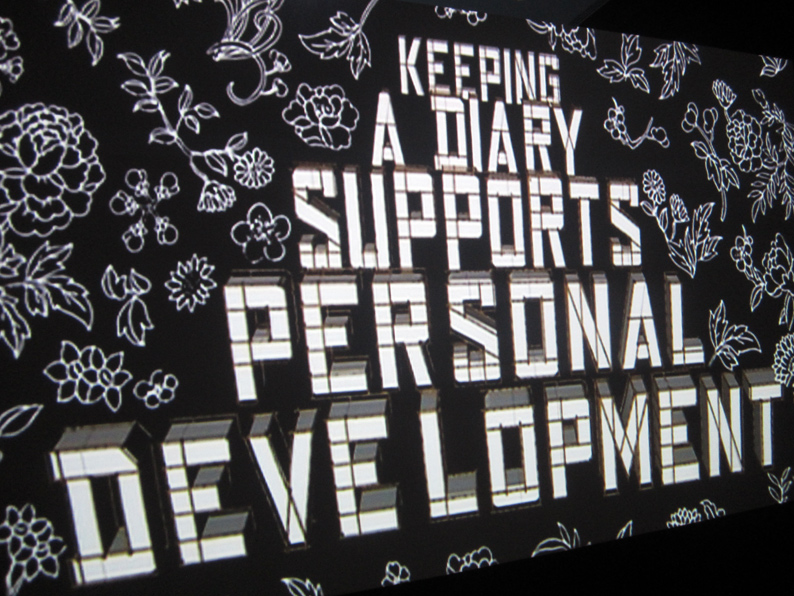
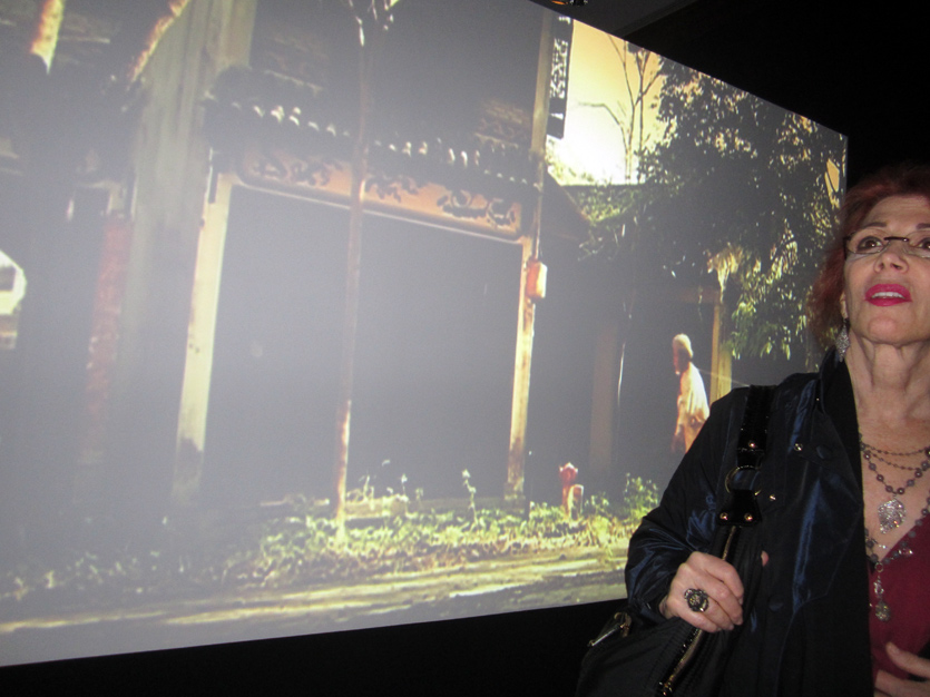
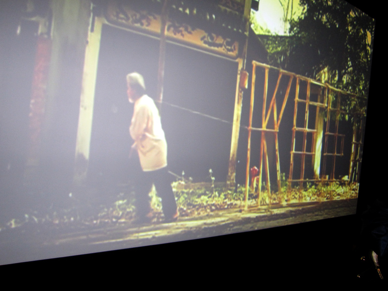
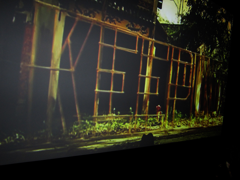
STEFAN SAGMEISTER, ‘Keeping a Diary’, 2006. HD video, 1 min.
in collaboration with MATTHIAS ERNSTBERGER and STEPHAN WALTER. copyright STEFAN SAGMEISTER
on the road to .. PERSONAL HAPPINESS.
KEEP A DIARY !!
I remembered this short film from when it was first screened to a large public .. at DEITCH PROJECTS back in JAN 2008. a big, bold blow-out show, and a first, or a rare … and a major hit, for a quote ‘graphic designer’ in the art world proper, it was a SAGMWEISTER sampler titled: ‘THINGS I HAVE LEARNED IN MY LIFE SO FAR’. it was designed to make waves; SAGMEISTER, you got your one big chance .. make that shot count !! and as such, this truly beautiful dream-like loop .. read like a fleeting afterthought. not that that is a bad thing, but it was up against a big big gallery chock full of bolder callers .. including being festooned with a huge live/living, and then degrading .. banana wall/quilt .. that spelled out: “Self-confidence produces fine results”, and a huge blow-up 2 story chimp on the gallery’s roof.
the one page title graphics .. of this project were so fine .. though, that I had kept them in my mental file, and how nice to see them again. they are still a beautiful, even meditative study in black and white, west meets east decoration/information composition/label.
and so was .. the poetic narrative .. esp how it unfolded.
what a pleasing, inviting and gentle way to say: get over it. get on it. WRITE.

like the ‘If I Don’t Ask I Won’t Get’ video that fronts the exhibit, this video, which comes to view, when you round the next corner .. projects large, almost life-size, and since the physical space allotted to the show, and this is NOT a bad thing .. is small, you have to view it in a shallow up-close and personal/personal space. which is a good thing. but also a kind of, gets you-off-your-comfort-zone shock, as it creates/forces immersion. it subconsciously attacks your habitual inner space and it gets you to ‘share’. experience and feel. not just view.
a rare plane for graphics . . . the least revered of all art genres, but apparently not for long, the way things have been shaping up.
VASARI, we love ya .. but come on .. get up to speed.

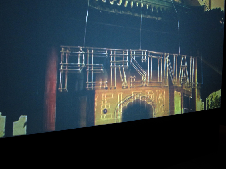
so a man appears, and he pulls a bamboo structure, and as it progresses forward it says: KEEP. KEEPING …
I do love how that initial black and white title page .. leads into such a rural pastoral landscape. it ‘twerks’ the senses, that for sure.
I just got the perfect metaphor: it’s the visual equivalent of an ironwork gate .. that opens, onto a garden.

KEEP. that’s a big thought, just all on its own.
as opposed to .. destroy ?
its also interesting to think on .. what it means, to go from expressing KEEP .. to KEEP-ING.
visually, a box-like font devised physically out of bamboo – that’s .. a big thought, too.
civilization, creativity .. in a nutshell.
and, all just – just in one man-made .. image.
now you know why graphic designer/artists, have dropped the ‘graphics’ part, and just call themselves ‘designers’ .. today.

SUPPORTS .. is a throw-back/celebration to the ‘host’ country, and its culture. new meets old, too.

PERSONAL.
it kinda strikes you .. ‘personal’, is such a banner word ?!!
plus it’s so .. well, FRAGILE.
it brings up; competition, survival. even the greasy rat who won the Chinese horoscope race. I’m meaning: ethics.
it’s also a feel for how quiet and dreamy, this little ditty of a lifestyle quest is.
I mean that could be, in another lifetime, in anothers hands .. shooting sparking fizzing whizzing blazing fireworks, no ?
or even, electric neon. but it’s wood. yes, I find that: significant.

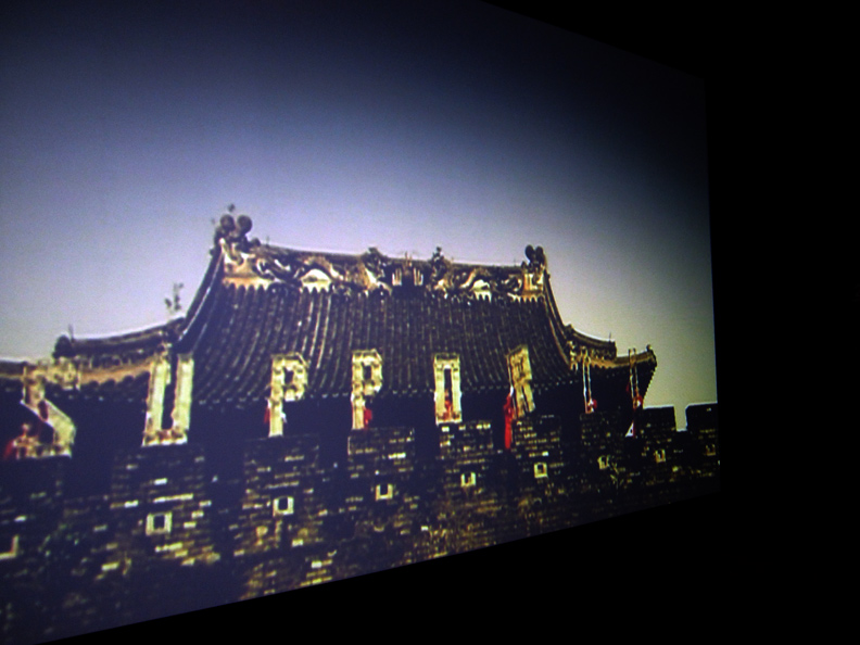
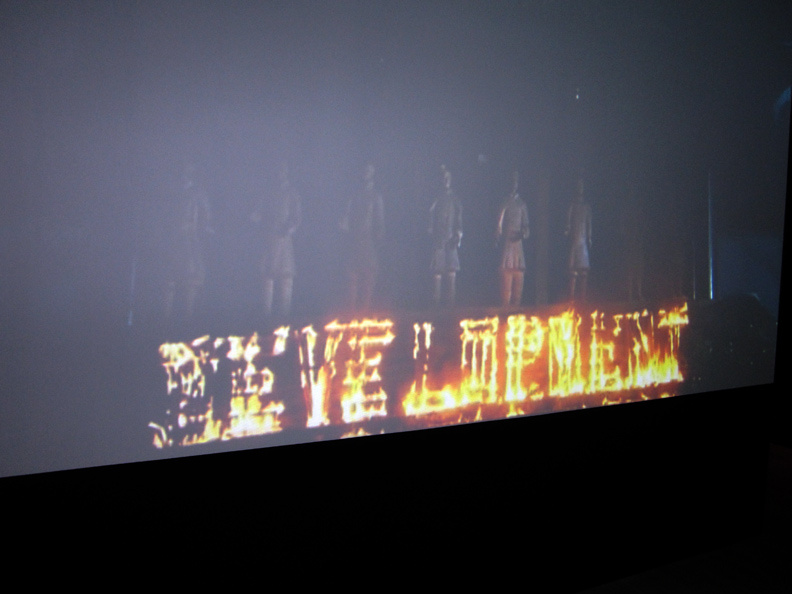
DEVELOPMENT.
well, lookie here .. there are fireworks, but it’s more like .. being / on fire.
write a diary.
I write a diary, I keep a blog.
ugly word. damn those early computer geeks.
if only words could be modified .. like fonts.
BUT: diary to blog.
now .. that’s talking about .. setting BIG conceptual/fires.
ps: re those ancient terracotta warriors just visible in the background . . .
apart from the greater concepts of civilization, war and personal territory . .
clay pots and sculptures, are pretty much the only thing, esp man-made – that will survive fire.
I know some artists in NYC, whose dad was pretty high-up in the American chain of command in wartime Korea, as a matter of fact, just saying because .. if you go visit their studio, ok they were twins, you can see this amazing stash of ancient ancient Korean pottery that the GIs made off with, and took back home.
can’t help but think .. that kind of attitude might be coming back . to haunt us, now.
he who takes ancient pots, offends old ancestors ?
MORE PIX – FROM THE OPENING .. POST SOON.
PHOTOS: NANCY SMITH
~SIX THINGS: SAGMEISTER & WALSH .. WRITE |
Posted in The Bomb | By Nancy Smith | April 5th, 2013, 9:19am
SIX THINGS: SAGMEISTER & WALSH
MARCH 15, 2013 – AUGUST 4, 2013
THE JEWISH MUSEUM – 1109 FIFTH AVE, NYC
as in, designers: STEFAN SAGMEISTER, and his new business/creative partner .. JESSICA WALSH.
and that’s REALLY (!!)
SIX THINGS to do . . . on the path to HAPPINESS.
with the way the New Year started for me, sudden death to put it bluntly – I was so .. on it !!
the show opened on Tuesday, March 12, 2013.
I had heard about it just a few hours earlier that very same day, but like I said: sad things were calling for big change, and I was on it !! I was a seeker.
and as it turns out, I would be .. a believer.
what could be better than that. and, yeah I do call that .. HAPPINESS.
esp in the big city that can let you down, and .. eat you up.
truthfully, I approached the opening .. a little dark on the inside, with even a touch more skepticism . . . than usual.
though I had heard the museum, under new guidance .. was reaching for a new cutting edge, I wasn’t sure just how much they were prepared .. to ‘bleed’ !!
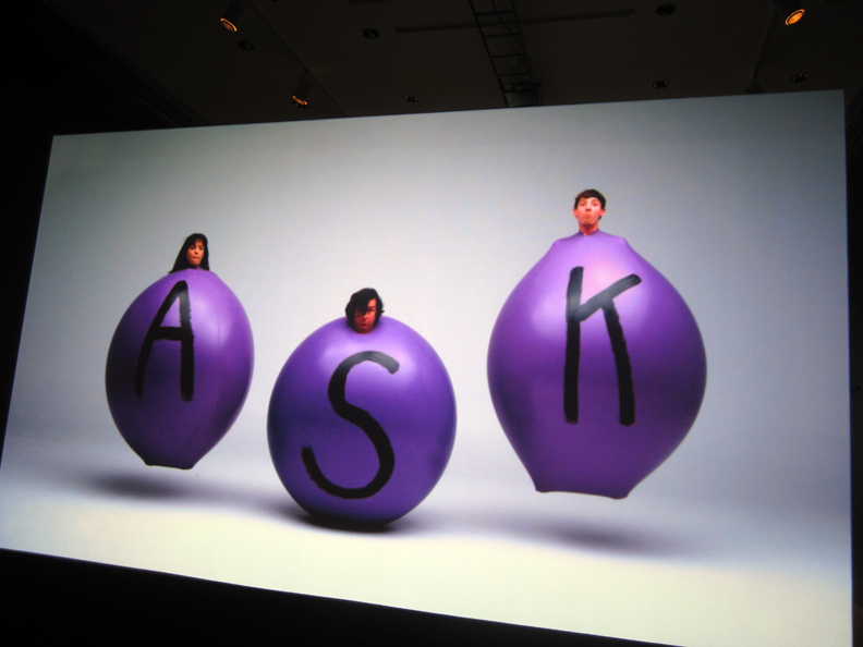
and those purple balloons with hand-painted white fonts .. the show’s first step forward, so to speak .. well, I dunno.
but not to fear . . . SAGMEISTER weaves his magic, as ever.
from the very moment you turn the institutional corner and come face-to-face, with what is really, in physical fact a small exhibit; large ideas and wonderful things … bloom irrepressibly into life. graphics animate & ideas: pop.
it’s an ‘art’ experience . . . that crosses many borders, and just for that very fact alone, is not to miss.
an oasis of thought, and super creative, yet mostly simple .. production values, ‘SIX THINGS’ is guaranteed to still even the most hyper-maniacs among us, and touch under even the most hardened skins.
in other words:
in this super-charged city of constant images but very little real substance.
let the Sagmeister Game of Substance … begin.

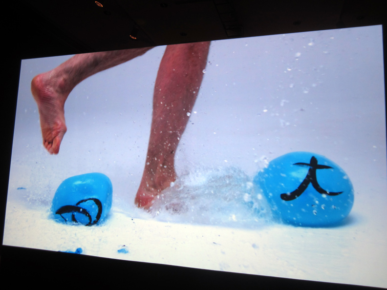
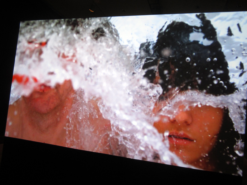
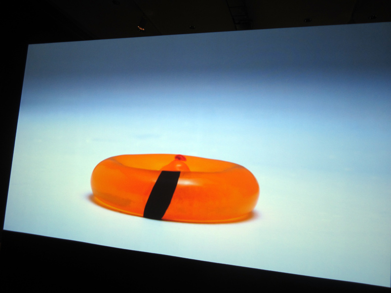
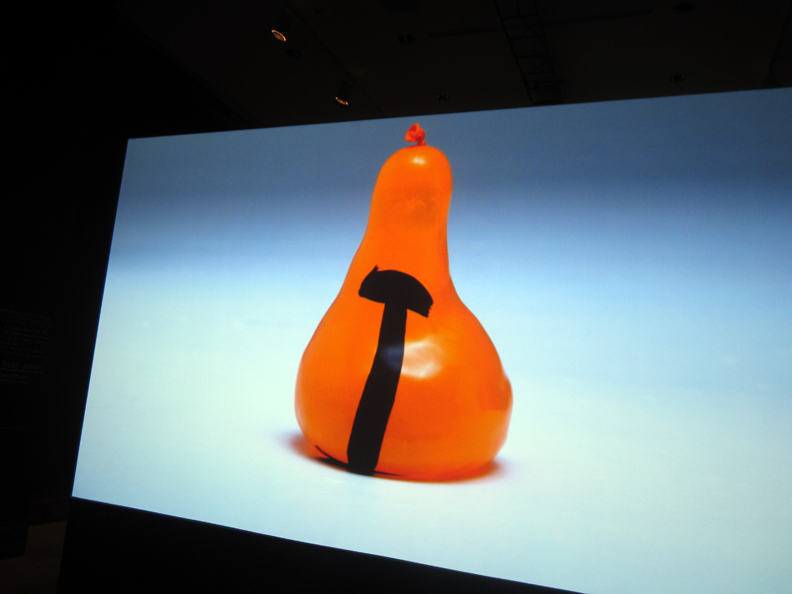
STEFAN SAGMEISTER, ‘If I Don’t Ask I Won’t Get’, short video in collaboration with STEVE ROMANO.
damn, NEVER JUDGE A ‘FONT’ . . . out of context !!
whoa, black hand-drawn oriental calligraphy-like .. single letter fonts – on balloons, way to .. go.
way to .. think.
way to .. fly !!

GET, IT ?!!
ideas .. take off, like balloons, and ideas / thoughts: like bubbles burst.
in your head.
connect . . the dots !!
wipe-out, wash-out. be born.
from left to right, that’s
SANTIAGO CARRASQUILLA, STEFAN SAGMEISTER, and JESSICA WALSH.
Santiago Carrasquilla is a designer in the new Sagmeister & Walsh studio, who worked on several of the concepts in the show, in particular .. the bubbling (!!) water ‘fountain’ .. in bubble letters (!!) on the floor. more on that, soon.
Jessica Walsh is Stefan Sagmeister’s new business partner.
this exhibit, ‘Six Things’ .. “marks the the first exhibition of their newly founded design firm, Sagmeister & Walsh”.

I have to tell you, I cannot lie – the moment I turned the stereotypical & proverbial (!!) museum corner and immediately faced up with this large scale video, my heart skipped a beat, and life was changed f-o-r-e-v-e-r. shock & awe.
what a rush.
literally you feel like you are 2 inches away from the the creative process, upfront & personal.
the word: exuberance does come to mind. so does, immersion.
so does: sharing.

the short .. visual attack / film’s premise is:
“If I Don’t Ask I Won’t Get.”
think on it. and if the bubble bursts .. so, what.
blow up another, and ask .. again.

persistence.
reaching. the hardness of a hand-made steel nail (the font) .. combined with the fragile pop / short span .. life of a balloon. the infinite potential of a momentary thought, desire, want, and .. need.
ps: the texts that accompany the pieces .. are very good too, illuminating without being draining. plenty of thought pathways, but no information-overload on Sagmeister’s dime, that for sure.

naked in the water, naked in your thoughts.
ASK.
apparently the first step on the road to .. HAPPINESS.
SO: what I also liked about the video, on a purely technical tangent . . was how it caught the ‘state’ of photography today, and the implicit potential for ‘pure’ & universal visual communication.
going even more technical .. it also gets in-your-face technical about the essential difference between say, old school 35 mm film and digital photography, which was a little hard to get used to in the beginning but now, as obvious .. here, reigns supreme – and that would be: the loss of ‘depth of field’, if not the concept of ‘background’, altogether.
in short: auto-focus. face/subject forward, background: wipe-out.
flat screen, white field, big energy. high def.
PHOTOS: NANCY SMITH
~SIX THINGS: SAGMEISTER & WALSH .. ASK |
Posted in The Bomb | By Nancy Smith | April 4th, 2013, 8:25am
. . . will the REAL . . . NICK CAVE – PLEASE STAND UP !!
FILE UNDER:
he’s a god, he’s a man, he’s a ghost, he’s a guru
you’ll see him in your nightmares
you’ll see him in your dreams,
but he’s not what he seems . . .

watch: NICK CAVE & THE BAD SEEDS .. RED RIGHT HAND
this seems to be the original 1994 soundtrack – I know because, it was the sound track to my life . . . for a long long time. it’s the true, driving .. birth.
yes, I was living off the Bowery, at the time.
listen to the man: “Play it LOUD”.

this is also a GREAT GREAT TAKE, just more recent & live !!
it’s slightly slowed down, and more to the edge of sexy, than deathly.
like … when the musicians push against the drive, and .. tease ya.
but it’s also better tech-wise – so, you can get it to go really loud.
watch: NICK CAVE & THE BAD SEEDS / live
DEDICATED TO YOU KNOW WHO . . . ghostman, SIMON.
some people have their dark sides, but then some people have their really, REALLY dark .. sides.
some people are called .. crack, for being right .. on.
right on the razor’s edge, the red right hand. aka .. crash smart.
some people ride the white death train ..
and don’t come back.
~NICK CAVE & THE BAD SEEDS |
Posted in Indie Music Reviews, The Bomb | By Nancy Smith | March 30th, 2013, 10:58am
ELIZABETH PEYTON
March 29 – May 13, 2013
Gavin Brown’s enterprise – 620 Greenwich St, West Village NYC
the show opened last nite, THURS MARCH 28, 2013 . . .

ELIZABETH PEYTON. the opening was pretty low key, at least the public face of it was.
I’m thinking that there was some serious action .. that had already gone on,
.. behind the scenes.

ELIZABETH PEYTON, ‘Jonas Kaufmann, March 2013, NYC’, 2013.
oil on panel, 23-1/4 x 18-1/4 in.

detail, ELIZABETH PEYTON, ‘Jonas Kaufmann’.

ELIZABETH PEYTON, ‘Jonas Kaufmann’ watercolor.

detail, ELIZABETH PEYTON, ‘Jonas Kaufmann, March 2013, NYC’, 2013.
watercolor on paper, 12 x 9 in.

the front surface of the frames – was silver leafed. n-i-c-e.

a less typical work .. in this show.
ELIZABETH PEYTON, ‘Elias, Elias Bender Ronnenfelt (Leipzig)’, 2013
color pencil & pastel pencil on paper, 8-3/4 x 6 in.

also unusual . . in the color palette and composition.
ELIZABETH PEYTON, ‘Elias Bender Ronnefelt’, 2013
oil on canvas, 10 x 8 in.

ELIZABETH PEYTON, ‘Var’.

ELIZABETH PEYTON, ‘Var’, 2013.
oil on panel, 15-1/4 x 12 in.

MICHAEL STIPE
see: MoMA PS1 and MICHAEL STIPE bring a geodesic dome to .. ROCKAWAYS. GOTHAMIST MARCH 9, 2013

JESSICA BAJOROS . . .
we did a studio visit with her, a little while back . . . HESH introduced us.
see: JESSICA BAJOROS
see: more JESSICA BAJOROS
Jessica told us that, JASON BANKER, who we meet on that 2012 studio visit – has just completed a new documentary feature, which he directed .. along with TIFFANY SUDELA-JUNKER and JORGE TORRES-TORRES .. titled ‘My Name is Faith’, 2012 .. about the hardships of rescuing a child born into a meth ‘lifestyle’ .. and, it is getting some serious buzz.
see: MY NAME IS FAITH
she also asked us if we had seen Hesh’s new haircut .. yes we did !!
and looking g-o-o-d !!
in fact, HESH is putting up a new group show, ‘MIRARE’ .. opening soon !!
in fact, this soon:
THURS APRIL 11th from 6-9 PM at COACHMAKERS GALLERY on MOTT ST, between BROOME & KENMARE .. should be a big par-tay, to say the least.
see: HH PRODUCTIONS/facebook for list of participating artists.
PHOTOS: NANCY SMITH
~ELIZABETH PEYTON |
Posted in The Bomb | By Nancy Smith | March 29th, 2013, 7:45am
