everyone knows, the only real sizzle in the art world right now – is in the secondary market, and the only real cutting edge sizzle in the secondary market is, guess who . . . ?
DAN COLEN.
I’d sure like to know what brand of bubble gum he’s chewing, because it sure sticks to the bottom of your foot, er, I mean wallet.
let’s hope the synthetic, cheery-looking stuff, sticks to the paintings, too.
according to the New York Times … “another record price for an artist at auction was set for Dan Colen, ‘S&M’, one of the artist’s abstract canvases created only of chewing gum that was expected to bring $200,000 to $300,000, was bought by WENDY CROMWELL, an art adviser, for $480,000, or $578,000 with fees.”
the action was at PHILLIPS de PURY.
a clear vindication for artlovers . . . which posted vocal support for the ‘sticky’ work, in opposition to the negative review that appeared in the New York Times – when the bubble work first surfaced in a solo show at GAGOSIAN, a couple of years back. the show was titled ‘Poetry’ and ran from SEPT 10-OCT 6, 2010.
see: CHEWING GUM !! DAN COLEN – YOU GO GO !!
SOME ARTLOVERS PIX FROM: DAN COLEN, ‘Poetry’, GAGOSIAN GALLERY, NYC. SEPT 10-OCT 6, 2010

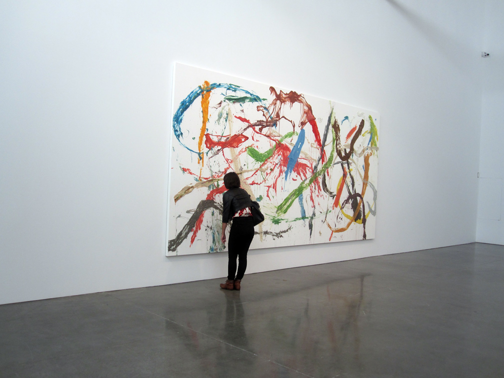
DAN COLON, ‘A Love Story’, 2010
Chewing gum on canvas. 106 x 209 in.

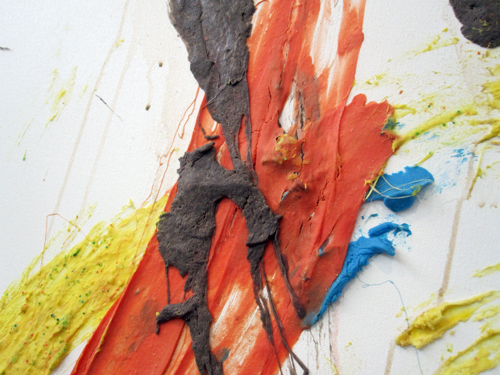
detail, DAN COLEN, ‘A Love Story’. (bubble gum)

DAN COLEN, ‘The Space Between Nothing and Everything’, 2010
Oil on canvas. 131 x 218 in.

detail, DAN COLEN, ‘The Space Between Nothing and Everything’. (oil on canvas)

DAN COLEN, ‘Overture (“Two Minutes in Silver Wells, Two Minutes Here, Two Minutes There, It Was Going to be Over in this Bedroom in Encino”)’, 2010
Half Pipe made of plywood, metal. 92 (H) x 192 (W) x 368 (L) in.

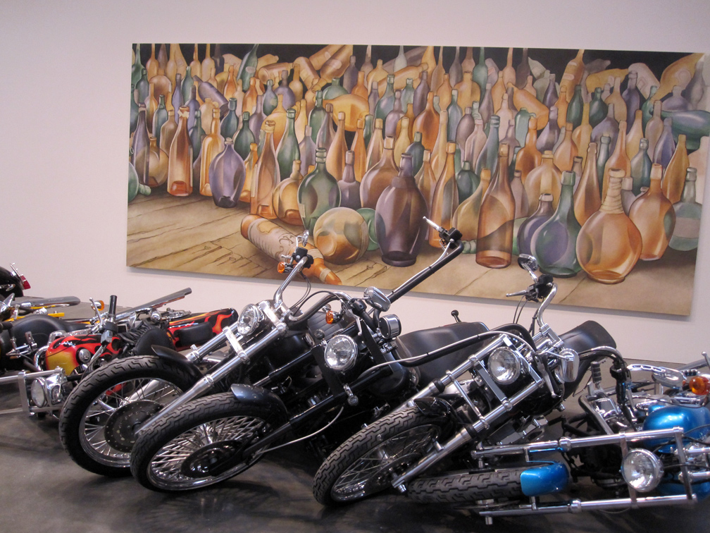
DAN COLEN, ‘Cracks in the Clouds’, 2010. Motorcycles, variable.
DAN COLEN, ‘In a Million Years’, 2010. oil on canvas, 90 x 204 in.

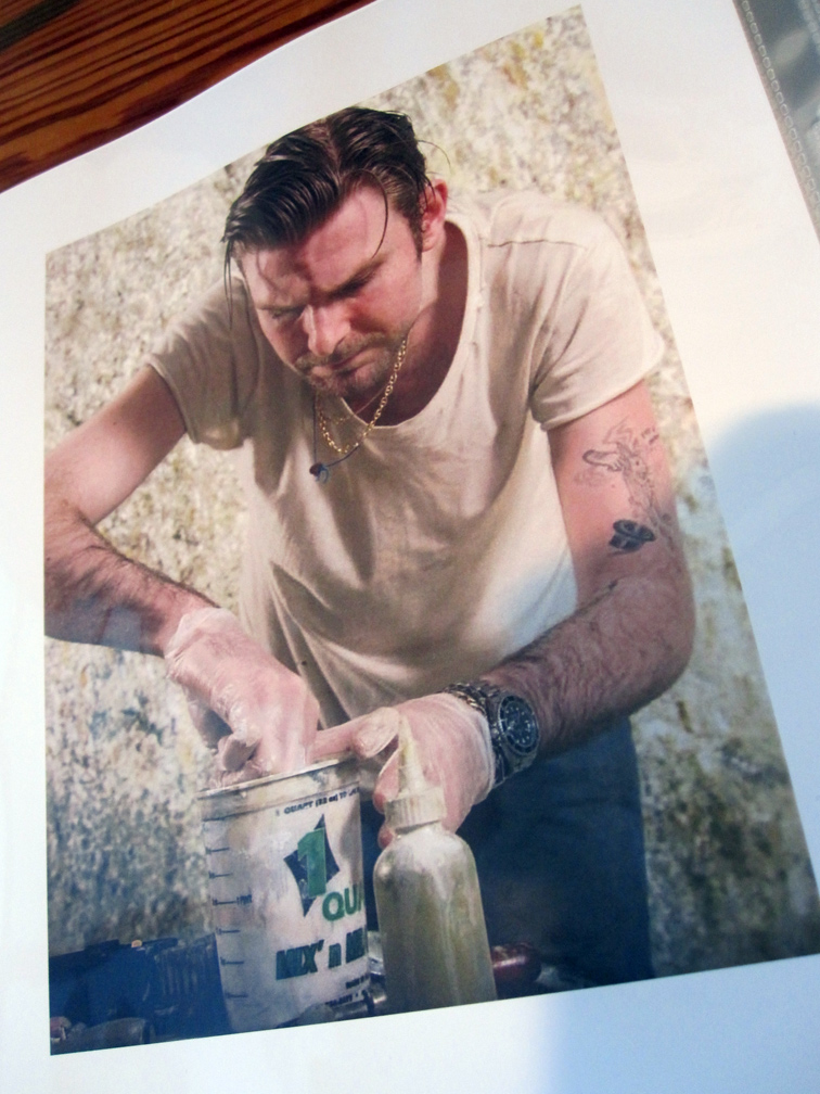
PHOTO OF DAN COLEN in ‘NEST – DASH SNOW DAN COLEN’, a big limited edition ‘coffee table’ book published by DEITCH PROJECTS in 2008.
PHOTOS BY & COPYRIGHT: NANCY SMITH. NYC SEPT 2010
~DAN COLEN: Bubble Gum Sticks |
Posted in The Bomb | By Nancy Smith | November 19th, 2012, 9:17am
Where is Jack Goldstein?
Nov 14, 2012 – Jan 15, 2013
Venus Over Manhattan – 980 Madison Av, 3rd Floor, Upper East Side, NYC
ART MAVEN SIMON CERIGO WEIGHS IN ON JACK GOLDSTEIN . . .
When I landed in the New York City art world in 1982, there was a lot happening in Soho, but in my opinion the two most important galleries at the time that were showing cutting edge work were the MARY BOONE GALLERY on West Broadway and METRO PICTURES on Mercer.
The interesting thing was that the aesthetics of each gallery were diametrically opposed. BOONE showed expressionist painters JULIAN SCHNABEL and DAVID SALLE, Salle really had a foot in both camps . . . while METRO was showing very cool/ironic conceptual photography, as in CINDY SHERMAN and LAURIE SIMMONS; and appropriation-focused painting by JACK GOLDSTEIN, and WALTER ROBINSON.
I was so impressed by the work in both galleries that by 1983 I tried to buy a big (major) DAVID SALLE from Boone, but there was a waiting list. I recall Mary telling me, “Take a number, there’s a line – 30 odd deep!”.
But in 1984 there was NO line at METRO PICTURES to buy a major GOLDSTEIN lightning painting, 14 feet across and 9 feet high, and it was extremely cheap !! I was able to snap it up before anybody else knew what was happening, for $8,000. this is the truth, believe it or not.
in 1986 I exhibited the painting in an ‘abstract’ group show in my small storefront gallery, SIMON CERIGO GALLERY on Ave A at the height of the original East Village scene. Even though it was a hyper realist lightning painting, I considered it an ‘abstract’ painting because visually – it pulsated in a very formal matter across the surface of the painting. I also included one of Walter Robinson’s spin art paintings, 3 x 3 ft – which looked like a Kenneth Noland ‘target’ painting of the early 60s.
a year later, or so . . . the WHITNEY asked me to lend the painting to a show in their brand new annex in Stanford Conn to which I consented.
by 1989 I had two small children and the Jack Goldstein painting was so big I couldn’t get it even through the window of my 5th floor Tribeca loft. I was also paying about $200 a month for its storage so, needing money to feed my new family, when the young director of a new gallery in Soho, who had seen it at my gallery asked if it was available – I said yes.
it took them a scant 2 weeks to sell it to a Toronto gallery and I realized a good profit, and though sad to lose the piece, I considered myself lucky because the art market collapsed right after the sale. a couple of years later I heard from somebody that the painting .. was in the collection of the National Gallery of Canada, in Ottawa – and the tag beside the painting said: COLLECTION SIMON CERIGO, I guess because I was the first, and only private collector to own it.
the main reason the National Gallery of Canada wanted the piece was because Jack was born in Montreal, even though he grew up in LA.
fast forward to 2005, Jack Goldstein having committed suicide by drugs, whether inadvertant or not, in 2003 at the age of 58, dealers were approaching me and asking whether I still had the Goldstein. regrettably … I had to say, no.
fast forward to last night. I was at VENUS OVER MANHATTAN, the new ADAM LINDEMANN GALLERY on Madison Ave . . . for the opening of their JACK GOLDSTEIN show, their 4th show. the reception took place from 9 pm to midnight to accommodate Lindemann’s fellow collectors who were at the big contemporary art auction, that had started at 7 pm.
titled ‘Where is Jack Goldstein?’, this beautiful show has mostly paintings from the early 80s and late 70s, but also included one of Jack’s famous 16mm films, a loop of the barking dog, titled ‘Shane’, 1975.
Mr. Lindemann, as everybody knows also writes an art column for the New York Observer, in which he is very vocal about the goings on in the art world, and by presenting this show, he has staked out a very bold position for Jack Goldstein vis-a-vie the aesthetic dialog current today.
Mr. JEFFREY DEITCH had taken the opposite position when upon becoming the new director of MOCA, in 2010, he cancelled the museum’s pre-scheduled Jack Goldstein retrospective. the published rationale on Jeffrey’s part for the cancellation was quote, that: “the show was academic.” I don’t find this surprising as Jeffrey is basically considered a “scenester”, and . . . you can quote me on that.
at the opening, Mr. Lindemann remarked to me how it took 20 years, and his death – for Jack Goldstein’s prices to start moving up. on the other hand Jack’s reputation and influence has never waned amongst succeeding generations of young artists and curators.
as an aside, I always wondered why the Jack Goldstein – Metro Pictures relationship ended in the late 80s. so my ears picked up when Mr. Lindemann casually mentioned to me that Jack and Helene, one of the founders of Metro Pictures were romantically involved until it all went south . . for quote “infidelity on Jack’s part”. . . blatantly, that is, in front of her face (!!) with another dealer. although he continued with some specific, and very colorful information, I think we’ll best close by saying that Jack was a notorious big party-down kind of guy .. and, we’ll just leave the rest to your imagination.

JACK GOLDSTEIN (Observatory), 1983 – PHOTO of ARTWORK COURTESY: VENUS OVER MANHATTAN
acrylic on canvas, 60 x 60 inches.
~JACK GOLDSTEIN: REVISITED |
Posted in The Bomb | By Nancy Smith | November 15th, 2012, 11:18am
HEADS UP – LAST 3 DAYS !! at the FILM FORUM, OCT 31 – NOV 13, 2012
FILE UNDER: DON’T MISS IT.
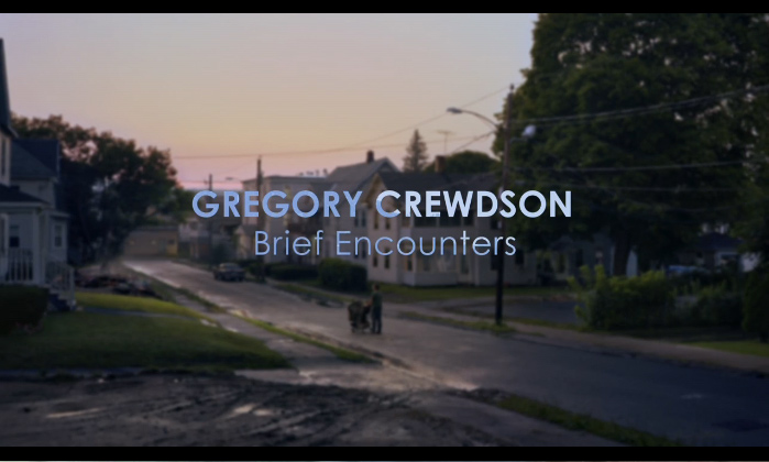
GREGORY CREWDSON: BRIEF ENCOUNTERS – A FILM BY BEN SHAPIRO
REVIEWED BY NANCY SMITH. NOV 11, 2012


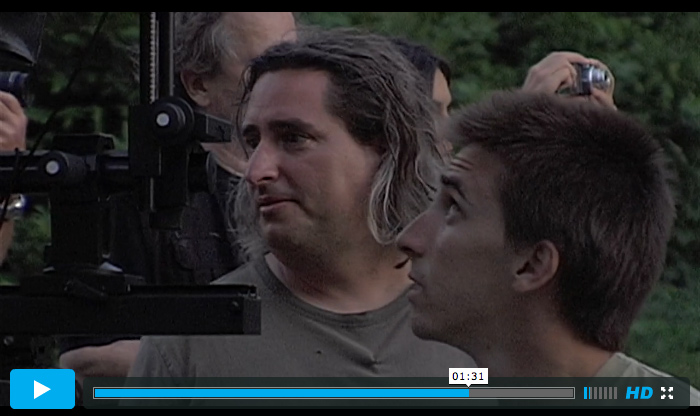
GREGORY CREWDSON, left, on location.
these past 2 weeks, NEW YORK CITY has seen a lot of tragedy, damage, and loss, due to extreme Hurricane Sandy’s rampage.
culturally speaking, specifically in the art world – probably the biggest loss – was the bad luck timing of this film’s – New York City opening run.
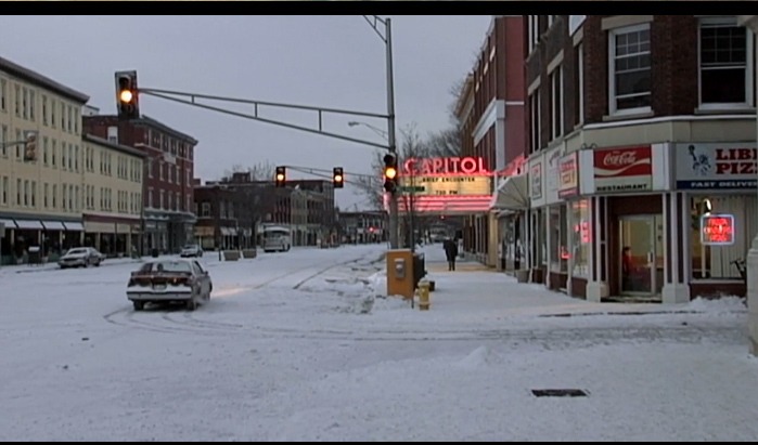
GREGORY CREWDSON: BRIEF ENCOUNTERS, ironically also a film of loss, pivoting on the natural downward spiral that is found in the unending cycle of human, geographic, and economic erosion, even touching on the inevitable degrading of the infra-structure of small town America circa 1940 – is a film that shouldn’t be missed on any account, but which also took on a more poignant local meaning, in the aftermath of Sandy’s path – yet, which lost its biggest play for gathering key audience momentum . . . due to the storm’s complete shutdown of the city.
bad timing to the max.
talk about real-world bad luck . . echoing the ‘down-on-your-luck’ ethos of the work !!
the reviews that managed to surface in the mainstream press, didn’t help.
the worst of the lot, was that dumb idiot chick in the NEW YORK POST, one FARRAN SMITH NEHME, whose under-educated and absolutely dreadful scribble – makes you wonder if she even saw the film. and if she actually did sit herself through an advance press screening – she still didn’t see it. what’s wrong with people, especially the ones who are supposed to telegraph the news.
one: even though it is a documentary – it is an astonishing narrative, and tells a wonderful story. it’s definitely NOT just all about the “astonishing amounts of labor and time” that go into the production of Crewdson’s work, though that in itself is a great reveal . . .
but more important, as to her last sentence . . . “Director Ben Shapiro keeps focus entirely on work, leaving Crewdson himself an enigma.” . . . this is SO ridiculous, and off-base, that all I could think of, besides being happy to be alive, and living on high ground – was, when would my Sandy-downed internet server gonna come back online, so I could refute this garbage, and set the record straight.
GREGORY CREWDSON; BRIEF ENCOUNTERS . . . is the most wonderfully, yet easy-going articulate portrait of an artist I have ever seen, and the artist himself is grounded and articulate to boot.
enigma, NOT !!
no, it’s not all about the work, the “SPEEDIES”, anybody ?!! though it’s obvious GREGORY CREWDSON is all about the work, and it’s a great piece of cinematic storytelling, esp great to be seen on a big screen, as to how it all comes about.
thank you BEN SHAPIRO . . . who produced, directed and PHOTOGRAPHED this film, and who followed Mr. Crewdson around for quite a period of time and, so the film includes, therefore . . . many history-making archival passages.
so, drop everything and go see it – on the big screen, here in NYC at least – during the next 2 days.
it’s the real deal.
I wasn’t that big a fan of Crewdson’s work before, but for sure, I am now.

the real magic in the film, and in the work is just how truly evocative . . . Crewdson’s photographs are. whether filmed on actual locale or created from the ground-up on a ‘production’ set .. we are provoked to see and feel the unspoken fear and sadness that lives in all of us. it’s funny-sad, but quite deeply true – how so much of life as we live it, is not about what we have, or have gained, but what we have lost.
somewhere along the way, in our personal lives, and somewhere along the way, as time passes, and specifically bypasses – the American small town ethos of the 40s, as the metaphor, and the reality.
and the inevitable future.
the only sureness is: all things will change.
a lot of this visual/emotional power comes from how Gregory Crewdson deeply understands his ‘story’ . . . and the detail-oriented vision with which he infuses what is still, even after the all the technical work – just one single frame, a still photograph. he says somewhere along the way that “every artist has one story that they tell over and over” . . . til they get it right.
one of the ways he gets it right, is simply through the use of man-made lighting.
on location, he shoots at twilight, when there is just that small window of camera time available to catch the production’s not day not night, but eerie ‘fictional’ light of an atmosphere, not so much charged, as so . . . incandescently imbued of the unknown. the photographs that result take ‘place’ and makes it: mystery.
without the viewer quite knowing why, at least until you see this film . . .
it’s that ‘captured’ unreal light that is the real ‘fiction’ and secret of these photographs. it’s simply ‘manipulated’ or ‘fabricated’ light as much as any other element – that really drives the scene. and tugs at your emotions. as the viewer, you can’t quite put your finger on the source, what is doing you in. and then the fog truck is called upon to roll through the composed scenario, just before the shutter clicks.
and you get it.
so yes. yes, for the power of great movies. profound photographs. enchanting story-telling, and behind-the-scene docs !!
take a pick-up truck spewing man-made FOG, add some cinematic lighting, and put to scenes of psychologically tinged reality, and you understand that Gregory Crewdson’s photographs are more like paintings, than you could have ever first imagined.
and nowhere near movies, which is the first impression.
watch the trailer & get more info: GREGORY CREWDSON: BRIEF ENCOUNTERS

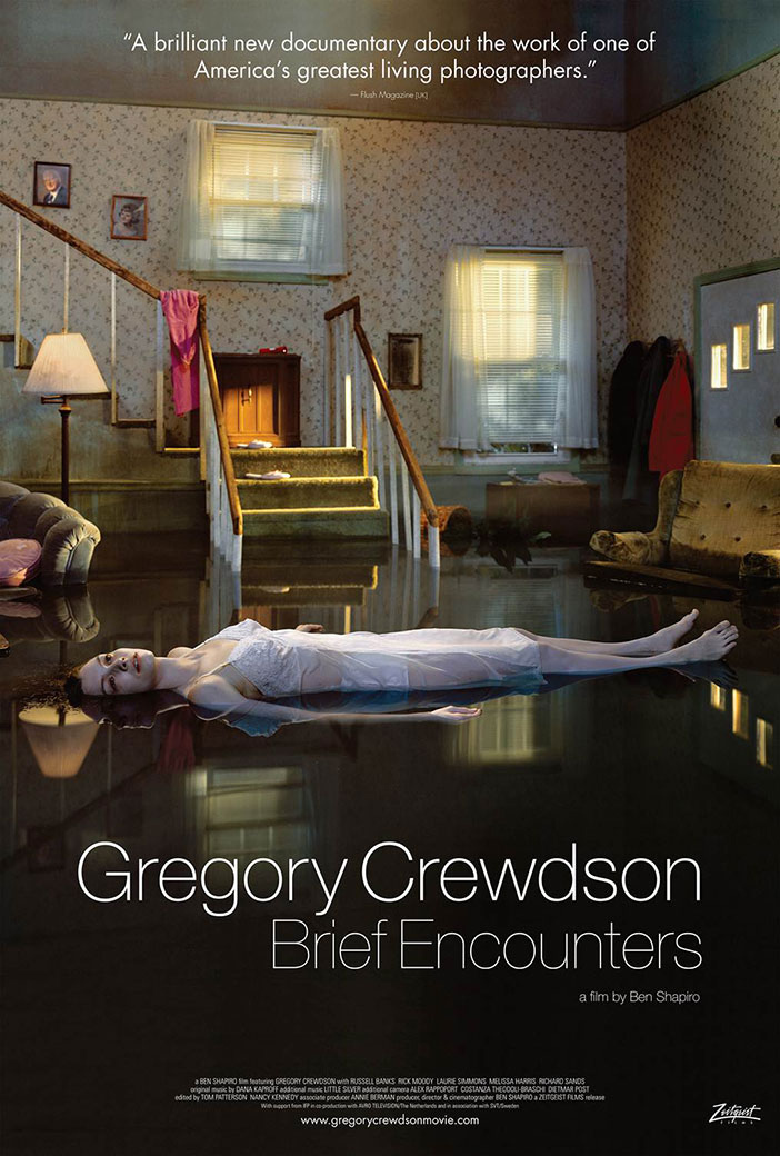
this is the media poster for the movie.
whatever was I thinking, not using this image for the initial review, after a storm that flooded a great swath of this city and its environs.
well, actually the flood that Sandy unleashed was NOT like this . . . at all. it was more like a dirty mud-filled sucker punch that had no prettiness to it, at all.
and likewise, even though this image, which I guess was picked for its obvious poster-grade mass audience common denominator graphic punch – stands not for the majority of Crewdson’s work, but interestingly more speaks to how . . . he LEFT this way-too surreal, way-too obvious, way-too-easy-to-read brand of visual ‘fiction’ behind. and for the better.
in fact you could say a really compelling subtext of the film is actually how it follows the evolution of the work back and forth as time goes on, and reveals Mr. Crewdson’s evolving artistic decision-making. and his, finally – deeply gathered ability to distill a ‘vision’ – that is so pure and perfect – that it makes for a deeply singular and profound body of work.
it’s like . . . he had several aesthetic paths, esp once he got with the big bucks, to tell his story. and he pared down the surreal, and upped the Walker Evans.
it’s interesting therefore to watch how in touch he is with himself, and what he wants to say . . . about the world around him, and the great dark mystery of it all. he doesn’t need to discuss it, it’s just that ‘key’ that he left this garish hyper-surrealism layering behind, and concentrated on the classicism and silence of less ‘mentally’ composed scenes.
it’s …. feeling .. . stripped down, not amped up, that is WORKING here.
it’s really all about the lighting and the details, not a super-imposed ‘drama’. we aren’t distracted by a ‘thriller’ of a pictorial narrative that we can read with our minds, as much as we are led down a path – into ourselves. the deep secrets, the loss and fear – beneath the surface. we don’t need over-the-top surrealism, to bring it all home, just a little attention to detail, a grimy window, a dirty thrift-shop lamp, a local native . . . and the unseen, but ever intuited . . . . pass of the fog.
this is the real genius of Gregory Crewdson.
~GREGORY CREWDSON: BRIEF ENCOUNTERS |
Posted in Movie Reviews, The Bomb | By Nancy Smith | November 11th, 2012, 2:11pm
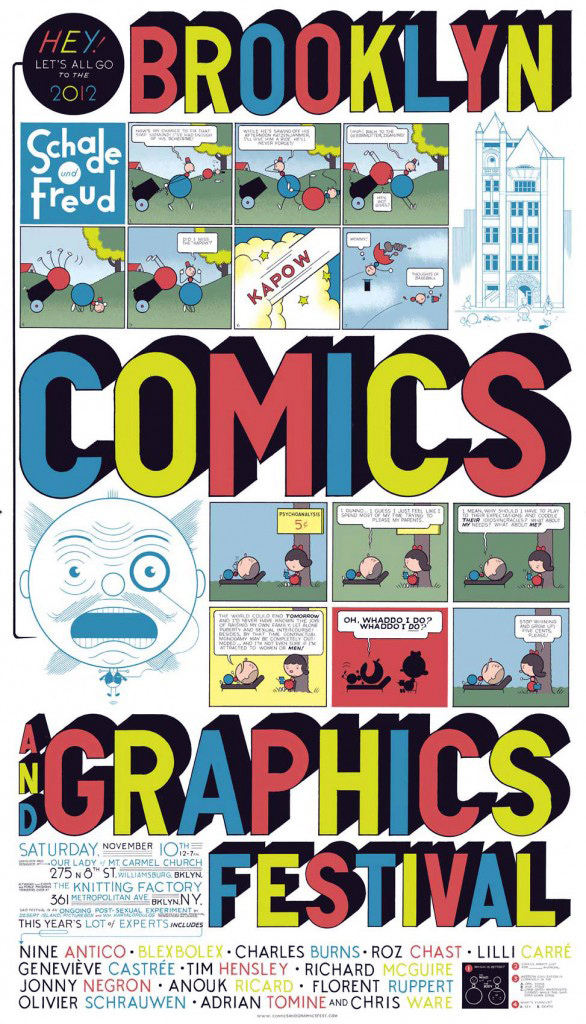
THE BROOKLYN COMICS AND GRAPHICS FESTIVAL
OUR LADY of Mt. CARMEL CHURCH
275 North 8th St. – WILLIAMSBURG, BROOKLYN, NY
SAT NOV 10, 2012 / 12 – 7 PM
FREE ADMISSION
see: BROOKLYN COMICS AND GRAPHICS FESTIVAL
and: their update blog

POSTER BY CHRIS WARE
~Yep, the ‘L’ train … is back up & running |
Posted in The Bomb | By Nancy Smith | November 9th, 2012, 6:59pm
so, HAPPY HALLOWEENIE – while I still have the web juice !!
the invisible ‘system’ – going down with the storm ?!!
damn, NYC caught between . . . a KILLER NANNY and a KILLER STORM.
and, on the very eve of Halloweenie !!
it’s like being shot – right . . . between the eyes.
PLUS: my hard drive, holding ALL my iPhoto pix since 2007 – is failing, the back-up is sputtering and my computer seems to be heading to the graveyard – too. I can hear the drives grinding. damn.
talk about YOUR PERFECT STORM.
it’s not funny . . . A-N-X-I-E-T-Y RULES !!
ok infanticide is bad enough . . . and, KNOCK on WOOD.
but. when you face PERSONAL / CYBER-DISCONNECTION . . . whether thru theft, loss, hacking, or hardware malfunction, that’s also severe enough to give your bio-body a heart attack, for real . . . that’s why people hold onto their phones, for dear life (!!) in the face of hulking muggers. it is like losing a child. or losing touch with your child, is maybe a better way to put it. we’re spoiled lethally soft by instant communication.
losing your digital device. it is losing your life. well that’s a bit unsensitive, but actually . . . damn straight – true. a void opens up, deep in the heart of you.
SO: when you face a week of being bumped off the grid – due to natural forces, they say the storm will down the power lines . . . that feed your devices. what can you do. can you manage to breathe.
yep, and you know it – at the end of the day – you need that electrical power current. like your body needs water.
so, NO, it’s not a TOTALLY wireless world, YET !!
and until it is, and they be working on it, I’m sure – ANXIETY RULES.
so you do realize we are already: half man, half machine, don’t you ?
SO FUNNIE, but get this !!
FILE UNDER: who woulda thunk it . . .
this is my conscious mind, above – and it’s totally wired . . . to the web as you can see.
though yes, I can also read TAROT CARDS, when it comes down to it . . .
but in MY dreams ?
omg, excuse the expression – I wake up this morning, and WTF am I dreaming ?
I am part of a hi-tech cyber crew hatching plans to ‘patch’ into the cyber banking world – and make off with the biggest digitial bank theft . . . in history – under cover of the storm !!
anonymous, move over !!
well, I guess what they say is true: yes, NECESSITY . . . is the MOTHER OF INVENTION !!
even, in your d-r-e-a-m-s.
ALL ARTWORK – BELOW – BY JAMES MOORE.
EXHIBITED at Mr. Fine Art, NYC – ‘NEON AND CANDLES’ – CURATED BY THOMAS ARSAC

YOUR BRAIN ON STEROIDS, I MEAN . . . the INTERNET !!
W-I-R-E-D.
BLACK LIGHT. sunshine, NOT !!
so with the killer storm, rhymes with killer whale ? as in BIO. BIO. BIO. VIOLENT.
and the horrifying break-down of the deranged Dominican killer nanny – I got to thinking, maybe it wasn’t . . . ALL about BIO-HUMAN warfare and self-destruction.
short-cut called: ‘planetary’ bio-species.
BUT: maybe it had more to do with the fact, that we are all living lives, in a future-sense. pressed by the new reality of economic forces & change . . . and so disconnected on the physical level – as a society as a whole.
while we live more TRULY – as a society as a whole – on the web. I mean how do you have a life, when you update a blog, do your Facebook, and . . . follow 780 twitter friends ?
our heads are b-u-r-n-i-n-g !! . . . . to the BONE !! with COMMUNICATION, INFORMATION, stalking ? and NO RULES.
our heads are on fire . . . with the youTube/google possibilities. aka the life & brain … on-grid. aka florescent light !! aka purple rain !!
I’m even thinking: LSD. or at the very best, peyote ?
not to mention all the god damn meds – everybody in this country is on. addarall, anybody ?
look out !! when you INTERVIEW YOUR NEXT NANNY.
KEY QUESTION NUMBER ONE: are you on meds ?
but, duh. with, or without the meds, we are wired . . . . and we are consumed.
we live in the alternate twilight.
it’s already happened. the future – is US !!

we are evolving into a planet . . . of animals – that are melted as in, w-e-l-d-e-d to the web, the alternate universe of the internet. c-a-p-t-i-v-e. c-o-n-s-u-m-e-d.
and note: the electric cord.
it’s not just a case of being wired. but of needing to be … wired.
as in: connected to the juice.
the . . . purple power ?

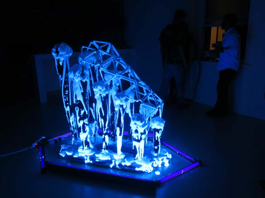
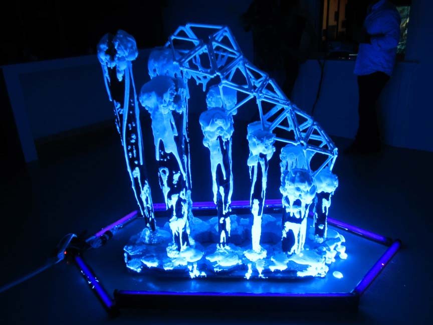
from the side you can plainly see . . the human skulls . . . dripping down the evolutionary ladder ?
killer whales. killer nannies. killer storms.
downed technology ?

ectoplasm of the f-u-t-u-r-e.

our NEW brains. . . . switched on, and ‘wired’.
merging with the machine, the grid. the web. the power source.
so, you do know a slice of a mouse’s brain, is no diff from a slice of the universe – except in SCALE. look it up.

and the ectoplasm pools around the feet, and lies in puddles like blood – on the porcelain bathtub … I know it’s friggin gruesome.
it makes you wonder how our ancestors ever got thru without the advanced linked-in technology we depend on today. I mean ok, first they had the stars to guide them, then the myths, then religion. to help them connect the dots. but still unless they had telepathy skills that we have lost / how did they ever feel …. SECURE ?
without smartphones. even just cellphones.
and I mean, even just our fairly recent colonist fathers . . . leaving Europe, or Africa (!!) for the new land, and once getting here, picking up and …. being pioneers setting off into the unknown frontier, ok they had quilts !! and guns !! BUT STILL without – any way to communicate to those back home ?
and. how did the fomilies left behind, cope with that. how did the 60s cope with . . . land lines, only ?

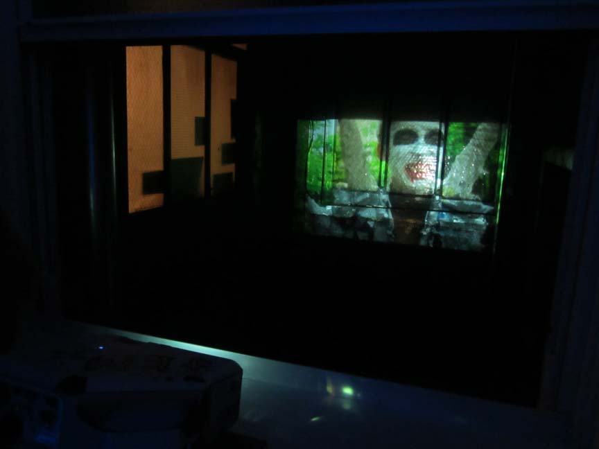
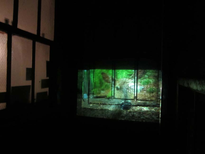
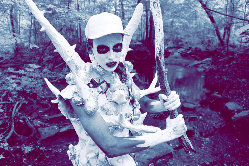
JAMES MOORE also projected a scary movie on the wall – opposite the ‘venue’. ha.

yes. we are on the very cusp of either going . . . totally back in time to primal, or becoming neo-primal – as in, back to basics: warriors, stalkers. predators. prey.
avengers. hackers. vigilantes ?
or, worse case scenario: bio-robot ‘demented’.
in fact: the issue seems to be . . how NOT to become humanly ‘dis-connected’ . . . in the face of so much … connection !!
so, yeah. the future don’t look to be as cuddly …. ‘locavore’ as in Brooklyn farm-to-table fare – as much as locavore: as in LOCO and VAMPIRE. and no doubt about it, we are the FOOD.
if we are not the FIGHTER ?
we are the victim, if we are not the bully ?
same old, same old human condition . . . if you think it down to basics, nothing ever . . . changes !!
two choices. be the hunter. or be the hunted.

BLACK & WHITE ?
with a little green, for bio – thrown in for good measure. ha.
we are in essence, dismembered – by the web.
we are the new: CAPTIVE ANIMALS. WE ARE PREY.
TO OUR CREATION.
DUDE, BETTER EVOLVE, FAST, GROW WINGS & LEARN to FLY . . . on that web.
THE FUTURE IS – US !!
THE FUTURE IS – NOW.

yes, even I … though mighty steeped in the ancient arts, watercolor, quilting & knitting . . . wake up to live on the web. to spill my guts . . . to total strangers ?

CHECK OUT: JAMES ELLIOTT MOOORE
this IS the face of the web. TRON, not !!
PHOTOS/COPYRIGHT: NANCY SMITH, NYC. SEPT 13, 2012.
~more, JAMES MOORE . . . |
Posted in The Bomb | By Nancy Smith | October 28th, 2012, 8:55am
FILE UNDER: ABSO-FRIGGIN-LUTE . . . ‘SIMPLE’ BLACK & WHITE ‘GRAPHICS’ . . . as POWERFUL METAPHORS.
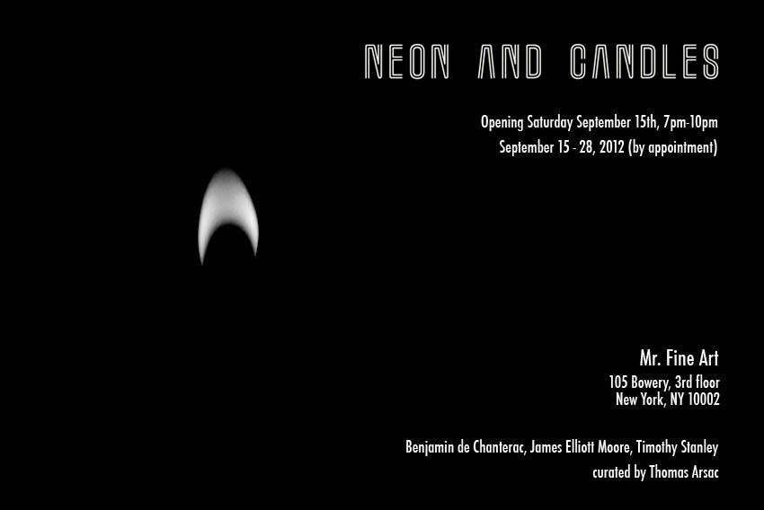
the flicker of a halfmoon-candle flame – against an all-black field . . . signifies: the BLACK & WHITE DESTRUCTIVE FORCE of … our otherwise ‘intelligent’ INTRA-SPECIES.
BIO-VIOLENCE . . . as it flickers and flares up.
as in HUMAN on HUMAN . . . GREED, VIOLENCE, WAR & DESTRUCTION.
WE ARE HUMAN, we b-u-r-n.

NEON AND CANDLES
SEPT 15-28, 2012
Mr. Fine Art – 105 Bowery, 3rd Floor, New York City (Lower East Side).
featuring the work of: BENJAMIN De CHANTERAC, JAMES ELLIOTT MOORE, and TIMOTHY STANLEY.
curated by: THOMAS ARSAC.

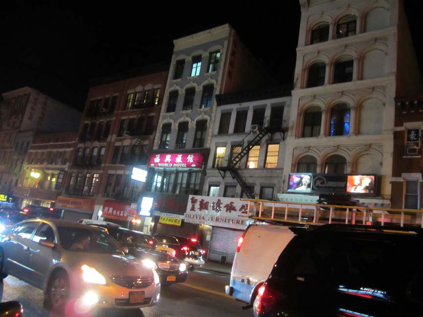
Mr. Fine Art is found on the almost top floor of one these buildings. actually, the one closer to the left, over the orange awning, on a deep dark and dank downtown strip of the Bowery, just off Canal.
SEPT 13, 3 days after still-dark 9-11 terrorist memories burned in as yet-unsoothed NYC, and 3 days after … we had all watched with horror as the American embassy lit the very sky with flames. 4 Americans killed, as it burst into outrageous violent flames – in that matchbox of a hell: BENGHAZI, LIBYA.
the night was even more marked. more harrowing, more theatrical, more dark & treacherous than usual, even on top of NYC’s 9-11, and the human toll/flames rising in Libya.
to get to Mr. Fine Art – a space, abso-friggin-lutely right OFF the art world charts, the wannabe visitor had to find a way through the teeming and untamed rowdy masses that feverishly consumed the blocked-off area – for the SAN GENNARO STREET FAIR.
if heading into the deep fringes of Chinatown on such a firecracker of a night didn’t spell: post-apocalyptic, MAD MAX / MOEBIUS futuristic & doomed underground . . . to see a show titled, ‘NEON AND CANDLES’ – and with absolutely no artworld pedigree, I don’t know . . . what would.

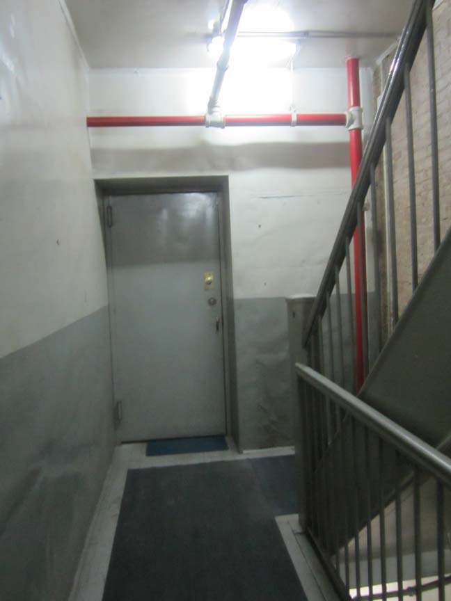
inside the old industrial loft building, the long steep hallway was conversely as bizarrely faceless and minimal – as the streets outside were rife with humanity, threat, and evil. this felt evil too. like being inside the . . . matrix.

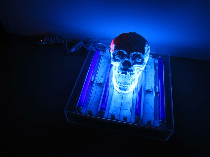
ARTWORK BY JAMES MOORE.
once up the steel gray and cold, four or five long flights of stairs, you opened the ‘faceless’ door upon a forsaken scene . . . of total blackness. total black-out.
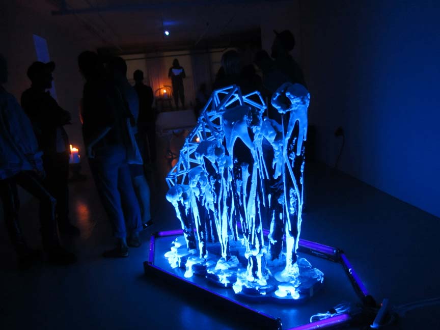
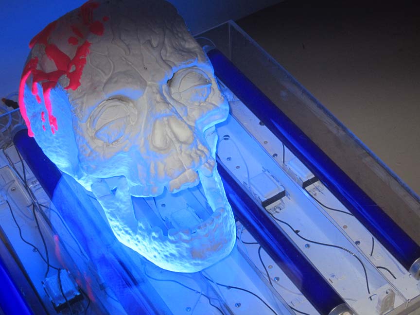
the very first thing my eyes could discern, was this totally black-light-lit – scenario of human death . . of hell on wheels, and I mean, specifically . . . on florescence tubes.
the future – as freak-out.
a huge human skull illuminated like a science fiction version of a fast-forward illuminated manuscript . . in a temple of doom.
it spoke to the . . . AFTERMATH of VIOLENCE.
it spoke to the finality of the bio-condition, except for the slow-to-degrade, bone of the skull.
it spoke to PROFOUND SADNESS, DESTRUCTION, EXPRESSION, and ironically: FUTURE VISION. it was like coming upon a campfire, except instead burning wood,it was fabricated raw white plaster, neon, and candles. that was . . . on fire.
it spoke to young men attempting to make profound statements.
as opposed to the hollow production that you mostly get to see, coming out of your ‘over-worked mainstream art world’ machine.
that predictable . . . listen to that cash register ping. thing. thang.
whatever. you know what I’m asayin’, and even if you don’t. you can guess.
but if you do, know . . . please don’t pretend that you don’t.

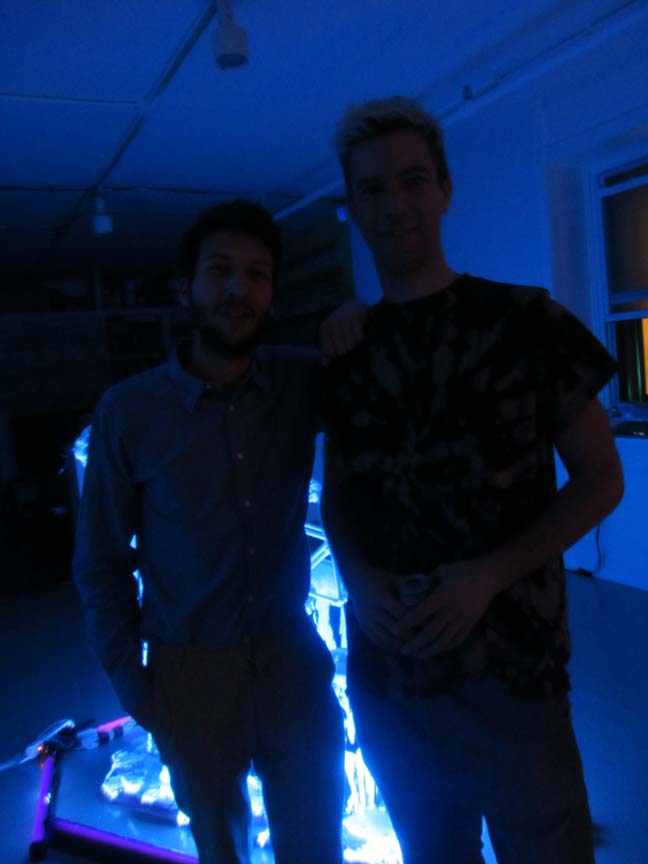
in the dark. this is how the room truly, looked. and glowed, deep purple and black.
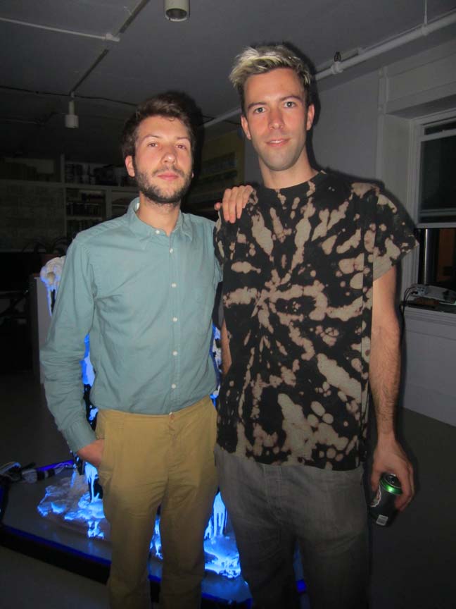
eerie. deathly. you can just make out, the show’s curator, at left, THOMAS ARSAC and one of the artists, he of the skull and black light above – JAMES MOORE.

on the left, the show’s curator, THOMAS ARSAC. with artist, JAMES ELLIOTT MOORE.
(through the magic/power of digital photography & auto-focus light flashes !!).

in the foreground, hulking, life-size, black-light lit, animalistic ritualistic sculpture by JAMES MOORE.
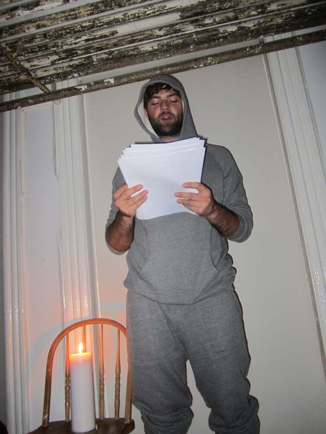
in the background – you can just make out performance artist: TIMOTHY STANLEY.

TIMOTHY STANLEY . . .
plus: dig those ‘degrading’ pipes along the top. just like as if in a ‘leaking’ old spaceship – lost !!
if Mr. Moore’s startling works . . . stood for a dismal future final, and I’m saying ‘future’, instead of past … because of the florescent tubing !! MR. STANLEY stood, literally, for the present. note the candle burning “in the present” – on the chair, beside him.
nobody could hear a damn thing he was saying, over the gallery din, and even if they could, they didn’t care and weren’t listening.
oh yeah, if that isn’t a metaphor for the PRESENT, I don’t know – what is.

BENJAMIN DE CHANTERAC was not present, he was in his homeland, FRANCE. (hello, PARIS !!)
the curator, also from FRANCE, THOMAS ARSAC was using this opportunity to debut his work in NYC. it was one piece, it was fresh off the factory – and it was awesome.
it was eloquent, it was mysterious, it was a road map to the unknown, and deviated (!!) future.
it was a time trip.
science fiction, CLOUD ATLAS ? . . . . though way more mutated, hello . . . planetary future shock !!

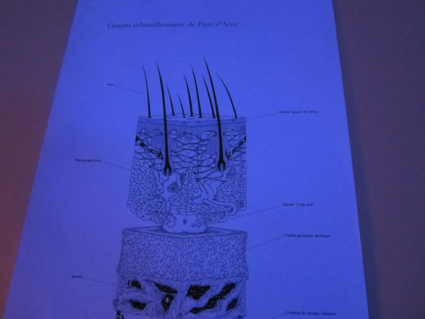
detail, ink on paper unique drawing by BENJAMIN DE CHANTERAC.
it’s amazing what a little, ‘quelle’ deviated light source . . . can do !!

the eyes – have it.
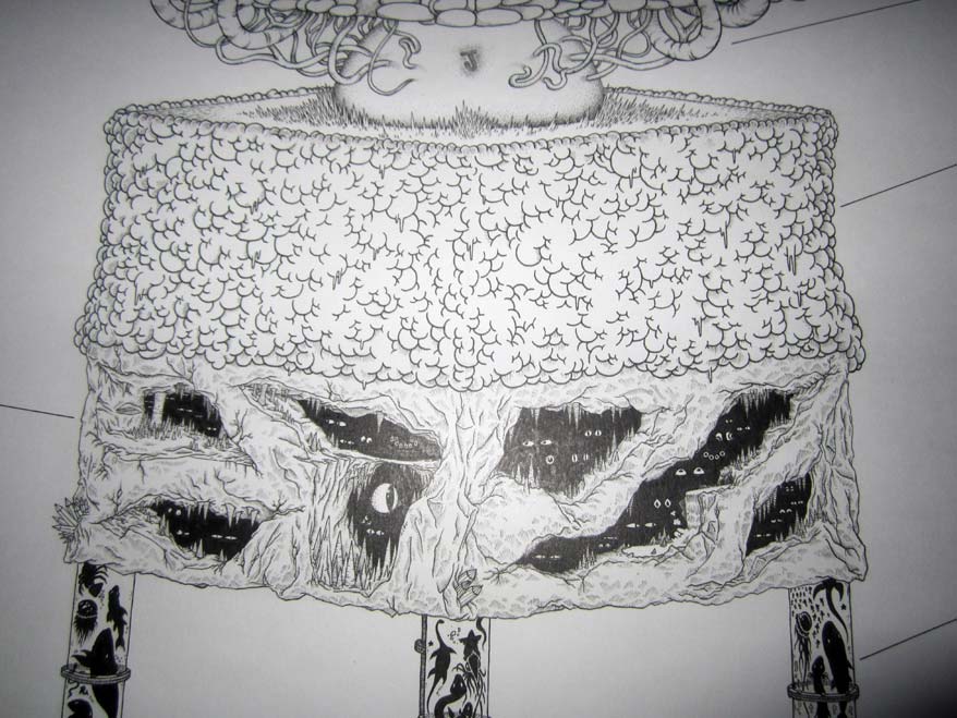
graphic detail, in an exquisitely detailed, science fiction-like ‘map’ drawing by FRANCE’S …. BENJAMIN DE CHANTERAC.

ARTWORK BY JAMES MOORE.
yep, it’s all about the details, the art, of the art.
the human condition, and the future tense !!
the light, the black, and the eyeballs, hold all SECRETS !!
ha.

just ask: Mr. Fine Art . . . himself !!
PHOTOS/COPYRIGHT: NANCY SMITH, NYC. SEPT 13, 2012
UP-DATE: THURS OCT 25, 2012 / 8:15 PM
FILE UNDER: HA !!
if you’re wondering about the sudden rash of ‘all black’ gallery shows with only black light aka purple light sources (!!) . . . witness the gallery invite fresh outta 109 in Brooklyn … tonite. ha.
it’s not …. a new ‘genre’, more like – lack of creative imagination at worst, unreferenced artistic dialog, at best.
(shades of Haim Steinbach – remember when everyone else was doing shelves-on-the-wall with stuff on them … after seeing his ?)
note to KENNY KOMER: who was at this EARLIER Mr. Fine Art all-black opening, and seems to be ‘spreading’ the ‘wealth’ at 109. “He who mocks the ‘point & shoot camera’ that has followed you around for the past ten years – will see cookie crumble.”
old Chinese proverb.
WE ARE HUMAN. we b-u-r-n.
POSTSCRIPT: in other words it’s not the ‘technology’, or the kind of camera, or ‘format’ – it’s always the brains & soul – behind the lens.
point and shoot – auto-focus, works fine for me !!
caught you – when nobody else had the brains to look, for even one second of play time.
what . . . do they teach you at Cooper Union, anyways ?
~NEON & CANDLES . . . |
Posted in The Bomb | By Nancy Smith | October 25th, 2012, 10:29am
it seems to be the last week to catch ALISON PEBWORTH’S – ‘BEAUTIFUL POSSIBILITY’ – TRAVELLING ACROSS AMERICA – TOUR, for now . . . anyways !!
ALISON PEBWORTH – ‘BEAUTIFUL POSSIBILITY’
OCT 15 – OCT 29, 2012
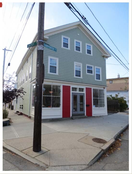
186 CARPENTER, PROVIDENCE, RHODE ISLAND


186 CARPENTER – is a storefront and office space . . . that presents arts programming and current events in Providence. hit the link – to see more pix of the space . . . small town urban/rural America, oh yeah !!
Providence is a beautiful word, it means:
1. care or preparation in advance; aka foresight.
2. prudent management, as in economy.
3. Divine care and guardianship.

ALISON PEBWORTH – ‘Beautiful Possibility’ – Title Banner.
featuring: Laudah Equiano, Tahcoloquoit (Sauk & Fox Chief), and Olive Oatman.
acrylic on canvas, 42 x 30 in.
‘Beautiful Possibility’ is a touring exhibition & research project that takes as its inspiration the 19th C. American Travelling Show.
for more banner photos, see: ALISON PEBWORTH ‘Beautiful Possibility’ – TOUR BANNERS – there are 10 altogether and each one is awesome – definite hit that link, and check them out.
ok, here’s one more:

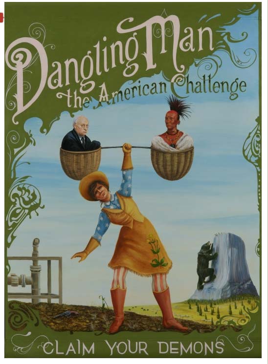
ALISON PEBWORTH – ‘Dangling Man’ – TOUR BANNER
Dick Cheney, Black Hawk, Seven Sisters on Mato Tipilia (Devil’s Tower).
acrylic on canvas, 42 x 30 in.

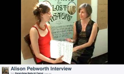
watch: San Francisco-based ALISON PEBWORTH, on the right – being interviewed at the SIGNAL+NOISE MEDIA ART FESTIVAL, 3 years ago.
(interviewer and interviewee – look to be of the same gene pool, no ? quelle fun !!)
check out: her website, ALISON PEBWORTH

and for sure, check out: her Roadside – Show & Tell
I really like her concept, and her GRAPHICS . . the bits of animation (!!) and the over-all web site design/organization !! . . . . as well as the paintings.
you go, girl !! tour that big bad America !! and . . . shine the light !!
~ALISON PEBWORTH – Americana Travelling Show . . . |
Posted in The Bomb | By Nancy Smith | October 23rd, 2012, 8:54am
FILE UNDER: if you want to banish redneck mentality, for-evah !! go no fur-tha !!
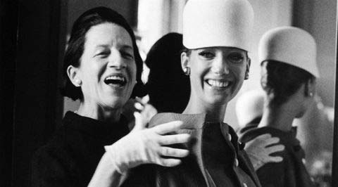
FILE UNDER: if you want to see why the current art scene is pretty much nowheresville, and that means lame, lame and more lame !! look no further than the fashion world, past, present . . . and probably, future !!
DIANA VREELAND: THE EYE HAS TO TRAVEL – A FILM BY LISA IMMORDINO VREELAND
REVIEWED BY NANCY SMITH. OCT 19, 2012

DIANA VREELAND: THE EYE HAS TO TRAVEL – CURRENTLY PLAYING at THE ANGELIKA FILM CENTER in NYC. DON’T MISS IT.

love this frame from the trailer – did you catch that … vintage crochet afghan (!!) – on the left.
WATCH: THE OFFICIAL TRAILER !!
p.s. hit the top image, to engage. don’t let that (lame) page fool ya.
the trailer starts off, with Ms. Vreeland narrating:
“the fashion world changes all the time. you can even see the approaching revolution in clothes. You can see and feel everything in clothes.” (!!)
the film is even more fascinating than the trailer makes for . . if you can imagine that.
it’s a wonderful story, a wonderful history – a vivid lively burst of color, fashion, and art. and key: ORIGINAL thought, also known as VISION – beyond the beyond.
but what really holds it all together is the brilliant job that the film’s director LISA IMMORDINO VREELAND, I guess a relative, has brought to the project, this film is one big treat. it moves swiftly as it lays the story down. the narrative just sweeps you up in the moment and never, ever … drops you into a dense too-much-info moment. somehow all the facts are laid bare with exquisite visuals . . . with such entertaining eloquence, the film is more a froth of a force, than a force of a force – if you get what I mean. nothing slows this film down, and it when it’s over, well . . . you just want to sit there, and watch it – all over again.
and, well regarding ‘all’ the facts, that’s interesting too.
though some mention is made of her personal life, she speaks of her very glamorous looking husband and how wonderful he made her feel, “how beautiful”, the film makes no other details of him or their relationship available. and though we do get to meet her grown-up sons, it’s a brief hello. but in those brief cameos, if you read between the lines, the filmmaker has opened up a little peek into maybe the only ‘flaw’ line of Ms. Vreeland’s super dedicated professional, if not downright obsessional life slash career. her grown sons have a strange half-life about them, like they never felt the absolute bonding of mother and child, it’s something that still seems to (sadly) resonate with them, even now.
but what a life, what a career – what superlative brilliance and authority did this “Empress of Fashion” exude, just as naturally as she did breathe. as she says, by way of explanation, she was born in Paris (!!) during the ‘belle epoque’, if you know your art history – you can put your head around that !! . . . and, she came of age during the Roaring Twenties – and, yes !! still in Paris. she didn’t fit into school as a child, and only settled down when she was sent to a dancing school, and yes, apparently she was quite the dancer.
she was of the original generation that was thrilled by the ultra fab: DIAGHLEV, NUREYEV and the Russian ballet, in Paris . . . and that was one visual, richly, profoundly dramatic scene – of course. no kidding. she was ‘found’ when she was full-blown dancing at a nightclub, in Paris of course, in her late teens, I think, something like that. she was noticed both for her dancing, and her style. she was chic, it seems from the get-go. she was wearing CHANEL !! and of course, once she opened her mouth, and the ideas and her full-on creative mind spun out in full gear, the next thing you knew she had her own fashion column. I’ll let the movie fill you in on that, and take over . . . it’s one amazing flight of inspiration, that’s for sure.

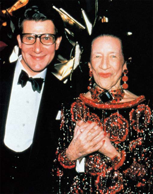
TWO LEGENDS: DIANA VREELAND with YVES SAINT LAURENT.
PHOTO BY ROXANNE LOWIT, ‘DIANA VREELAND’ by ELEANOR W DWIGHT, pg 262 – PHOTO C/O DIANAVREELAND.COM
the quote that appears with this photo, pretty much says it all:
“Mrs. Vreeland was one of the most exceptional people I have met in all my life. Her force of character, her glamor, her intelligence, her innate sense of elegance and her exuberance energized all those who meet her.” ~ YVES SAINT LAURENT, Designer, excerpted from ‘Diana Vreeland’ by ELEANOR DWIGHT.
YES !!
there IS an amazing website associated with this film . . . and it is absolutely, and delightfully chock-full of ARCHIVAL PHOTOS & QUOTES !!
it’s a rainy day – go for it !!
see: DIANAVREELAND.COM
WITH INITIAL REPORTING BY: KATE CERIGO
~DIANA VREELAND: THE EYE HAS TO TRAVEL . . . |
Posted in Movie Reviews, The Bomb | By Nancy Smith | October 19th, 2012, 10:11am
. . . showing the art world – where it’s . . . . really at.
FILE UNDER: there’s only SO much Redneck, as in Honey Boo Boo, not MARK ENGER !! you can take, and how many times can you really look at Kim Kardashian’s fat ass, and find it fascinating, anyways.
let alone be bored to tears . . . by Bernadette ?

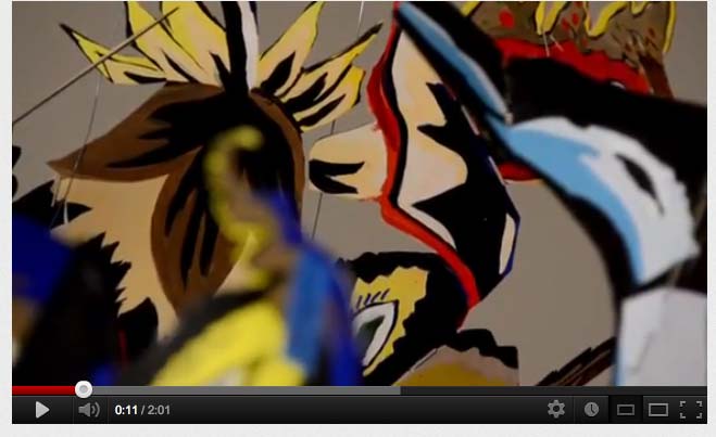
omg – first frame . . . and it takes off !!
light-weight, low-fi (!!) romantic chic poetic zine-like painted paper cut-outs, what have I been telling yo’all. duh !!

KRISTEN STEWART, bad girl !! how fun !!
Campaign shooting by STEVEN MEISEL, duh !!

oh to die for. so smart. I can hardly breathe.
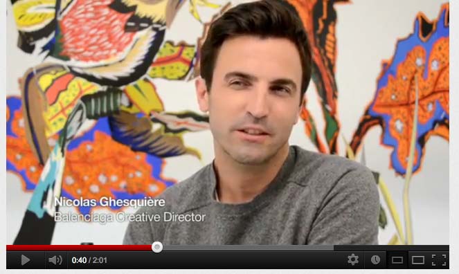
NICOLAS GHESQUIERE – BALANCIAGA CREATIVE DIRECTOR.
yep x 1,000,000 – watch: FLORABOTANICA – KIRSTEN STEWART DEBUTS PERFUM for BALENCIAGA !!
P.S.
when in Chelsea, that’s where you should head. even just to browse and, well, dream … on.
they have a great boutique down there.
on 22nd St. btwn 10 and 11. in the middle of nowheresville !!
(just joking, maybe !!)
WITH INITIAL REPORTING BY: KATE CERIGO.
~BALENCIAGA & KRISTEN STEWART . . . |
Posted in The Bomb | By Nancy Smith | October 18th, 2012, 1:36pm
Bernadette, sweet Bernadette, NOT !!
FILE UNDER: so maybe this is why – everybody’s new fav flavor . . . is REDNECK !!
we’re so sick of . . . artistic pretension.
SO, is it fair game, in the midst of talking about whale-on-whale intra-species violence, captivity, masked cyber-vigilantes, child suicide, and deadly child predator/bullies – to return to the art world, that happy playground (!!) and report on the demise of a used-to-be group, now exposed as: not … so much.
I always thought this group, known collectively as BERNADETTE CORPORATION, and running their own Lower East Side gallery outlet, REENA SPAULINGS FINE ART (a made-up name, bye the way, and maybe name-making was their best . . . calling ?) was way ‘too cool for school’.
as in: too self-involved with very little visual pay-off, and certainly not anywhere enough to offset their sharp-elbowed social elitism. so even though I lived close-by, I skipped going there altogether, even though for some reason, that greatly mystified me to no end, I guess they had a lot of literary-type, writer friends, tons of ‘academic’ paper and text extolled them.
their best caper was probably the stealth-like start-up of their very first storefront space on Grand St, deep into the old Yid neighborhood .. in fact they took ‘out’ an ultra-conservative womans’ clothing store and did some fairly outrageous stuff, in the big display window, with nary a sign stating that this was now a gallery. I well remember all the ole timers complaining to me . . . “what, this is a gallery. this is Fine art ? better it should have been a bakery.”
yep: Bernadette Corporation rolled on – like one big non-stop … the-emperor-who-wore-no-clothes storyline, attracting dim witted collectors like flies. well, if you can’t call the art, it’s always easier to go for what purports to be art – if it has a flashy, and key: SNOBBY …. text or tag line. not to mention the prerequisite, awesome-in-volume, and way-fawning Artforum chorus.
what is this a subversive vigilante website, or what. damn straight.
and more power to the freedom of the individual on the web, as opposed to the well-financed and mighty tarnished art publication industry. amen.
you couldn’t find a bigger bunch of sheep, anywhere.
not to mention, paid p.r. . . . just saying.
bottomline: if you bought into Bernadette Corporation, you lost.
BUT: you don’t have to take my word for it . . .
read: Bernadette Corporation ‘2000 Wasted Years’ . . . by KEN JOHNSON, NEW YORK TIMES. OCT 5, 2012
ha. ‘2000 Wasted Years’ – is right. well at least they got that part right. and no, they were not being wittily ‘self-deprecatory’ !! these guys just don’t have the required humor genes, their bio bank – it’s all self-smug inward – all the way.
see: Artists Space – ‘Bernadette Corporation – 2000 Wasted Years’ and you can pretty much come to – your OWN conclusion !!

installation view ‘Bernadette Corporation: 2000 Wasted Years’ at Artists Space, image c/o Artists Space.
the show is up thru DEC 16, 2012.
Artists Space – 38 Greene St. – in SOHO.
hmmm . . . and, you are . . . . ?
~Bernadette . . . |
Posted in The Bomb | By Nancy Smith | October 18th, 2012, 10:59am
